Introduction
Quilting can appear a complicated task at the outset, and rightly so. It uses specialized equipment, patterns, and involves many phases to complete a project. But when broken down into discrete steps, it becomes manageable. The same is true of data visualization: it is a science and also an art, taking sets of data and presenting them in a way that is visually understandable, inviting, and hopefully, aesthetically pleasing.
It may seem like the two have nothing in common, but quilting and data visualization can be a happy marriage. Quilting joins together multiple layers of fabric with a middle layer of insulation using stitching. Quilting can produce functional objects, such as blankets, coats, and desk pads, or decorative objects like wall hangings. For these reasons, quilting can be a good medium for beginning data crafters. Quilting provides rich opportunities for conveying information, from patterns in the fabric, to the size of cut pieces, to the pattern of the stitching ultimately holding together the layers.1
As a longtime figure skating fan, I have a lot of feelings about the sport! I only began figure skating as an adult in my early thirties, but my fandom stretches well back into my pre-teen and early teenage years. (Fellow fans may recognize this piece’s title as a reference to the 1992 cult film classic, The Cutting Edge). This project uses a dataset from the sport of figure skating. While many data crafting projects rely on datasets gathered by the crafter themself, this can be a barrier to less experienced sewists and data visualizers.2 Using sports datasets can be fruitful for a variety of reasons:
- These sets are often meticulously curated; makers don’t have to collect data of their own, over time, as with quantified self or personal informatics data crafting projects. This provides an immediate gratification factor.
- There is so much data collected for sports and there are so many different statistics even within a single sport.
- While it might seem “lightweight” on the surface, sports can still be very personal. Think about childhood or family fandoms, sports that a maker played or participated in, and obscure sports that have very specialized fandoms. Curling fans, I know you’re out there!
The project demonstrated here requires cutting and sewing in straight lines only, making it accessible for beginning sewists; it is also one that could be produced in other media. Many public and academic libraries already include sewing machines in makerspaces, but makers could alternatively use cut paper, paints, or colored pencils on graph paper.3 It can also be adapted to other sports data sets fairly easily. Following Vladis, et al’s example, it could be expanded into a day-long or multi-session series.4
Data gathering
Before we can develop a pattern, we need to have our dataset. I developed a different quilt in late 2022 for a university library data crafting workshop hosted in our digital humanities research center, so I returned to the idea for this project.5 That project visualized individual medal winners, by country, at the World Figure Skating Championships from 2013-2022. This time, I returned to World Figure Skating Championship data, but shifted my focus to the percentage of medals won, by country, for the period 2014-2023. How would this visualization change my view of this data? Would it reveal different interpretations and insights? This design mimics a word cloud graphic produced by text analysis, where more frequent words or phrases appear larger in the cloud and less frequent ones smaller.
I used a Google spreadsheet to gather my data from a fan-run website, SkatingScores.com. SkatingScores offers a queryable database, but also tidy overview pages for competitions.6 My spreadsheet had 3 sheets for gold, silver and bronze medal data. I placed the years on the vertical axis and countries on the horizontal axis and began counting medals by country.
Here’s the resulting gold medal table:
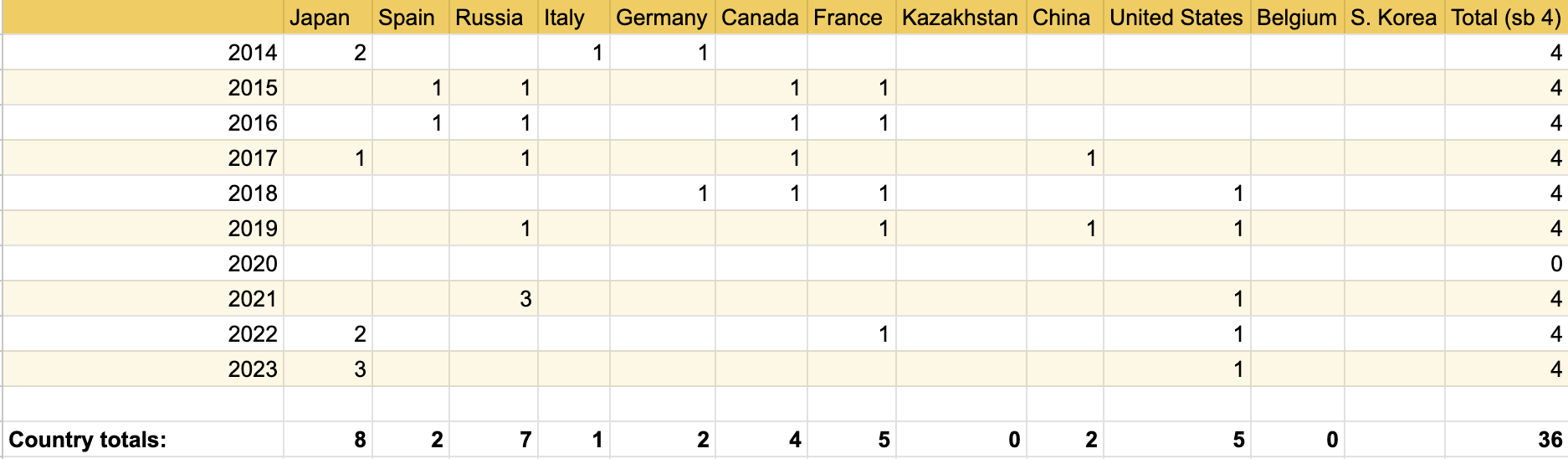
Figure 1. World Figure Skating Championship gold medal winners by country, 2014-23
I used simple SUM functions to add up the column and row totals. Four medals are awarded each year for each placement, one for men’s individual, women’s individual, pairs, and ice dance. The horizontal sums in the final column were a double-check for me that I was collecting data for all disciplines for each medal type in a given year.
From these tables, I derived the percentage won by country by dividing the country medal totals by 36 (the total number of medals awarded in the period; no Championship was held in 2020 due to COVID-19):

Figure 2. Percentage of gold medals won by country (2014-23)
I ordered them by hand in descending order of percentage in a new column, then rounded to whole numbers for ease of cutting.
Developing a pattern
Now, the real fun begins when thinking of how to represent each nation visually! I relied heavily on my previous project, recycling many of my design choices that were based on country flag colors and features. I began by collecting data on colors used in flags, then moved to features to help differentiate as so many nations share flag colors. I still had pieces of most of these fabrics on hand from my previous project, so I only ended up changing South Korea’s fabric from a solid white to a white and navy polka dot.
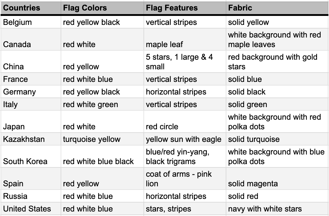
Figure 3. Fabric key for countries winning World Figure Skating Championship medals, 2014-23
Next, I decided how large this piece would be when completed. I landed on 30” wide (three columns each measuring 10” wide finished) by 40” long, which allows about 4” of fabric per year. This makes the finished object rectangular and a little smaller than 3 by 4 feet– a good size for a small wall hanging or blanket.
I used a standard quarter inch (0.25”) seam allowance, so the cut pieces will all have a standard width of 10.5” (allowing 0.25” on each edge). To figure out the lengths to cut, I returned to my spreadsheet and the column of percentage of medals won by country in descending order. Using spreadsheet functions, I multiplied the percentages by 40 (our desired final length). I then added 0.5” to each value in a new column for the seam allowances, and rounded to whole numbers for ease of cutting.
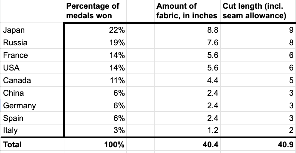
Figure 4. Gold medal winner fabric calculations
I repeated this process for each of the medals. This also helps us see how much fabric we really need to purchase. Fabric is sold by the yard (36” long by width of fabric, typically 40-44” for quilting cottons), so for smaller countries a quarter or even an eighth of a yard might suffice.
Assembly
There is a dirty little secret to sewing: there is very little time spent actually sewing! Most of our time is spent in the preparation and finishing phases, but we’re finally there.
I gathered and cut my fabrics according to my calculations, then began sewing the columns together. I laid out the cut pieces in the order they should be sewn:
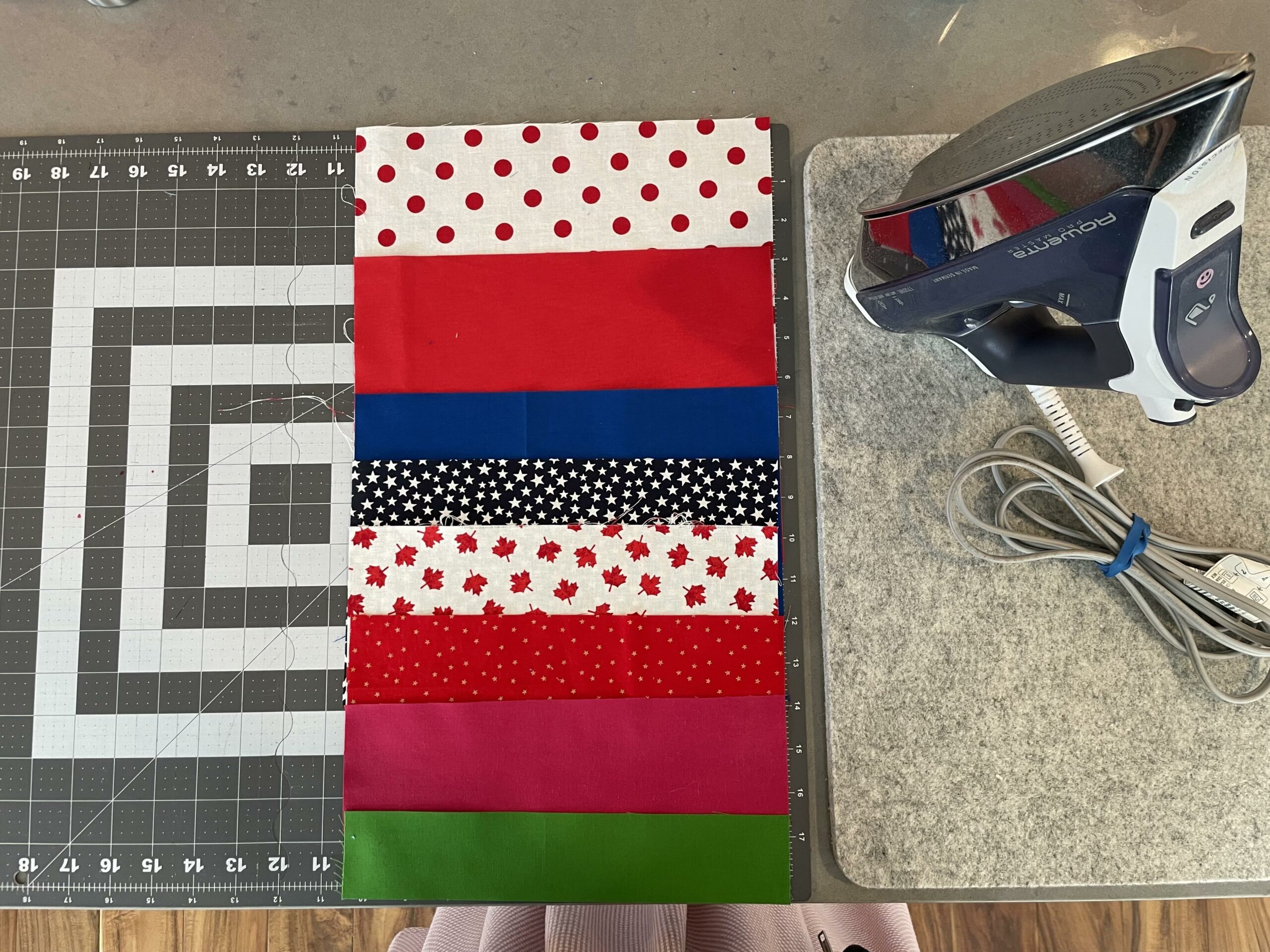
Figure 5. Gold medal fabrics laid out in order on cutting mat, ready to be sewn
When working with patterned fabrics, sewists need to take care to match the printed sides together when sewing so that the patterns all appear on the top (see Figure 7 in the Recipe).
I repeated this process for each of the medal columns. With this design, sewists can make aesthetic choices when countries have equally sized pieces, as in the case of silver medals where five nations each earned 3% of the medals (see Figure 6). I chose to order mine in a color pattern I liked, but this is up to the sewist.
Once the columns were assembled, I laid them out side-by-side and discovered an issue.
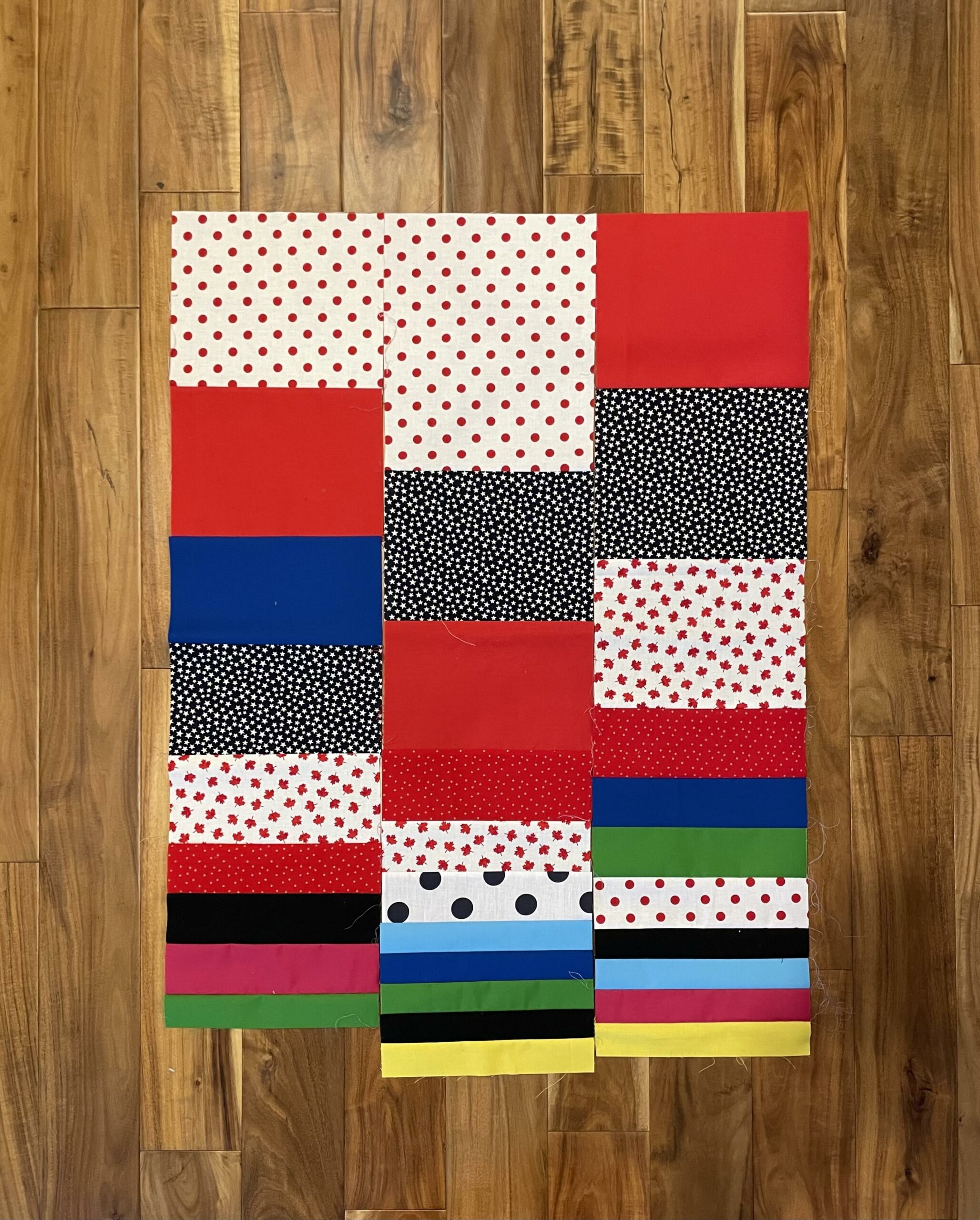
Figure 6. Gold, silver, and bronze columns laid out side by side. The column lengths are not equal!
My rounding calculations led to the columns being unequal lengths! Now I was left to decide: did I want to sew this as is, and leave the object as a wall hanging? Should I try to equalize the lengths by taking a tiny bit off the silver and bronze columns at the top? I could also fill in the gaps at the bottom using a different fabric. Or a hybrid of both?
While trimming a bit off the top seemed most attractive at first, it went against the visualization’s logic and risked reducing the visual impact of the top medal-winning nations’ accomplishments. In the end, I decided to fill in the blank spaces at the bottom with a neutral color not used by any of the countries’ flags, in favor of completing a small quilt as I’d originally intended.
With the columns now of a more equal length, I sewed them together to complete the quilt’s top. I won’t detail my finishing steps here, but Melanie Ham’s Your First Quilt video series is a very clear resource for beginning quilters to learn the process of putting the quilt fully together. I’ve begun using a no-show binding method, which takes your design right to the edge of the front, but sewists may also use a traditional binding to provide a frame around the top’s design.
Conclusions
This project’s design is much less granular than my previous skating data visualization. As far as the design and assembly of this quilt, it was easier because it simply used fewer pieces of fabric. This quilt has just 31 cut pieces, versus 120 in the previous design, and yet it lead to some unique observations:
- Twelve nations won World medals in this period.
- Japan earned the most golds and silvers, followed by Russia with the most golds and bronzes, then the USA with the most silvers and bronzes.
- In every category, one of the “Big 6” countries (Canada, USA, Japan, China, France, Russia) claimed the first five spots. These are host nations of the major international senior competitions leading to Worlds.
- Silver and bronze have slightly more variety with Kazakhstan, Belgium, and South Korea winning at least one medal.
- Success at one step of the medal podium doesn’t guarantee it in another; for example, France won many golds, but relatively few silvers and bronzes. However, many of the countries have won at least one medal in each category.
- The northern hemisphere continues to dominate figure skating.
Although I’ve done two projects now using this data, this design could be reworked again to give weightings to the different medals. Imagining the way the physical medal podium has the gold medalist standing tallest, a sewist could multiply the gold or silver medal sizes by a factor to increase their sizes. Another possibility is to calculate the total percentages of all medals won by each country and build an abstract visualization more like a word cloud.
Supplies and Recipe
The following items are commonly used in sewing and quilting projects and you may find them useful:
Sewing supplies
- Cutting mat – to protect your work surface and help measure
- Rotary cutter – this type of cutter produces clean, straight edges better than scissors
- Ruler/Cutting guides
- Pins/clips
- Iron + Ironing board – pressing the seams as you go helps the finished piece look neat
- Sewing machine – this pattern can be completed on a regular sewing machine
- Quilt-piecing/patchwork foot – makes sewing 0.25” seam allowances much easier!
- Walking foot – this specialized foot is helpful for putting together the layers of fabric without bunching or gathers
- Scissors – small size for trimming threads
- Seam ripper – we all make mistakes at some point and need this tool to take out stitching!
- Hand-sewing needle – most quilts are finished with hand stitching the edge binding to the back
- Painters tape – can be helpful in tacking down layers as you assemble your quilt
Pattern: Making a sport dataset quilt
- Following the steps detailed above, begin your work by choosing a sport you feel passionate about and choose a dataset from it. The dataset can be large or small, but keep in mind that quilts usually repeat design elements (known as blocks) across rows and columns, so having a dataset that employs a range (ex years) may be helpful.
- Next, refine the dataset to the data you plan to visualize. Sports collect all kinds of figures and statistics, so hone in to a specific statistic, team, player, competition, or country.
- With your chosen subset of data, organize them using a method of your choice. This could be done by hand, or using digital tools like spreadsheets. Since quilting usually produces rectangular objects, tabular tools help you begin to visualize what a pattern could look like.
- Developing a pattern is where the real fun begins! This is where you will decide the form your quilt will take. Will it be a traditional rectangle? How big do you want the finished piece to be? How will you represent your statistics with color, fabric pattern, size or texture? Will your quilting stitches (the stitching that holds all three layers together) convey information as well? It can be helpful to draw your vision out on graph paper at this stage to help scale it.
- With your design worked out, it’s time to source your fabric and other materials. Etsy is a great source for small cuts of fabric (less than a half yard) as well as obscure novelty prints. For example, I found my maple leaf fabric that represents Canada in my projects via Etsy.
- Using your cutting mat, rotary cutter or scissors, and rulers, cut your fabric to the planned lengths and widths to form your blocks. It is very helpful to lay the fabrics out as they will be sewn at this step, then sew them piece by piece together, making sure your design is coming out as planned. If you’re using patterned fabrics, be sure to place the right sides of the fabrics together and sew from the wrong side so that your patterns come out on top:
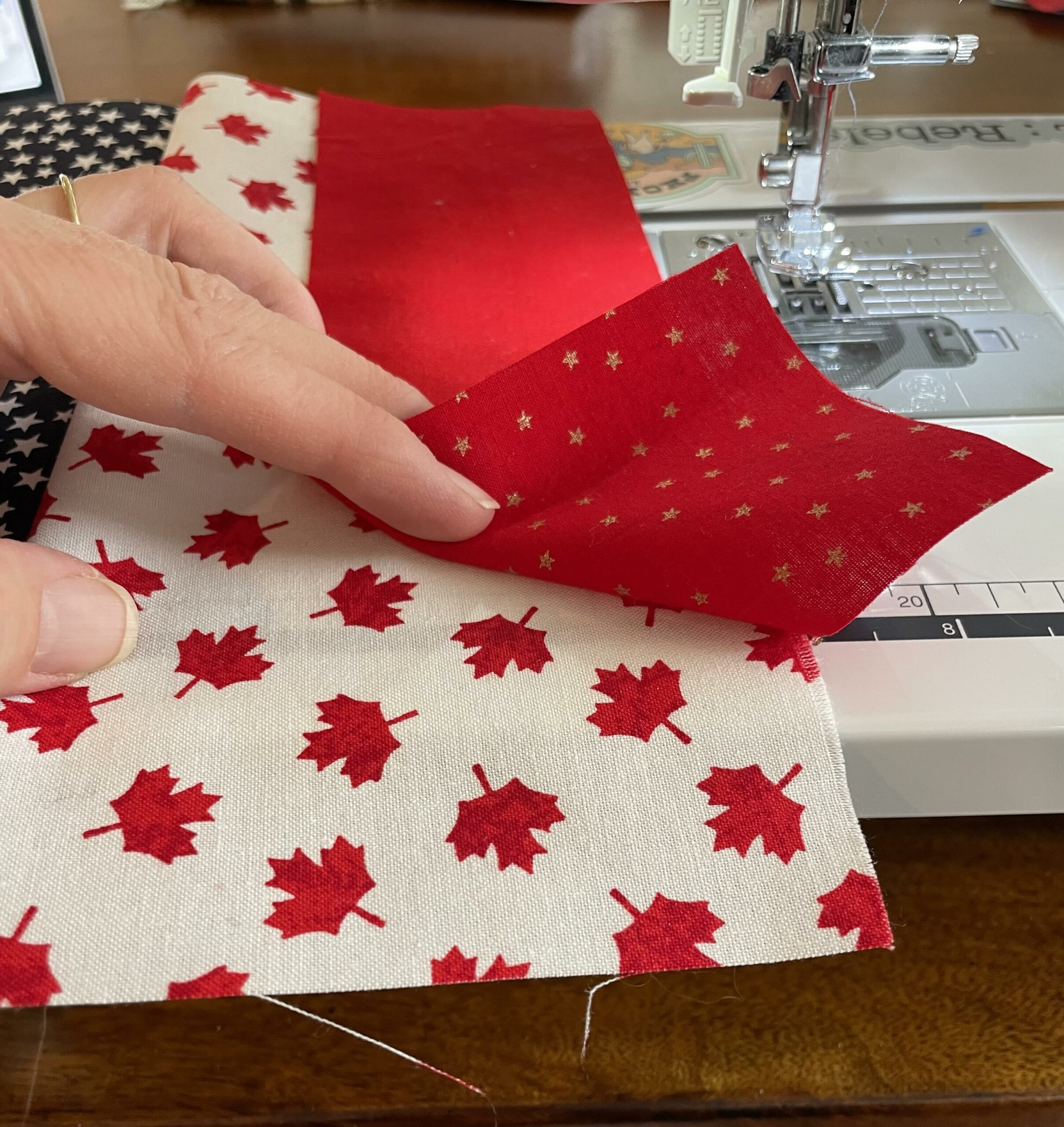
Figure 7. Make sure to sew patterned fabrics with right sides together, from the back.
- Sew together all your blocks into a single top piece to form the front of the quilt. This is typically done by sewing either rows or columns first, then sewing those together. There may be uneven edges– this is completely normal! As you put together the layers of your quilt (the batting and backing), you will trim the edges to be even with the other layers. Again, YouTuber Melanie Ham’s Your First Quilt series provides a clear overview of finishing steps for your quilt.
- Use, display, and enjoy your quilt! I like to use my skating data quilts as lap blankets in my library office in chilly months.
Notes
1. I don’t use the term “data quilting” as this term has a distinct meaning used by data analysis methodology: “a three-layer approach and drawing on the comparable and parallel process of quilting, we introduce and describe each layer: backing, batting and top. The backing of the data quilt is the research problem and method, which supports the upper layers. The batting of the data quilt is the data and data analysis, which adds depth and dimension to the data quilt. Finally, the top layer of the data quilt is the presentation, visualization and storytelling, which pieces together the results into a single, cohesive deliverable.” I lean instead towards data crafting or data physicalization. (Murugan Anandarajan and Chelsey Hill, “Data Quilting: Art and Science of Analyzing Disparate Data,” Cogent Business & Management., June 1, 2019, https://doi.org/10.1080/23311975.2019.1629095). ↩
2. Jordan Cunliffe, Record, Map & Capture in Textile Art: Data Vizualization in Cloth and Stitch (United Kingdom: B. T. Batsford Ltd, 2022); Pierre Dragicevic, Yvonne Jansen, and Andrew Vande Moere, “Data Physicalization,” in Handbook of Human Computer Interaction, ed. Jean Vanderdonckt, Philippe Palanque, and Marco Winckler (Cham: Springer International Publishing, 2021), 1–51, https://doi.org/10.1007/978-3-319-27648-9_94-1 ↩
3. Elizabeth Hartnett, “Why Make? An Exploration of User-Perceived Benefits of Makerspaces - Public Libraries Online,” Public Libraries Online - A Publication of the Public Library Association (blog), November 28, 2016, https://publiclibrariesonline.org/2016/11/why-make-an-exploration-of-user-perceived-benefits-of-makerspaces/, accessed January 21, 2025 ↩
4. Nathalie Vladis, Aspen Hopkins, and Arvind Satyanarayan, “Data Crafting: Exploring Data through Craft and Play,” in IEEE VIS Workshop on Data Vis Activities to Facilitate Learning, Reflecting, Discussing, and Designing, 2020, http://vis.csail.mit.edu/pubs/data-crafting/↩
5. Teresa Hebron, “Why Me, or, How I Learned to Stop Worrying and Tried to Data Craft,” Nightingale, April 19, 2023, https://nightingaledvs.com/data-visualization-quilting-craft/↩
6. “World Championships,” Skating Scores, accessed December 3, 2024, https://www.skatingscores.com/wc.↩