At Princeton University, there is a two-week period every January in which all members of the institution are encouraged to teach and learn outside of the formal classroom contexts. This time between the Fall and Spring semester and all of its events and offerings is known as “Wintersession.” As part of a Wintersession offering facilitated by Ariel Ackerly, Ofira Schartz-Soicher, and myself, I created a “friendship bracelet” that represented trees I routinely encounter when walking between two libraries on campus.
Nearly every day, I walk a path between Firestone, the main library on campus, and Lewis Science Library. This is a common thoroughfare for many of us on campus, and it serves as the central artery for traffic of all kinds. The trees along this route set the scene throughout the year, blooming in the spring and turning fiery hues in the autumn. We step on their fallen leaves and sneeze when they release their pollen. However, trees and other plants are all too easy to ignore, which we as humans do at our own peril.1 The trees along this path are central characters of university life that warrant appreciation and attention. Indeed, there has been a push to increase the labeling of plant species generally on campus, which is why I believed there would be a dataset of campus trees that we might use for our Wintersession – a way to connect via shared experience to the topic of data physicalization. As part of this event, I created a friendship bracelet that represents the trees I encounter as I walk between our library locations. The form lends itself to linearity, like my path, and it also evokes the kind of warmth I feel towards our “true and silent friend,” the tree.2
Librarians might consider using friendship bracelets as part of an effort to find and engage with local datasets, particularly those well suited to linear forms of representation. In our case, creating this data physicalization connected us with the groundskeeping team, an otherwise distant university department. In the end, we found that this new connection benefited both parties. The groundskeeping team had started to track the types of trees as part of a project to label species of plants on campus and better understand their own work through the tracking of data. The data originators in groundskeeping were enthusiastic about how their data were engaged with in unexpected ways. Their tracking key information about trees on campus opened the door for students to notice not only the trees but also the groundskeepers’ efforts in planting, tracking, and supporting plant health across campus.
Planning:
Identify your source of data for trees along a given path.
Option A: Get your data from an existing source. This may be published online or may be informally shared.
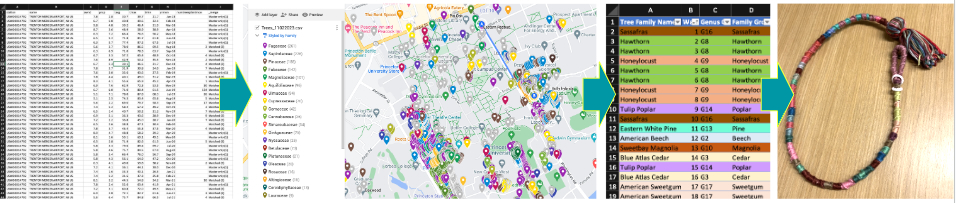
I was able to acquire a mapping of trees from our University Facilities, Groundskeeping Team. I believed this information would exist in part because of the labels that have been placed on some of the trees on our campus. If there is a labeling initiative, then I thought there would probably be a list with locations and tree types being kept somewhere. I reached out and spoke to a number of people in facilities before being directed to the person who managed that dataset. They were happy to share the information and were enthusiastic about seeing what students did with that information.
Option B: Alternatively, tree data can be manually created data, by taking a photo on your phone of each tree in question and using an application or built-in feature to make an identification of the species.
For example, on iPhones, a small leaf icon will appear in the bottom-center of the screen of the Photos application if a plant is “recognized” by the Visual Lookup feature. Alternatively, Android users might use an application like iNaturalist to identify species they are not yet familiar with. Regardless of which tool or system being used, the computer can only make suggestions about species identification, suggestions which need to be verified by a human. In practice, this can look like taking the species suggestion from the algorithm or artificial intelligence, and comparing that with information about that species which is available from a reputable source. Sometimes it may take multiple photographs of a single specimen to find an angle that is readily identifiable through computational methods.
List your trees.
Once you have an idea about the species represented by various trees, those data will need to be organized linearly. List out the trees in the order they appear along your chosen path.
This process works best for me when I narrow down the data in a couple of stages.
Prepare your data.
Isolate out the data you will be using to make your data physicalization. By the end of data preparation, you should have a simple, color-coded table that is able to be printed on paper.
Make a simple table.
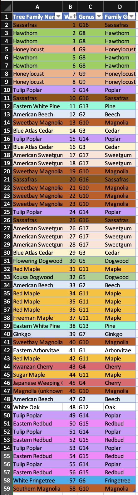
First, I use an Excel or Google Sheet to list out the key pieces of information that I am going to use in my physicalization. For example, I removed the extra information about side and age, since I did not intend to represent those pieces of information in my object.
To find out which trees fell along the path I selected, I uploaded the data table (which included location information) into a mapping tool online, in this case, Google’s MyMaps. At this stage, I found it helpful to explore the data using the faceting provided by the mapping tool.
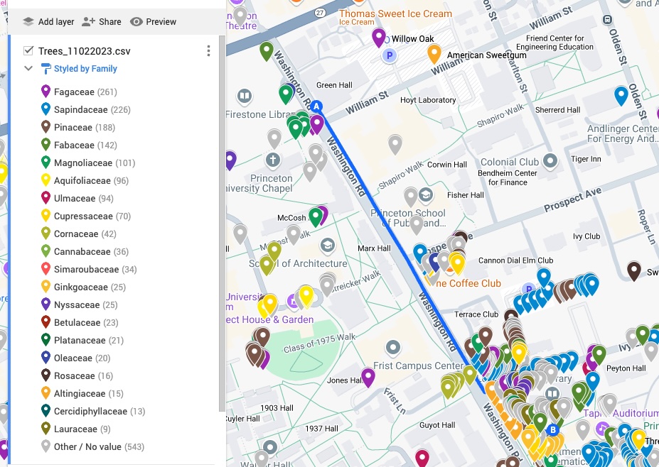
Mapped trees on campus
Color code that table.
I like to color-code the information, so it will be easier to follow when I’m tying knots later. If you were using Google to map the location of trees along a path, you can take their arbitrary color coding as a starting point, but do feel free to edit these automated selections. If you were in a spreadsheet, you can use conditional formatting to color code values in the table.
If you can print in color, then highlighting the rows and shading them in different colors (or setting up conditional formatting rules in Excel) can be the most efficient way to color-code at this stage. Depending on your comfort level in different tools, you can even put your table in Word and color code it there, but keep in mind that Word’s format is entirely focused on display and there won’t be an easy way to manipulate the data in that program. If color printing is not an option, I print out the table and add in color with a highlighter, colored pencil, or other similar material.
Use paper when possible.
I find referencing information on paper beneficial for making. Paper can be folded up, crammed in a bag with other materials, and balanced on a knee without having to worry about damaging a screen or running out of battery. Paper also limits the amount of information I have access to, which is helpful in keeping me focused on the act of making.
Preparing Materials:
Line up your embroidery thread.
Gather together as many colors of embroidery thread as there are species of trees along the path.
If there are too many species for each to have its own color of embroidery thread, see if you can group them together by any classification (i.e. all birch tree types are in one family group so they can be represented by the same color, regardless of subspecies).
You may need to iterate over your coding schema based on the materials you have available to work with. Color coding your data table is one way to anticipate that the number of colors required might be too great. However, do be ready to iterate on your coding schema in order to find the best balance between individual examples and categories.
Decide on a knot pattern that represents each tree.
For example, I used 5 knots to represent each tree, but you may wish to use 10 knots for a longer bracelet or smaller number of trees. Once you choose a number of knots for each data point, stick to that number.

Cut thread to length.
Cut all the colors of embroidery floss to be approximately the same length. In general, the length of the thread should be two to three times as long as the finished bracelet. If you run out of length for a color unexpectedly, you can use a fisherman’s knot to lengthen threads. Keep in mind that you’ll want to “bury” these knots in the central group of threads to avoid seeing the added material. If you know that you will be using more of one color than another, I recommend adding a second string to the group rather than lengthening that color, which more easily becomes tangled.
Making:

Make a loop.
Start your bracelet with an overhand loop knot.

Tie half-hitch knots.
Pull out two threads that represent your first data point and tie them around the other threads using a basic knot (also known as a half-hitch) for the number of times you selected. I chose to tie 5 knots for each tree, so after the first group of 5 knots, I switched the threads to tie the next group of knots with a new color that matched the data it represented. As you tie the half-hitch knots, the knot will begin to twist around the central bundle of threads, which will create a spiral effect (like in this instructional content).
![]()
Make a Bracelet Closure:
Option A: Tie a bead to the end and secure it using one final knot.
Once you have tied your last group of knots, finish your bracelet with a large bead for fastening through the loop on the other end. You may have to be creative about how you tie your bead on and knot it securely. If your bead is large enough, you can keep the loop the same. If the bead slips out of the loop too easily, reduce the size of the original overhand loop-knot to be just slightly larger than the size of that ending bead.
Option B: If you prefer not using a bead, you can tie the two ends together for a permanent closure. To do this, use the remaining thread to attach one end of the bracelet to the originating loop knot at the other end.
Bonus: For a more refined look, use another piece of embroidery floss to wrap the loop of the bracelet with a spiral of knots. Start by tying the thread to one end of the loop and then repeat the half-hitch knot until all of the exposed threads from your starting overhand-loop-knot are covered.
Voila! Your data are ready to wear.
This process can also be used to physicalize other kinds of data that are readily rendered in linear form and are able to be grouped by around ten categories. This format is suited to minimally complex data with limited facets.
Humanities Data Example:
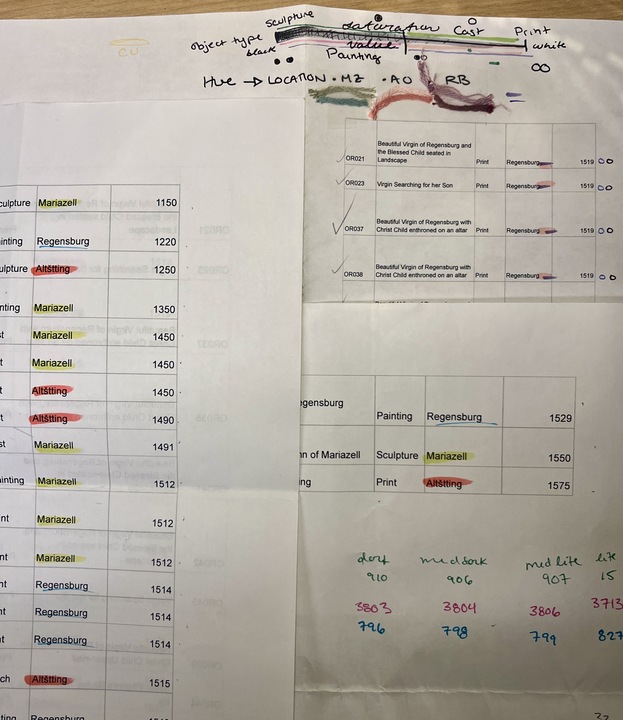
I used the same technique to create a wearable bracelet representing the objects associated with miraculous images of the Virgin Mary located in the Germanic South in the late medieval and early modern period. That friendship bracelet symbolizes the objects I investigated in my art history dissertation.
Each object is represented by 7 knots of a particular hue, indicating which of the three sites of worship it was made for: Blue for Regensburg, Red for Altötting, or Green for Mariazell.
The shade of the color further distinguishes the type of object along a spectrum from three dimensional and entirely unique to examples of two-dimensional and reproducible objects. The lightest tones signify three-dimensional sculptures, dark tones represent prints, and middle tones denote paintings and cast or punched metal pilgrims badges. Additionally, I added golden embroidery thread to the knots that represented objects that were understood to be capable of performing miracles. The length of floss needed corresponded to the number of examples that were going to be represented in knots. The more knots appearing in one color meant there needed to be longer floss to pull from in order to create those knots. For example, I needed much more dark blue floss because most of the objects I wanted to represent were prints.
The objects are arranged in chronological order, from the 12th century to the 16th century, showcasing historical progression and emphasizing the massive influx of printed material at the turn of the sixteenth century. The overhand loop served as a starting point, and the first knots tied represented the oldest objects in my data. The farther away from the starting loop, the later in date the object represented was created.
This bracelet looks similar to the tree bracelet I made, yet it serves a different purpose – a visual and tactile representation of my research that blends craft and scholarship and tangentially engages in the wearable and meditative practice entangled in the objects of both devotion and study that it represents. Not wholly unlike rosaries used in practices of prayer at Marian worship sites through the centuries, this bracelet is a symbolic and contemplative tool, weaving together the historical and spiritual significance of the objects in my dissertation.
1. Ro, Christine. 2022. “Why Plant Blindness Matters.” February 24, 2022. https://web.archive.org/web/20240714083447/https://www.bbc.com/future/article/20190425-plant-blindness-what-we-lose-with-nature-deficit-disorder Archived July 14, 2024 by the Internet Archive. ↩
2. Quote from the poem “The Friendly Tree.” Wynne, Annette. For Days and Days: A Year-round Treasury of Child Verse. United States: Frederick A. Stokes Company, 1919, p. 180. ↩
Sarah Reiff Conell, PhD
Sarah earned her Ph.D. in the History of Art and Architecture from the University of Pittsburgh in 2022. Her research involved collecting and exploring data from stories about miracles that were attributed to the Virgin Mary in 16th Century Bavaria and Austria. Now, Sarah is a Research Data Management Specialist at Princeton University, where she curates data and serves as an editor for C19 Data Collective, a humanities data publication.