Introduction
Dear Data Binghamton started as an interdisciplinary discussion between the Digital Scholarship (DS) team and a professor from the Department of Teaching, Learning and Educational Leadership (TLEL). During their initial conversation they realized they had a shared admiration for Giorgia Lupi and Stefanie Posavec’s Dear Data project. Through Dear Data professional data illustrators Lupi and Posavec challenged each other to send each other weekly postcards over the course of a year that contained a thematic data visualization on one side and a key on the other (Dear Data – The Project n.d). The result is a blend of art, data, and self-reflection (Carpenter et al. 2024). The DS librarians and TLEL faculty member at Binghamton believed Dear Data might be used to structure a similar initiative at Binghamton focused on engaging data-intimidated or data-detached undergraduate students in data literacy activities. The conversation led to the two joining forces by bringing in a cohort of faculty and graduate students from across campus to create Dear Data Binghamton.
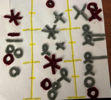
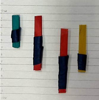
Figure 1
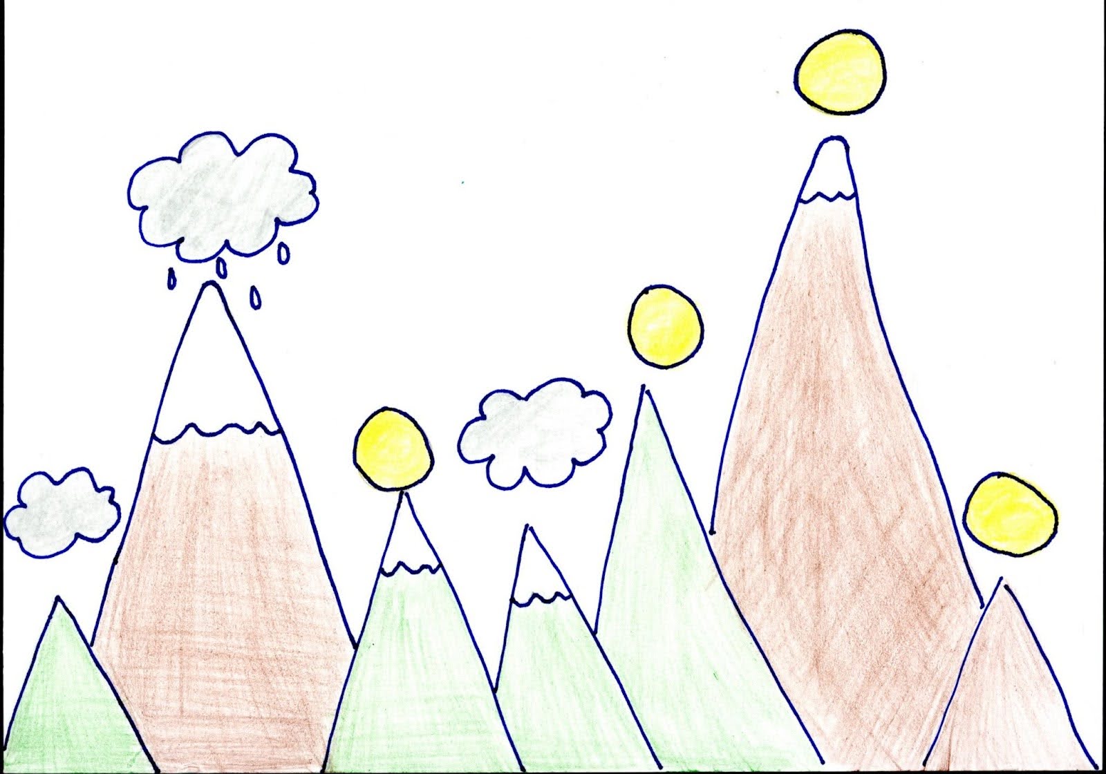
Examples of student-created postcards based on screen usage.
The first iteration was based on creating postcards similar to Lupi and Posavec’s original project around the theme “A week of social media,” which asked participants to keep track of their social media use over the course of a week. Throughout the semester, events focused on walking participants through a series of creative exercises to teach some of the basic principles of data visualization and design and engage students in best practices around data collection and analysis. Participants were welcome to create and drop off postcards in the Libraries or during events with more than 30 postcards submitted during the semester.
Now in its third year, the project has continued to evolve to encompass a wide range of different personal data projects. Last spring, a new round of postcards were created, encouraging participants to track the number of times they expressed gratitude through text messages. This iteration allowed participants to easily collect and analyze their data in one session, enhancing the accessibility of the activity. The project has also expanded to encompass a number of new formats, including a postcard exhibit at the library, an in-class workshop for an undergraduate Data Visualization course, and multiple presentations for a campus Data Visualization interest group. Members of the Dear Data team have also designed a course on Data Storytelling for first-year students to bring the team’s passion for data literacy into the classroom more formally.
Figure 2
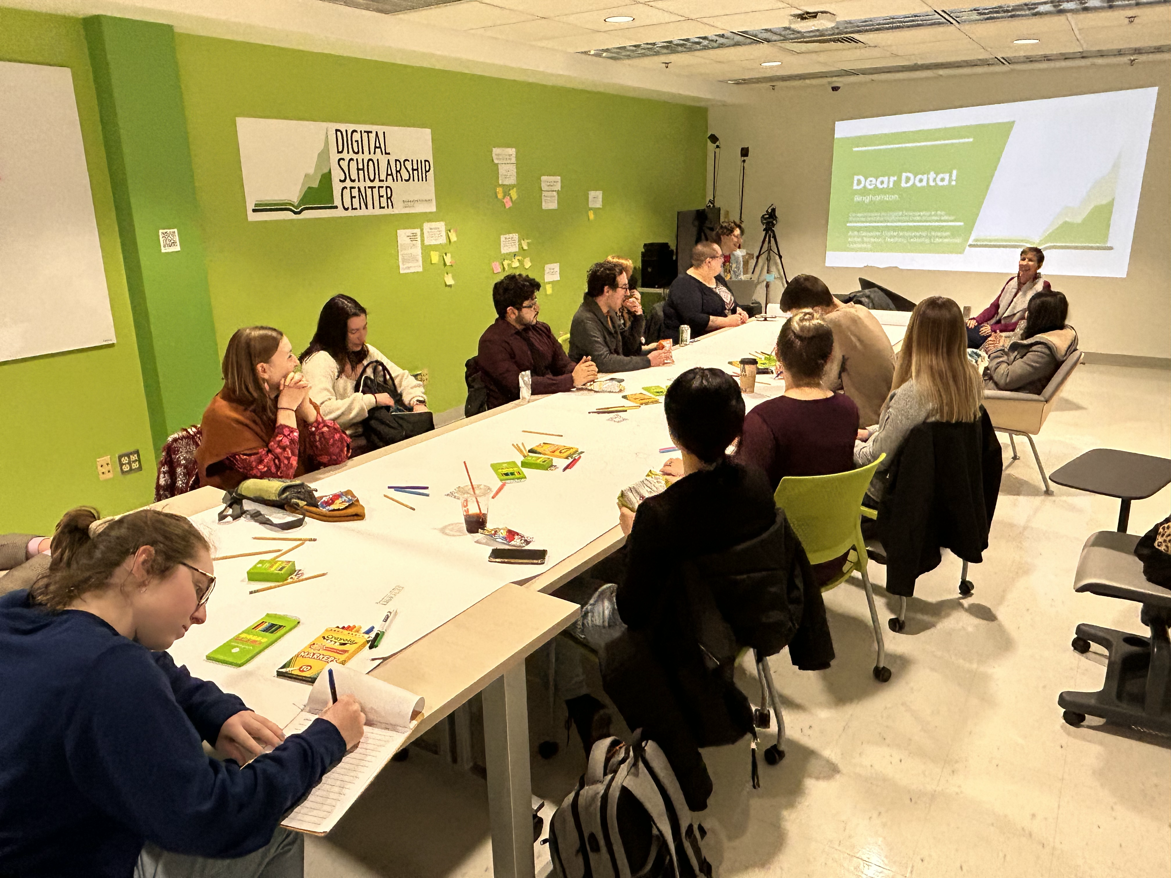
Participants at a Dear Data kickoff event
From Postcards to Physicalization
From our experiences running Dear Data events focused solely on postcards we found that participants often struggled to move beyond visualizations such as pie charts, line, and bar graphs. Inspired by projects from dh+lib‘s “Making Research Tactile: Critical Making and Data Physicalization in Digital Humanities” and the collection of art within “Making with Data” the Dear Data Binghamton team considered if pivoting to using physical materials would help students think beyond the bar graph a little further (Huron et al. 2022). Links between data physicalization and data literacy have been explored by many, especially for younger students, showing increased understanding of basic data literacy concepts when utilizing physical objects, such as through crafting physicalizations, to create and explore data visualizations (Bae et al. 2023; Zhu et al. 2023, 2023). Eager to explore this hypothesis, the Dear Data Binghamton team created and integrated a data physicalization activity into the Data Storytelling course taught in Fall 2024. The goal of the assignment was to push the bounds of 2D visualization of their personal data (i.e. Dear Data) to a 3D model that reflected a more creative practice and approach, while also considering the tactile accessibility of representing data.
Process (How to…)
We provide guidance towards creating and implementing a similar assignment as part of a class or workshop. This can be done as an individual or as a small group of students.
- Data: Students collect 5-7 days of personal data (e.g., music, bad habit, emotions). From our experience, students should submit their ideas for approval as some data ideas do not lend themselves well to telling a story through data physicalization such as “how many times a day do I study.” We asked students the following: (a) What data will you collect?; (b) What three variables will you collect?; (c) How will you collect the data?; and (d) How will you remind yourself to collect the data? Other approaches to data include utilizing an online dataset of interest or asking students to collect data through observations, surveys, or informal interviews.
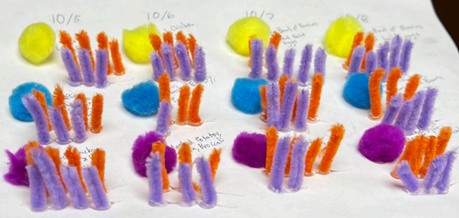
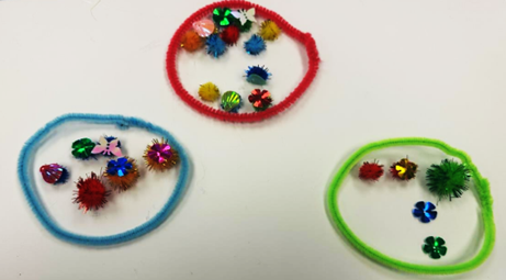
- Data Building Kits: Kits should include a range of objects to create physicalizations including distinct textures, forms, and functions of materials. Our kits included low-cost materials such as cotton balls, pom-poms, pipe cleaners, felt pieces, macaroni, ribbon, and popsicle sticks (see Figure 3).
Figure 3
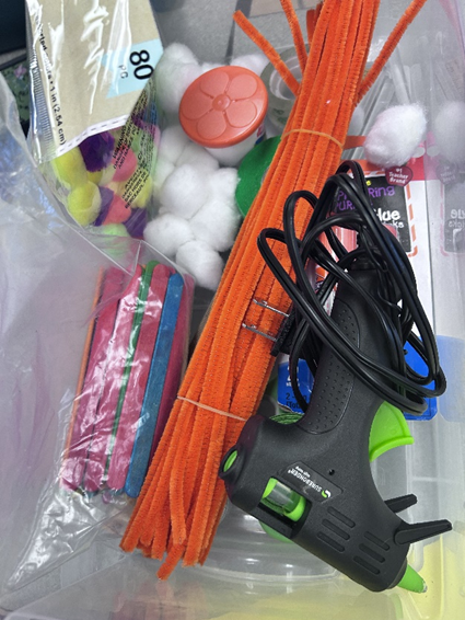
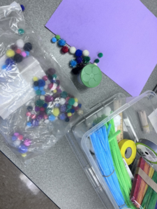
Data physicalization kits
- Create: Students create their data physicalization. They should consider things such as how each variable can be represented using the different materials (e.g., ribbon or pipe cleaners may represent length of time, cotton balls for intensity or size); the scale, layout, and interaction of their physicalization as a whole; and how viewers will experience and interpret their final visualizations. We further suggest providing examples of data physicalizations, such as Pierre Dragicevic and Yvonne Jansen’s Gallery of Physical Visualizations and Related Artifacts, and discuss what they notice and what they wonder about those examples (Dragicevic & Jansen, 2021). This step will take at least one hour to complete.
- Peer Evaluation: Students should be provided time to evaluate one another’s data physicalization. Questions may include the following: (a) How do the design elements (colors, shapes, layout) contribute to the overall impact of the physicalization? (b) What story does this physicalization tell? (c) What works well? What could be improved? Based on the feedback, students should consider changes to their data physicalization.
- Data Storytelling: Students craft a 250- to 300-word story – setting, climax, and closing – using the data physicalization as a point of reference. An alternative approach is to create a gallery or an exhibit in a library. Instead of a story, students write an artwork label. It could also be an interactive showing in which the visitors take an active approach, such as answering a question about the data physicalizations.
Insights
In examining the assignments, there were several patterns in how students created their data physicalization. One pattern across all students was the use of color to represent one of the variables from their data set. As illustrated in the first image in Figure 4, color was utilized to represent time of day — orange being morning, yellow being daytime, and purple being nighttime.
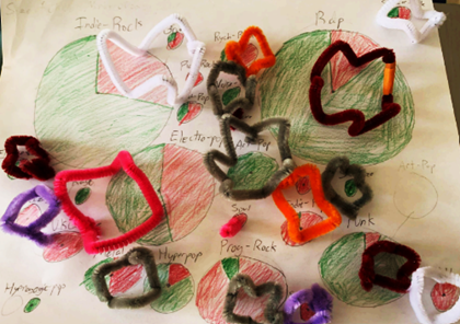
Shapes and/or icons were also employed by students to represent variables. One student used shapes to represent emotions — circle for bored, square for happy, triangle for tired, and a half circle for annoyed — while another created symbols to display what they were doing when they were biting/picking at their nails (e.g., star at work, circle on the phone).
Figure 4
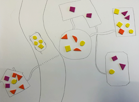
Use of color in data physicalizations
In addition, there was variation in how students represented rating scores. For instance, one student recorded the meals they ate for breakfast, lunch, and dinner. Under each meal, noted by the different colored pom-poms, the students included a satisfaction rating by the number of orange pipe cleaners on a scale of 1-5 (see Figure 5). The second image (see Figure 5) is another example in which a student created spikes on various crowns to represent the number of stars they rated each music genre given a scale of 1-5.
Figure 5
Representation of rating scores
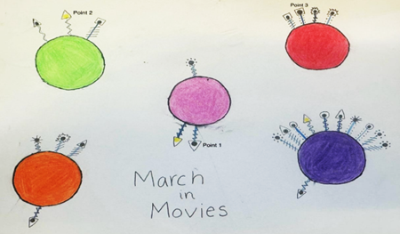
In addition, students represented frequency of a variable by utilizing one of a material, such as one pom-pom or one sequenced shape, to represent one data point. This is illustrated in the examples provided in Figure 4 and the first image in Figure 5. In Figure 7, each pom-pom was a data point, with different colored pom poms representing a different movie genre.
Length of time was another consideration by students. They employed popsicle sticks or pipe cleaners as observed in Figure 6. In the first image, the students used the height of pipe cleaners to denote the amount of time they were on the phone during different locations – class (pink), outside (purple), and dorm room (white). The second image displays the amount of sleep a student slept over the course of four days. The first stick shows the student slept for four hours between 12:30 am and 4:30 am.
Figure 6
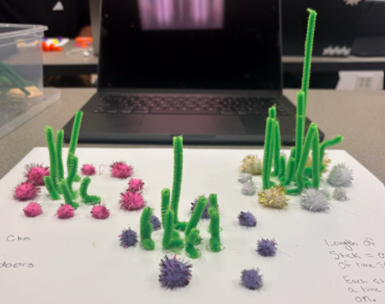
Representation of frequency through height and length
While students were creative and intentional about how they represented each of the three variables (i.e., data points) through the various materials and their visual properties, they did not seem to consider the tactile nature or properties (e.g., fuzzy, sphere-shaped) when choosing the material for their data physicalization. Some students did seem to engage more creatively with data and created visualizations outside of the typical bar chart, pie chart, and line graphs foundational to middle and high school curriculum. Additionally, a few of the students found that creating the physicalization inspired how they represented the same data as a Dear Data postcard visualization. As stated by one student, “Because these were all very visual traits, it made the translation to the postcard a simpler task.” Figure 5 further displays the similarities between the two representations with the data physicalization showing “deeper depth by using more shapes and colors.”
Figure 7
Data as represented by postcard and data physicalization
Feedback and Themes
The 3D visualization assignment pushed students to think beyond conventional data representation, offering an opportunity for hands-on creativity and abstract storytelling. One student noted, “When doing the 3D-Visualization, I truly had to think outside of the box at how I could depict a certain data set that I had collected, yet show it in an abstract way. I had to do my best to tell this story still without it getting lost in translation.” This freedom to explore personal datasets and represent unique experiences was a highlight for many, as it allowed them to go beyond typical graphs and infuse personal creativity into their work.
However, the challenge of this medium was significant. Many students expressed difficulty in transitioning from more familiar formats like drawing to constructing a 3D model. As one participant reflected, “I enjoyed doing the postcard, yet found the 3D part extremely hard. I like that I tried something out of my comfort zone, because now I know I would much rather draw my data.” Others echoed this sentiment, appreciating the hands-on nature of the project but finding the effort required to gather materials and create a model to be a barrier. One student commented, “The postcard was fun to make, but pretty time-consuming compared to creating a simple graph like the one above.”
Despite these challenges, the tactile and multi-sensory nature of the project was a key advantage. One student remarked, “This method of data storytelling is more tactile, allowing it to be more accessible, and also texturally different… I was able to utilize so many mediums like color, texture, and shape, to tell a story.” Another student highlighted the specificity offered by 3D, explaining, “I utilized the third dimension to increase the specificity of my data representation, using the length of pipe cleaners to show the amount I slept instead of using a color to represent a range of hours slept.”
Ultimately, the 3D assignment offered a complex, yet rewarding, approach to data visualization that allowed students to explore new dimensions of creativity and storytelling.
Future Plans
We believe that our success in the classroom can be adapted for library programming. As such, we have planned a library data physicalization event, using the same methods, during the upcoming 2025 Love Data Week. The planned event will be a two-hour workshop in the Digital Scholarship Center wherein participants can drop in anytime. Dear Data Binghamton will supply the crafting materials, and the group members will lead them through the physicalization activity. Depending on its success, it may become an annual event, an asynchronous tabling option, or another step in Dear Data Binghamton’s evolution. We also have begun building collaborations with other groups on campus, including the art museum and fiber art groups, to form additional modalities for data physicalization projects.
With our success in all Dear Data Binghamton’s iterations, we believe that librarians can adapt the project’s concepts in library programming for their audience. Hopefully, this physicalization activity is one example of how to do so. We believe no one should be too intimidated by data or creativity, and creating a connection with one’s own personal data helps to bridge the gap for students on either side of the spectrum.
Citations
Bae, S. Sandra, Rishi Vanukuru, Ruhan Yang, Peter Gyory, Ran Zhou, Ellen Yi-Luen Do, and Danielle Albers Szafir. “Cultivating Visualization Literacy for Children Through Curiosity and Play.” IEEE Transactions on Visualization and Computer Graphics 29, no. 1 (January 2023): 257–67. https://doi.org/10.1109/TVCG.2022.3209442.
Carpenter, Ruth, Amber Simpson, Melissa Haller; Mamen Rodriguez Galindo; Mary Tuttle; Hannah Jones; Amanda Ortiz. “Data + You: Promoting Data Literacy at Binghamton University.” In Data culture in academic libraries : a practical guide to building communities, partnerships, and collaborations, edited by Marcela Y. Isuster and Alisa B. Rod. Chicago, Illinois: Association of College and Research Libraries, 2025.
Dear Data. “THE PROJECT.” Accessed February 6, 2025. http://www.dear-data.com/theproject.
Dragicevic, Pierre, and Yvonne Jansen. “Gallery of Physical Visualizations and Related Artifacts.” List of Physical Visualizations, April 15, 2021. https://dataphys.org/list/gallery/.
Huron, Samuel, Till Nagel, Lora Oehlberg, and Wesley Willett, eds. Making with Data: Physical Design and Craft in a Data-Driven World. New York: A K Peters/CRC Press, 2022. https://doi.org/10.1201/9781003264903.
Zhu, Caiwei, Chloe Oi-Ying Leung, Eleni Lagoudaki, Mariana Velho, Natalia Segura-Caballero, Dietsje Jolles, Gavin Duffy, Günter Maresch, Marianna Pagkratidou, and Remke Klapwijk. “Fostering Spatial Ability Development in and for Authentic STEM Learning.” Frontiers in Education 8 (April 17, 2023). https://doi.org/10.3389/feduc.2023.1138607.
Zhu, Caiwei, Remke Klapwijk, Miroslava Silva-Ordaz, Jeroen Spandaw, and Marc J. de Vries. “Cognitive and Embodied Mapping of Data: An Examination of Children’s Spatial Thinking in Data Physicalization.” Frontiers in Education 8 (December 21, 2023). https://doi.org/10.3389/feduc.2023.1308117.
Halie Kerns, Ruth Carpenter, Kirsten Pagan, Amber Simpson, and Melissa Haller
Halie Kerns, Ruth Carpenter, Kirsten Pagan, Amber Simpson, and Melissa Haller are all actively engaged in advancing data literacy at Binghamton University. As members of the Dear Data Binghamton initiative (recently renamed Data & You) they continue to explore innovative strategies for making data approachable, creative, and personally meaningful. Their collaborative work centers on integrating data storytelling, visualization, and reflection into classrooms and activities across campus.