
Category: 2024 Special Issue
Play With Your Data (printable zine)
Play With Your Data on Humanities Commons
Making Research Tactile: Critical Making and Data Physicalization in Digital Humanities
This special issue of dh+lib introduces our readers to how digital humanities can integrate data physicalization into the research process and how data physicalization is a form of critical making. Seven case studies are presented here, ranging from how we can use data physicalization to teach digital methods to how data physicalization can aid in the creation of research objects.
What is data physicalization?
Before we get too deep into the work itself, what is data physicalization? Essentially data physicalizations are tangible objects whose appearance, form, and design are informed by data. Rather than making a traditional “flat” data visualization in Tableau, Python, or some other software, these projects use textiles, clay, fiber, and more to present their information. There are many terms for this process, like physical data visualization, embodied data visualizations, data materialization, but we are using data physicalization as it is a term that has been long adopted by design fields already.
Data physicalization can also incorporate themes from other critical data fields. Data physicalization shares a lot with data feminism, and in particular in the ways it makes labor visible. While traditional visualizations can sometimes appear effortless, physicalizations often emphasize the hands of their makers. That labor also promotes deeper relationships between the practitioner and their data, as they spend more time directly interacting with the data (Cleghorn 2019). For readers of the physicalizations, they can engage them both visually and haptically, creating a deeper engagement with the information presented. That care and attention makes data physicalizations a tool with a lot of potential for projects dealing with data about people and can function as data visceralizations. Many makers see data physicalization as a way to reassert human elements back into data processes that are often abstracted and distanced from the subjects of representation. The possibility for tangible connection—by the maker and the viewer—engender rehumanization.
Why in DH?
So why would a digital humanities need data physicalization? Would a data sculpture or quilt even count as digital humanities work? If we take an expansive definition of digital humanities, where digital humanities is the process of using technologies to help us pursue and answer humanities questions, then digital humanities doesn’t have to be digital. Indeed, not all technologies are digital, and exploring non-digital technology can help us reconnect to another meaning of digital, referring to fingers and hands, which underscores the broader issue of how we can think about computation as something extra- or non-human rather than being a fundamental part of the human experience. Woodwork, ceramics, and weaving are all technologies that predate computers. In fact advanced weaving looms helped inspire the first computers. Weaving, knitting, lacemaking are all algorithmic and such fabric-based making is a way of demystifying how computers function – they aren’t these weird magic boxes, but are related to these everyday activities that have been going on, in some cases, for millennia (Harlizius-Klück 2017). By integrating physicalization into our practice, we better understand data and computing as part of our human existence rather than solely the province of machines. And by integrating these types of skills into our digital humanities practice, we can begin to credit more forms of knowledge in the academy. While data sciences and heavily computational digital humanities place a high value on coding skills, which can benefit particular genders and socio-economic backgrounds, elevating skills like crochet and embroidery as technical and academic skills allows us to acknowledge a wider variety of traditional knowledge (Haas 2008).
Additionally, data physicalization can be a critical data practice. These types of visualization help us explore the ways power impacts the data we study and utilize, thereby enabling a particular ethic of digital humanities praxis. Data physicalizations are slower than traditional visualizations, and that slowness promotes a deeper connection between the practitioner and the data themselves. Additionally it can take longer for a viewer to interpret a physicalization, and that process of translation can encourage a more meaningful relationship between the viewer and the data. For data on sensitive subjects, like people or the environment, this time can help both the researcher and the reader to reflect on the story being told.
This work isn’t new to digital humanities. Two entries in the Debates in Digital Humanities series, Making Things and Drawing Boundaries (Sayers 2018) and Bodies of Information (Losh and Wernimont 2019), both touch on making and materiality in digital humanities, and there have been digital humanities data physicalizations (Webber-Bey 2014). However as the #DHMakes community continues to grow and more scholars turn to making as a way to engage in their research, libraries need to be involved in these conversations too.
Why in libraries?
But why should libraries, and those who work within them, care? Data physicalization can be a great partner for traditional digital humanities instruction, teaching technological methods without using a computer (D’Ignazio 2022). This can help students engage with data-oriented and humanities-oriented computational thinking while simultaneously addressing tech anxiety. It allows the instruction to be more focused on scaffolding and embodying data literacy concepts than on specific software, giving students the skills to then apply the information to their own research (Russell and Hensley 2017). Additionally, by familiarizing themselves with diverse research methods, libraries will be better prepared to support a variety of learning styles and needs.
In this issue
This issue consists of seven data physicalization case studies taking inspiration from cooking blogs: each study is framed as a narrative about the author’s experience; several studies include an accompanying pattern for the reader to try. These patterns have been gathered into a zine that you all are welcome to print and share. The issue covers a range of methods, from weaving to programming wearables, and a variety of topics, like dealing with failure and considerations for coming up with the design of a data physicalization.
We hope this special issue can serve as an invitation to join us in this work. Please try making any of the patterns in our zine, post pictures of what you make using #DHMakes—a hashtag many folks in the community have been using—and if you find more readings on this topic, or write one yourself, add it to our Zotero group of resources on data physicalization. And when the call for proposals for the second part in this series comes out, consider submitting something to it!
Citations
Cleghorn, Ripley. 2019. “Why You Should Close the Computer for Your Next Data Visualization.” Nightingale (blog). October 2, 2019. https://medium.com/nightingale/why-you-should-close-the-computer-for-your-next-data-visualization-3636663d0b35.
D’Ignazio, Catherine. 2022. “Creative Data Literacy: Bridging the Gap between the Data-Haves and Data-Have Nots.” Information Design Journal, July, 6–18. https://doi.org/10.1075/idj.23.1.03dig.
Haas, Angela M. 2008. “Wampum as Hypertext: An American Indian Intellectual Tradition of Multimedia Theory and Practice.” Studies in American Indian Literatures 19 (4): 77–100. https://doi.org/10.1353/ail.2008.0005.
Harlizius-Klück, Ellen. 2017. “Weaving as Binary Art and the Algebra of Patterns.” TEXTILE 15 (2): 176–97. https://doi.org/10.1080/14759756.2017.1298239.
Losh, Elizabeth, and Jacqueline Wernimont, eds. 2019. Bodies of Information: Intersectional Feminism and the Digital Humanities. Minneapolis, Minn. London: Univ Of Minnesota Press.
Russell, John E., and Merinda Kaye Hensley. 2017. “Beyond Buttonology: Digital Humanities, Digital Pedagogy, and the ACRL Framework | Russell | College & Research Libraries News,” December. https://doi.org/10.5860/crln.78.11.588.
Sayers, Jentery, ed. 2018. Making Things and Drawing Boundaries: Experiments in the Digital Humanities. 1st edition. Minneapolis: Univ Of Minnesota Press.
Webber-Bey, Deimosa. 2014. “Runaway Quilt Project: Digital Humanities Exploration of Quilting During the Era of Slavery.” The Journal of Interactive Technology and Pedagogy, no. 6 (November). https://cuny.manifoldapp.org/read/runaway-quilt-project-digital-humanities-exploration-of-quilting-during-the-era-of-slavery-0f3051c0-9511-4642-9c91-9f47ad761442/section/f7beacd0-44e9-4c22-be61-8c2d5c0e01a0.
Emotional Bookmarks: Data Physicalization and the Language of Literature
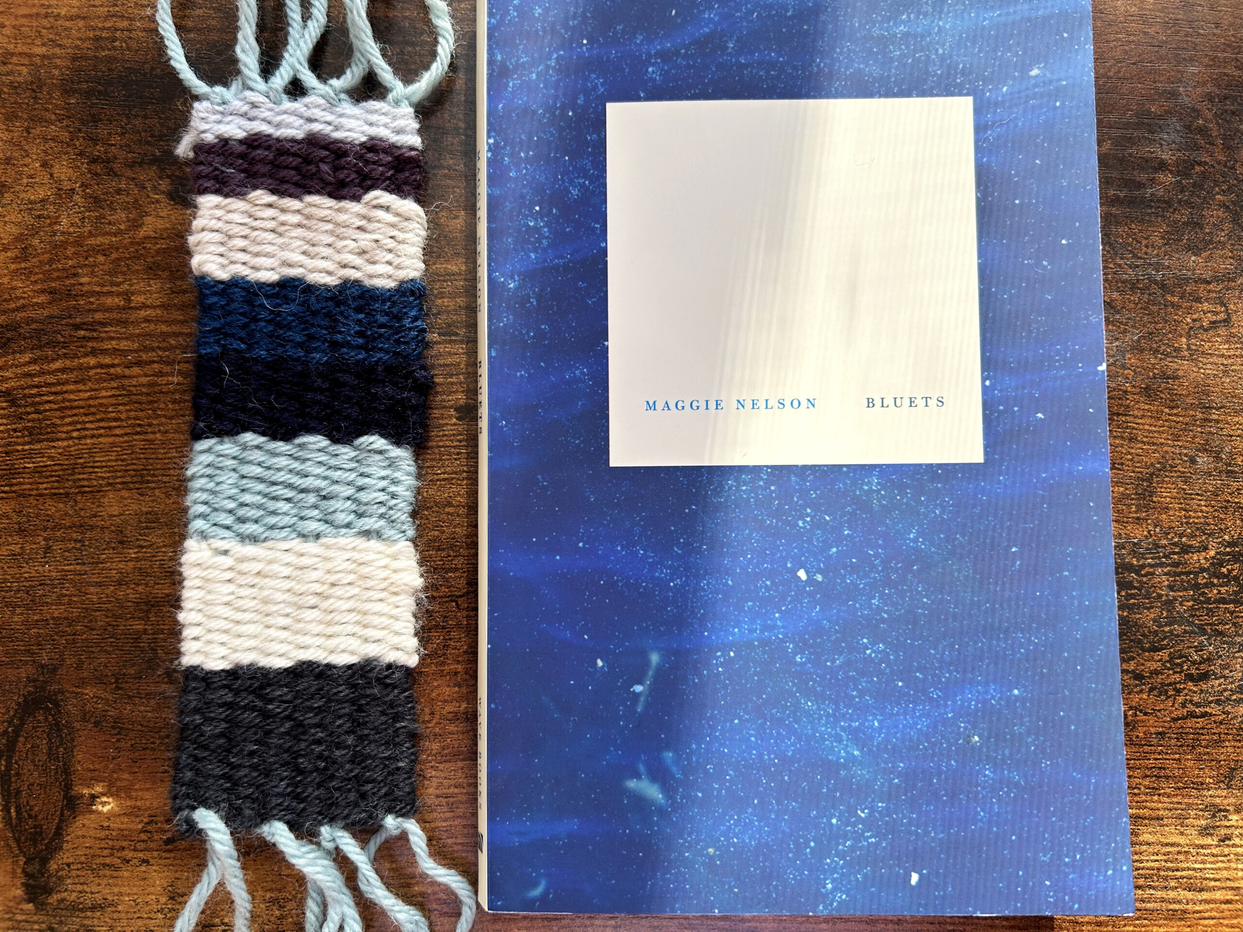
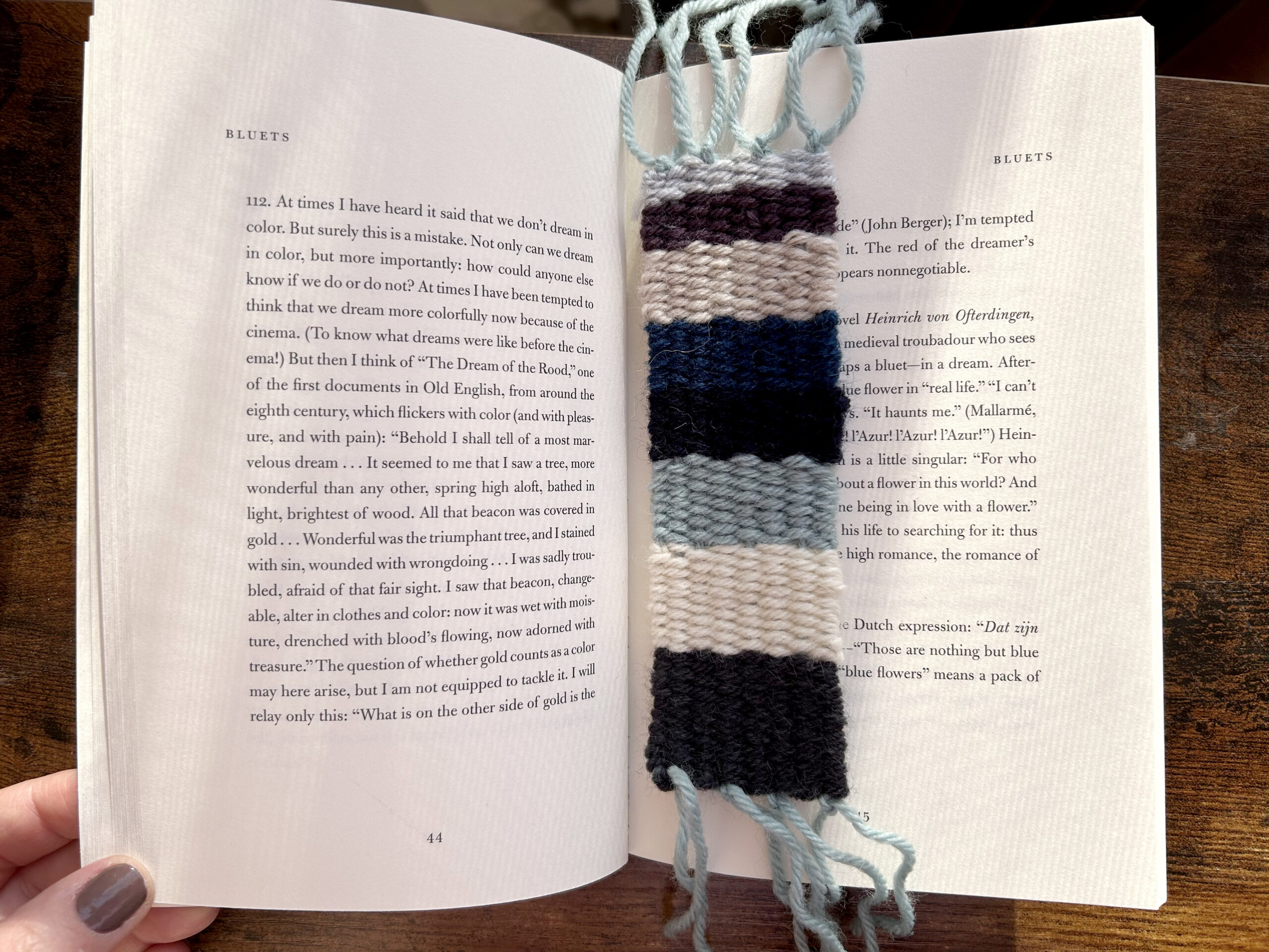
Color has long had a deep connection to our emotions, which cuts through different cultures, time periods, and contexts, from textiles and architecture to design and art. Goethe was the first Western color theorist to suggest that colors have a direct effect on our physical and psychological wellbeing. Writing in his book, Theory of Colours, he argues, “yellow excites a warm and agreeable impression” and “blue tends to melancholy and sadness.” [1] These ideas still resonate, some 200 years later, as notions around the healing properties of green crystals or the power of purple to reduce anxiety persist. The connection between colors and emotions has been explored by many data artists and designers, and there are even algorithms that will automatically select “appropriate” colors for data visualizations, such as pink for data about love. [2] These kinds of algorithms are often based on Western stereotypes or cultural repetition of color in relation to a given topic. There is no inherent reason why pink should suggest love. It is only through the repeated use of pink in Valentine’s Day cards and romance novel covers that, especially in an American context, the color pink tends to be associated with love. In this project, I was interested in exploring this connection between color and emotion, especially as it is expressed through language. Although words and language are not the only, and not even necessarily the primary way, we might express emotions, it is the way emotion comes through in literature and writing. However, language in literature is never straightforward, and emotional moments are infused with varied meanings and contradictory implications. It was in this complicated mix of interpretation, language, and emotion, that I explored Maggie Nelson’s book Bluets, to pull forth an emotional analysis of the book and create a data physicalization in the form of a woven bookmark.
Data physicalizations can be defined as physical artifacts whose geometrical shape or material properties encode data. [3] Data physicalizations have the capacity to change our relationship to and understanding of data, and as others have argued, one of the key ideas around data physicalizations is that they can deepen our emotional connection to data. [4,5,6] If we can touch data, might it make the data feel more personal? If, for example, we can wrap ourselves in a scarf based on weather data, will it help us to think more deeply about the climate crisis? Data physicalizations can take many forms, and utilize different materials, such as wood, metal, textiles, plastics, liquid, and clay. Recent works in the emerging area of data cuisine have even explored food as a material for expressing emotional data. [7] In my project, I have used wool yarn, both as a practical material that works well for weaving as well as a material that is soft to the touch and not too thick to slip into a book.
Data physicalizations are often less explicit than 2-D representations, which are typically created on paper or a computer screen, but there is nothing inherent in data that suggests it needs to be situated in a particular medium. One of the effects of this is that 3-D work may be more open to interpretation. With a data bookmark, there is no way to know what the data means or what it represents, unless someone explains it. There may be ways to intuit what the data means, especially if we think of familiar, cultural representations of color (e.g. love and pink, or in this case, blue and melancholy). However, what I find interesting about data bookmarks is that it is a deeply personal data representation. It’s not meant for anyone else and doesn’t need to adhere to cultural or social expectations. It’s meant for the reader, me, to connect more deeply with the book I am reading, and perhaps to serve as a reminder of the book should I ever return to it later. If I created many data bookmarks, they could even serve as a kind of archive of my own personal library.
There are additional qualities—built into the medium—that come to life in data physicalizations beyond the data. For example, a metal sculpture may feel cold; an ice physicalization may melt and change over time; a piece made from tissue paper might feel light and fragile, blown away by the wind. These are all additional, experiential, characteristics that add to the interpretive and sensory experience of data physicalizations. At the same time, many data physicalizations borrow similar representational practices as computer-based designs, such as the use of color, shape, and size to correlate to particular data points. Quilts, knitting, and weaving can easily adapt shapes and styles, such as bar charts and line graphs, but increasingly, data artists are exploring ways to leverage the properties of the material to move beyond the kinds of representations we can already do on paper or screen.
Physicalizations that utilize thread, yarn, fabric, and other textiles often emphasize color as a primary element of representation because color is such an important element in textile design. For this project, I wanted to use an emotional analysis of books to create a data physicalization. A natural way to do this is through handmade bookmarks, an object that is inherently connected to books and lends itself to making. The bookmarks are woven on a small hand-loom and the process is simple and accessible, making it possible for anyone to do, even if they have never had any experience with weaving.
The book I chose to work with, Bluets, by Maggie Nelson, is a book that I have always found to be particularly emotionally resonant. The book is ostensibly about the color blue, although it goes far beyond the color itself to explore issues related to the author’s life, relationships, loss, grief, and love. The book is written in an especially poetic manner and consists of 240 short entries, some as short as a sentence and some as long as ten sentences. The book makes reference to philosophy, poetry, cultural studies, and art as Nelson explores the color blue from a theoretical and practical perspective and weaves in a thoughtful personal narrative.
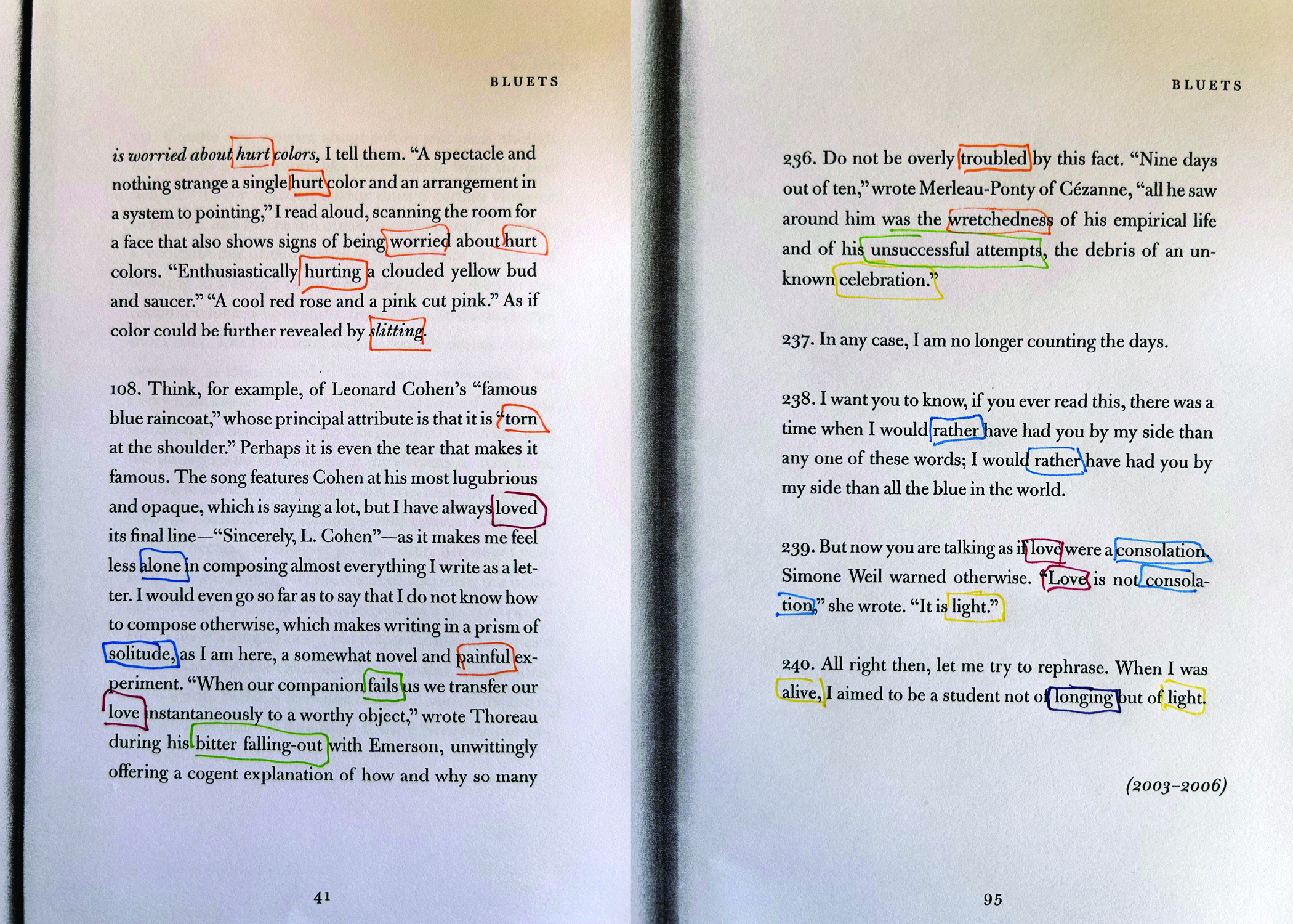
To collect data, I intentionally went about this in two ways: digital and analog. I wanted to understand the different outputs if I let a machine search the document, as well as my own analysis by hand. There are a number of programs that will conduct a sentiment analysis on text, and they work by pulling words based on a certain set of constraints, for example, particular emotion words and related words. Because I was already familiar with this book, I had a sense of what kinds of emotions are contained within the book. However, this is an especially poetic book and one that uses language in unique and unexpected ways. The data from the digital analysis was limited by its ability to only analyze words in the book. This meant words and phrases that were not “technically” emotion words could be missed. Likewise, when an emotion word was used in the negative form (e.g. I was not happy) the software might capture this as happy, rather than unhappy. These issues have been explored in digital humanities before, [8] and I was interested in experiencing the difference firsthand in my own analysis.
Despite the fact that it took significantly longer, I was surprised to discover how much more accurate and nuanced the analog analysis proved to be. There are several reasons for this. First, I was able to highlight data beyond a single word use. I could highlight a phrase or even a sentence, even if that sentence didn’t technically have any emotional words in it. Even increasingly advanced forms of AI have difficulty understanding poetic and nuanced language, especially sentences that are laden with metaphor, simile, and allusion. [9] This is something humans are very good at. Secondly, I was better able to identify negative uses of emotions, as well as to detect when the author was being sarcastic, ironic, or intentionally using a word in an alternative way.
Consider, for example, this excerpt, early in the book:
- The half-circle of the blinding turquoise ocean is this love’s primal scene. That this blue exists makes my life a remarkable one, just to have seen it. To have seen such beautiful things. To find oneself placed in their midst. Choiceless. I returned yesterday and stood again upon the mountain.
There are few words in this paragraph that directly express an emotion, and yet it is obviously deeply emotional. The word “choiceless” is a particularly moving word, one that could suggest anything from helplessness to anger to failure to resignation. There are several words in this paragraph that suggest something beyond their direct meaning: remarkable and beautiful, as well as the entire last sentence “I returned yesterday and stood again upon the mountain” strikes me as referring to a sense of awe or gratitude. This was a consistent feeling throughout the book, even though the word awe is never actually used in the book, there are so many words that imply this emotion. In fact, awe itself is defined as a sense of both fear and wonder—a complicated and even contradictory emotion that is sometimes difficult to identify even when we are feeling it.
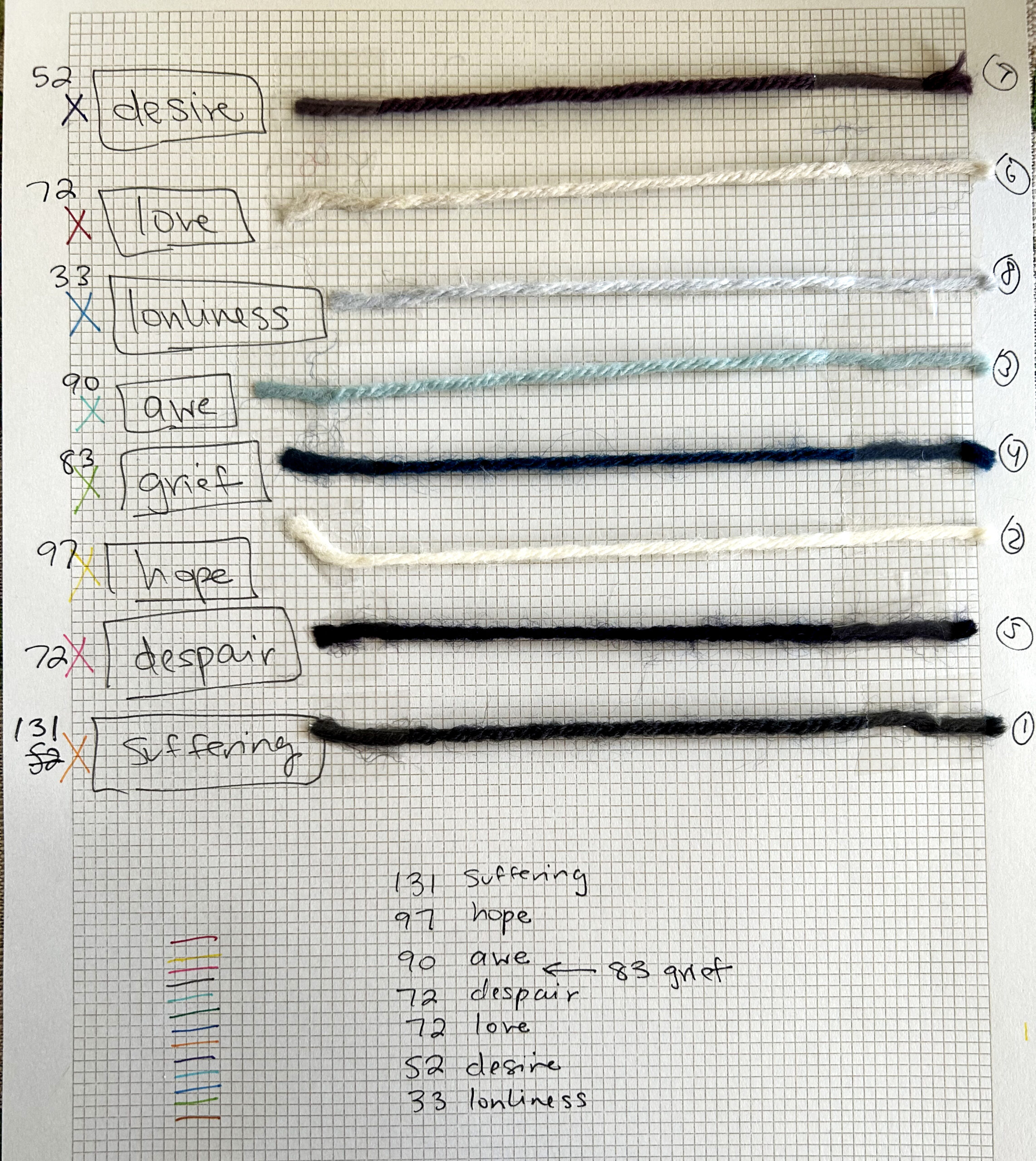
When I began my analysis of Bluets, I wrote down a dozen different emotion words that I expected to be expressed in the book. Had I not read the book before, I might have approached this in a different way, but what surprised me was how several emotions were so clearly at the heart of the book, but it was difficult to articulate exactly what those emotions were. The aforementioned “awe” became a catchall for anything that resembled wonder, surprise, or thankfulness, as well as concepts connected to god, heaven, spirituality, and religion. During my analysis, I wondered if this was reductive—to categorize all of these varied and unique emotions into one larger sense of “awe.” It is reductive, I will concede, but at the same time, I found it useful to put constraints on the number of different colored threads that I would use in the bookmark. Thus, all of the emotional categories contain multiple types. Isn’t this the very nature of emotion, though? If I say the word love, doesn’t everyone have a hundred ways of defining this? What about desire? Or grief? These simply aren’t words that have a singular definition, and so I took heart in the nature of the project, knowing that if someone else analyzed this book, they might very well come up with an entirely different set of emotions. What I categorize as suffering, someone else might call pain or struggle or heartbreak. What I think of as hope, someone else might think of as happiness, joy, connection, or meaning. The point of the analysis is not to offer a definitive explanation of the book, but rather to highlight my own understanding and emotional experience of it. In the end, I came up with 8 emotions that, in my experience, best-described Bluets:
| Emotion | # Instances |
| Suffering | 131 |
| Hope | 97 |
| Awe | 90 |
| Grief | 83 |
| Despair | 72 |
| Love | 72 |
| Desire | 52 |
| Loneliness | 33 |
These emotions were then translated into a woven bookmark based on color. In choosing colors for this project, I experimented with several different palettes and settled on one that utilized various shades of blue, grey, and white because the colors clearly tied in with the content (and title) of the book. Because this is a short book, I was able to do a direct representation of the number of times a given emotion was represented, although with a longer book, it could make more sense to do this based on a proportional percentage. Bluets is a book that I have loved for many years, and it was especially rewarding to create a data physicalization that helped me to think of the book in a more profound way, even after having already read it multiple times.
Goethe referred to blue as having “a peculiar and almost indescribable effect on the eye. As a hue it is powerful it is on the negative side, and in its highest purity is, as it were, a stimulating negation. Its appearance, then, is a kind of contradiction between excitement and repose.” [10] Bluets, and the range of emotions contained within it, exist in this liminal space between excitement and repose. I’ve already felt this many times as a reader, but as a designer and data artist, this project gave me a new understanding of the emotions in the book, and the bookmark stands as a physical reminder of the words Nelson has so carefully crafted and which have meant so much to me.
Pattern: How to Make an Emotional Bookmark
Step 1: To make an emotional bookmark, begin by choosing a book and conducting an analysis of all the emotional words and phrases in the book. For the analysis, I encourage you to do it by hand, as this builds an intimate connection with the language in the book. But, you may also use a digital tool, or simply search terms throughout a PDF. (Figs. 1, 2)
Step 2: Once you have collected your data, you will need to organize it. This can be done by hand by simply adding up the number of emotional words and phrases you have collected, or you can employ a tool such as Excel or Tableau to organize your data. This can be especially helpful if you are working with a large book. Now is the time to connect your data to your yarn colors. (Figs. 3, 4)

Step 3: Set up your loom. I used a small hand loom for this project, and there are several bookmark looms that can be purchased online. Alternatively, you can build your own loom from a piece of cardboard. Once you have set up the yarn on your loom, or what is called the warp, you can begin to weave by pulling yarn back and forth through each line with what is called the weft. The weft will consist of all the various colors you have chosen for your project. As you are weaving, you may need to use a comb, which typically comes with weaving kits, to push the yarn down as you move through each line. In a pinch, you can use a fork for this! (Figs. 5 & 6)
Note: You can use other textiles for this, such as embroidery thread, fabric, or felt. You could even use paper to weave a bookmark. You might try experimenting with different mediums for different books!
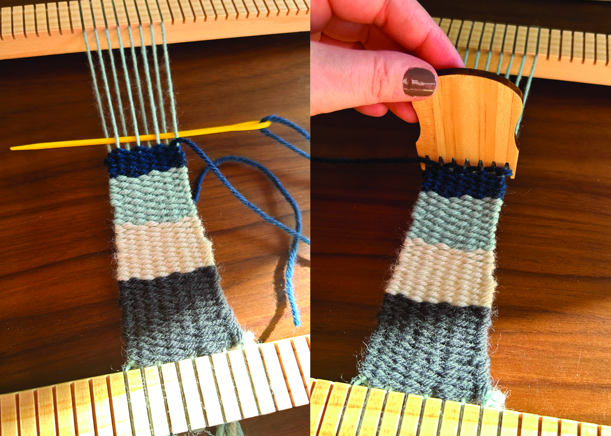
Step 4: After your bookmark is finished, tie off all the ends to secure the yarn, and enjoy your bookmark! (Fig. 7)
—–
Notes:
[1] Von Goethe, Johann Wolfgang, and Charles Lock Eastlake. Goethe’s Theory of Colours. Routledge, 2019. (First published in 1810).
[2] Lin, Sharon, Julie Fortuna, Chinmay Kulkarni, Maureen Stone, and Jeffrey Heer. “Selecting Semantically‐Resonant Colors for Data Visualization.” In Computer Graphics Forum, vol. 32, no. 3pt4, pp. 401-410. Oxford, UK: Blackwell Publishing Ltd, 2013.
[3] Yvonne Jansen, Pierre Dragicevic, Petra Isenberg, Jason Alexander, Abhijit Karnik, Johan Kildal, Sriram Subrama- nian, and Kasper Hornbæk. 2015. “Opportunities and Challenges for Data Physicalization.” In Proceedings of the 33rd Annual ACM Conference on Human Factors in Computing Systems (CHI’15) . Association for Computing Machinery, New York, NY, 3227–3236. DOI: https://doi.org/10.1145/2702123.2702180
[4] Hornecker, Eva, Trevor Hogan, Uta Hinrichs, and Rosa Van Koningsbruggen. “A Design Vocabulary for Data Physicalization.” ACM Transactions on Computer-Human Interaction 31, no. 1 (2023): 1-62.
[5] Lupton, Deborah. 2017. Feeling Your Data: Touch and Making Sense of Personal Digital Data. New Media & Society 19, 10 (July 2017), 1599–1614. DOI: https://doi.org/10.1177/1461444817717515
[6] Yun Wang, Adrien Segal, Roberta Klatzky, Daniel F. Keefe, Petra Isenberg, Jorn Hurtienne, Eva Hornecker, Tim Dwyer, and Stephen Barrass. 2019. An Emotional Response to the Value of Visualization. IEEE Computer Graphics and Applications 39, 5 (Sept. 2019), 8–17. DOI: https://doi.org/10.1109/mcg.2019.2923483
[7] Li, Yufan, Yue Huang, Kang Zhang, and Varvara Guljajeva. “Bitter Data: Bitterness Taste in 100,000 Trouble Data.” In Proceedings of the 16th International Symposium on Visual Information Communication and Interaction, pp. 1-2. 2023.
[8] Kim, Evgeny, and Roman Klinger. “A Survey on Sentiment and Emotion Analysis for Computational Literary Studies.” arXiv preprint arXiv:1808.03137 (2018).
[9] Deng, Jiawen, and Fuji Ren. “A Survey of Textual Emotion Recognition and its Challenges.” IEEE Transactions on Affective Computing (2021).
[10] Von Goethe, Johann Wolfgang, and Charles Lock Eastlake. Goethe’s Theory of Colours. Routledge, 2019. (First published in 1810).
Black Ribbon for Mourning: Affective Solidarity and Feeling Very Difficult Data
The following recipe focuses on using data visceralization to engage very difficult data, with an emphasis on what feeling the data can do (as opposed to seeing it), and strategies for contextualizing the data and its effects.
There is a particular subset of visualization-based data science known as Quantified Self. The Quantified Self (QS) movement relies heavily on wearable technologies, specifically wearables that produce data out of the workings of our bodies. Under the guise of promoting health, information harvested from individuals’ bodies undergoes analysis, visualization, and organization based on factors like time, location, and correlation. Through the integration of tracking devices near bodies, the Quantified Self (QS) movement presupposes the impartiality of data sourced from fitness trackers, treating them as mere extensions of the Western philosophical imperative to “know thyself.”
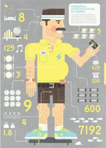
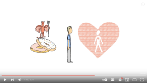
The logic underlying the Quantified Self movement that emerged alongside contemporary fitness trackers is that more data is needed for a better self. This logic is demonstrated in the following visuals. Figure 1 shows a cartoon straight-sized man with a slight paunch surrounded by myriad data points, including weight lifted, emails sent, meals consumed and what seems to be either sperm count or number of sexual partners; the latter data point is unclear. The image is labeled “personal identification numbers,” suggesting that like one’s bank PIN, these numbers reveal something that is typically kept tightly protected. Figure 2 is a screenshot from a New Scientist video about the QS movement, showing a cartoon white man, whom the devil is trying to tempt with donuts. Rather than being opposed by an angel, the devil is instead countered by the quantified self, visualized here as a pink heart with a blank effigy in the middle, surrounded by streaming data. The narrative of this feedback loop between data and self (i.e., the Quantified Self) creates a myopic focus on self-determination and supports fantasies of meritocracy. If one can just understand one’s data, and act upon that understanding, one can improve oneself. If one cannot, it is a failure of inadequate data, poor understanding, or a lack of will, but never of the model of neoliberal self-determination that values efficiency and data over experience, context, and messiness.
If the ideology of the Quantified Self movement privileges the self-optimizing individual primed for productive work, then an alternative conception of wearables for feminist futures requires what I call the Quantified Self-in-kinship (Knight 2018). The Quantified Self-in-kinship refuses neoliberal self-optimization logics, widening the scene to account for the self as an always already-social self.
To further illuminate my concept of the Quantified Self-in-kinship, I’ll focus my recipe on Black Ribbon for Mourning, a critical making project that comes out of Fashioning Circuits, a public humanities research collective that I co-founded in 2011 and for which I am the ongoing director. Critical making is one of Fashioning Circuits’ central methods of engaging questions and disseminating knowledge. Scholars define critical making as critical thinking meets making, or interpreting with and through technology. In Fashioning Circuits, I describe it as drawing on the expressive potential of the technology we study, using and misusing it to collaborate and engage communities.
Black Ribbon for Mourning centers on 2016 police killings of Black persons in the U.S. Black Ribbon for Mourning was created in 2017 with my collaborator Jessica C. Murphy for the HASTAC exhibition on the Wearable and Tangible Possible Worlds of Digital Humanities, an exhibition that I co-curated with Jacqueline Wernimont that collectively suggested that one of the possible worlds of DH is material, embodied, and grounded in feminist approaches. Many of our UT Dallas students and faculty colleagues offered stitching support for the project and the project draws upon data from MappingPoliceViolence.org, whose project leaders are Samuel Sinyangwe, Deray McKesson, and Brittney Packnett Cunningham.
Black Ribbon for Mourning starts with a number: 309. According to MappingPoliceViolence.org, there were 309 Black people killed by the police in 2016. While Black Americans made up only 13% of the U.S. population that year, they accounted for 26.7% of people killed by the police. Black Ribbon for Mourning draws connections between the contemporary epidemic of police killings that grows out of anti-Black racism, and the logics and economy of colonialism and the 17th century slave trade. We take our title from Robert Ligon’s 1657 book A True and Exact History of the Island of Barbados, a colonial operating manual of sorts for Caribbean plantation owners that Molly Farrell (2016) identifies as an early instance of “human accounting.”
Farrell suggests that Ligon’s clothing budget for the sugar plantation articulates social hierarchies and is performative in the way that it conflates people and commodities. In a striking passage, Ligon writes, “Black Ribbon for mourning, is much worn there, by reason their mortality is greater, and therefore upon that commodity I would bestow twenty pound” (qtd. in Farrell 2016, 95). The inconvenient and expensive mortality here is that of the enslaved person, whose death necessitates the purchase of black ribbon so that kin may signal that they are in mourning. Ligon’s casual enumeration of the hidden costs of the 17th century mortality of enslaved persons and the attendant costs of mourning rituals reminds us that data points and their articulation often suppress the complexity of lived realities.
The two instances, 2016 police killings and Ligon’s 1657 book, are separated by 359 years but connected in many ways, including that they share a logic of misplaced solutionism. For Ligon, the response to the mortality of enslaved persons is not to abolish the conditions of slavery, nor the colonialism which depends on its violence, but to budget more money for the signifiers of mourning. In contemporary policing, solutions are often sought in militarization or surveillance technology, rather than examining the flaws in the fundamental principles of policing itself.
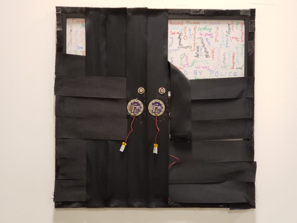
Black Ribbon for Mourning involves a square frame mounted on a wall (figure 3). Twenty black ribbons, in reference to Ligon’s twenty pound, are woven together. As participants approach the square, they are invited to remove a ribbon and tie it around their arm (figure 4). The ribbons have a LilyPad Arduino and a vibrating motor sewn into them and are programmed to pulse, with each one-second vibration representing a black person killed by police in 2016. A longer vibration indicates multiple people killed in one incident, while multiple short pulses signify separate incidents on the same day.
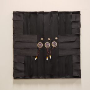
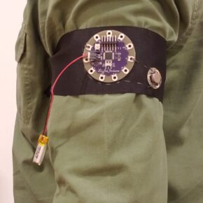
Originally conceived of for a half-day exhibition, the entire “year” of 2016 passes in four hours, with each day lasting 39.3 seconds. Carrying the ribbon with them, the wearer experiences a faint vibration, timed at intervals that do not, cannot, make sense. As ribbons are removed from the tapestry, the first names of those killed become visible (figure 5), gesturing towards the possible world where Black lives are named and matter, which can only happen in the absence of black ribbon.
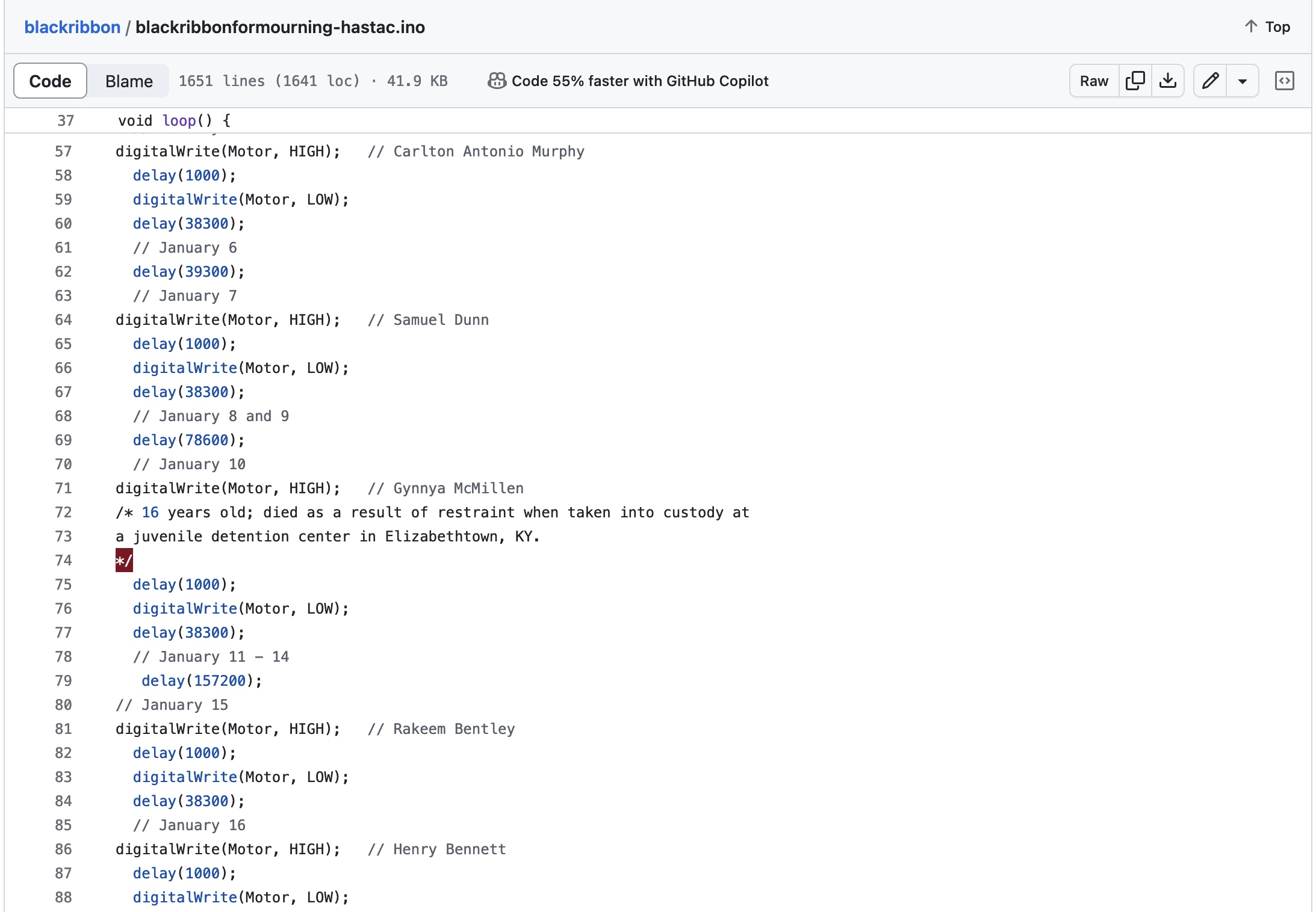
The signifying strategies of Black Ribbon for Mourning extend into the code itself, which is made available on a laptop sitting next to the wall hanging. There was a way to code this that involved a spreadsheet and automating the calculations via Arduino. This would have been efficient; seamless. However, the coding, for me, was a ritual of memorialization. As you can see in this screen grab of the code (figure 6), I hand-coded it, line by line, commenting in the name of each person killed. In some cases, I also noted details about the person’s death, such as the January 10th death of Gynnya McMillen who was only 16 years old and died as a result of restraint when taken into custody at a juvenile detention center in Elizabethtown, KY. My collaborator, Jessica C. Murphy, hand wrote each name on the glass as her daughter read them aloud as part of her ritual of memorializing. In both cases, this was our attempt to recognize the lives behind the data. The handwriting is imperfect. The code is not elegant. In fact, it is somewhat glitchy. But how could it not be? The texture of the data lives in the acts of naming and in allowing the imperfections to stand as we repudiate the imperative to efficiency.
The project makes two key refusals that challenge the paradigms of data science and technological innovation. First, instead of data visualization, it foregrounds data visceralization – that is, making data felt – as a praxis that thwarts the visual regime that privileges efficient transmission.
By putting on the armband, the user tacitly agrees to allow the archive of names encoded in the ribbon to operate upon them for up to four hours. During this time, they may be browsing other artworks, sitting in panels, and so forth, moving through different spaces and attending to different matters. While the installed frame suggests a site-specific meaning, the armband travels. Thus, the data and the wearer’s experience of it are continually being recontextualized. This rebuffs the data visualization method of arranging data into discernible patterns within a stabilized and fixed frame.
In rejecting data’s visualization, the project attempts a detourning of visuality’s origins in and contemporary presents in anti-Black violence. In “The Right to Look” visual culture scholar Nicholas Mirzoeff identifies visuality as problematically “manifest[ing] the authority of the visualizer” (2011, 474). He traces the origin of visuality back to what he terms the “plantation complex,” the shaping of reality and imagination that originates from the surveillance and visual strategies of the slave trade, the techniques of which are embodied in the figure of the overseer. Mirzoeff (2011) argues that visual complexes are formed in stages, through classifying, separating, and aestheticizing, and he identifies the 1670 requirement to map all plantations as being one classifying strategy that was fundamental to the formation of the plantation complex. Though he does not name it as such, this places information visualization at the birth of the plantation complex. These entanglements persist into contemporary times as noted by Black studies scholars such Brian Jefferson Jordan, who argues that predictive crime mapping legitimates racialized geographies, or Katherine McKittrick who critiques the actuarial algorithms that visualize Black death in an act of prognostication.
Rather than manifesting the authority of the visualizer, the feminist DH approach of Black Ribbon for Mourning circumvents the professional ground rules of data science and asserts the importance of subjects and the role of subjectivity. By interrupting the visual and instead tying data to the material specificities of embodiment, the project refuses what African American Studies scholar Ruha Benjamin notes as the tendency for some technologies to “render Black people hypervisible,” exposing them to social and political vulnerability (2020, 99). I suggest that by thwarting the visuality complex, the project attends to Benjamin’s call for strategic exposure, that which resists intrusive or violent visibility and intentionally exposes selective information in the name of challenging erasures, making structures of oppression perceptible (2020, 127).
The second paradigm-challenging refusal of Black Ribbon for Mourning is that in making data felt while removed from the visual field, the project also refuses to reproduce the spectacle of black suffering, which is historically (and contemporarily) exploited in an attempt to produce empathy.
Critical race scholars have extensively scrutinized the notion of empathy. Saidiya Hartman (2022) highlights that narratives depicting violence often inadvertently perpetuate the violence, exposing the “precariousness of empathy” wherein the role of a witness can easily transition into that of a mere spectator. In the pursuit of eliciting empathetic responses, there’s a danger of overshadowing the experiences of those who have endured suffering, reducing them to objects of our own emotions. Hartman emphatically asks, “Can the white witness of the spectacle of suffering affirm the materiality of black sentience only by feeling for himself?” (2022, 24). Her critique suggests a deficiency in white witnessing that requires contrived empathy.
In examinations of race within digital contexts, Ruha Benjamin (2020) observes a growing prevalence of empathy in the marketing strategies of digital technology. Moreover, Lisa Nakamura (2020), in her work “Feeling Good About Feeling Bad,” highlights the inadequacies in leveraging technologies of immersion and simulation to foster empathy. She critiques recent virtual reality initiatives that aim to immerse viewers in the experiences of marginalized individuals, arguing that they often fail to put the user “in the shoes” of the subject, resulting instead in what she terms “toxic re-embodiment” (2020, 51) – a situation where individuals occupy the bodies of others who may not even have autonomy over their own bodies.
Hartman, Benjamin, and Nakamura’s critiques articulate much of what makes Murphy and I uneasy about empathy and prompts us to try to avoid the problematic trap of generating (White) empathy at the expense of (Black) subjects (and the data around their deaths). There is no way in which Black Ribbon for Mourning could possibly emulate the feeling of being Black in the U.S. for non-Black users, nor is it the goal for it to do so. Nor for Black users can the data presented be interpreted as a stable and complete historical accounting of the violence perpetrated against Black Americans at the hands of the police. Rather than activating toxic re-embodiment to occupy the body of an “othered” person, the project aims to keep the focus on the user and the social systems in which they are immersed.
Nakamura (2020) suggests that the “implied presence” of so-called “virtuous VR” fails to produce knowledge about an-other. In contrast, Black Ribbon’s nebulous pattern of interruptions attempts to unsettle what is known about the user’s world and the systems of violence that are always active alongside our everyday activities. For a thoughtful user, this unsettling can be an embodied challenge to their epistemological framework, creating what feminist scholar Claire Hemmings has identified as an affective shift, the “gap between self-narration and social reality” that might develop into “affective solidarity,” “an account of experience that is dynamic rather than essentializing” (2012, 157). In other words, affective solidarity avoids the most problematic tendencies of empathy as identified by Hartman and other scholars. Black Ribbon for Mourning is elastic in that it engenders a range of effects for different audiences. For some it may act as a tactile reminder of the epidemic of police violence; for others a prompt to reflect on their role in what Patricia Hill Collins (2000) terms the “matrix of domination;” for still others, a step in the process of developing affective solidarity. This is the “quantified self-in-kinship” (Knight 2018). Quantification is used in this case to resist the essentializing outcomes of empathy and provide an affective shift instead.
Creating encounters that facilitate this kind of reflexivity is the motivation for me, as a white woman, to do the work of data visceralization. Black Ribbon for Mourning is meant to raise and suspend questions – drawing on Sara Hendren’s work on disability and DH – for an audience who may not yet be at that moment of reflexivity.
Recipe for Feeling Data and Affective Solidarity
Ingredients
Items 5-10 can be found on this shopping list from Sparkfun electronics.
- A data set that tracks one data point over a period of time, plus any important contextual information about the data.
- A length of black ribbon or any other kind of textile that can be worn close to the body.
- Arduino IDE software.
- Fabric glue.
- A LilyPad Arduino microcontroller.
- A LilyPad vibrating motor.
- A spool of stainless steel conductive thread.
- A 3.7v rechargeable Lithium-Ion battery with a JST connector.
- USB cable to connect the LilyPad to your computer.
- Hand-sewing needle.
Instructions
This project has three basic parts – the textile and hardware, the data, and the code.
Textile and Hardware
- Using a small amount of fabric glue, affix the LilyPad Arduino and vibrating motor to your textile. You are only gluing it to hold it in place while you sew, so not much glue is needed. Set this aside to dry for an hour.
- Once the above is dry, use the conductive thread to sew the connections below. Use small, neat stitches between the petals and make multiple loops of thread around each petal to ensure good contact.
- From the positive petal on the vibrating motor to a numbered petal on the Arduino.
- From the negative petal on the vibrating motor to the negative petal on the Arduino.
- Attach the battery via the JST connector on the LilyPad Arduino. If the battery needs to be charged, you can plug it into your computer via USB while you are working on other parts of the project.
Data Preparation
- Gather as much information about your data set as possible.
- Consider creating a “data biography” to situate your data and restore context (D’Ignazio & Klein 2020, n.p.). Keep in mind that for yourself, preparing the data is part of the process of understanding the phenomenon and honoring the lives behind the data. For others who may access your code, the additional context you can provide may help in the affective shift.
- I’ve created a Data Analysis worksheet based on D’Ignazio & Klein’s work that you may find useful.
- Sort your data by date and, if necessary, time.
Code
In Arduino, the code files are called sketches. You can download a basic sketch to get started from my github repository for this recipe.
- Calculate your basic time unit.
- Identify the span of time that your data covers. Example: 1 year, 1 month, etc.
- Decide how long your project is intended to be worn. How many hours is the event at which you intend it to be worn?
- Calculate your basic time unit. In the Black Ribbon for Mourning project, we were dealing with one year of data (a leap year) to unfold over a four-hour exhibition. Our basic time unit is that one day is equivalent to 39.3 seconds. However, Arduino calculates time in milliseconds. So our basic time unit is 39300.
4 (hours) x 60 (minutes) = 240 minutes
240 (minutes) x 60 (seconds) = 14, 400 seconds
14,400 (seconds) ÷ 366 (days) = 39.3
- Decide how you will handle multiple incidents during the same time period. For Black Ribbon for Mourning, we used multiple one-second pulses to indicate more than one person killed on a day, and longer pulses to indicate more than one person killed in the same incident.
- In a text editor, write an Arduino function using DigitalWrite that turns the vibrating motor on and off for one second (1000 milliseconds), with a delay the length of your basic time unit – 1000. For Black Ribbon for Mourning, ours looks like this:
digitalWrite(Motor, HIGH);
delay(1000);
digitalWrite(Motor, LOW);
delay(38300);
-
-
-
- This would turn the motor on for one second, and off for 38.3 seconds before proceeding to the next instruction. If there was more than one incident on a day, we adjusted the number of pulses and delays accordingly.
-
- To get started in your Arduino sketch, create a “Motor” int (integer) variable and set it to the petal number to which you have attached the vibrating motor on the Arduino.
- In the Setup, define “Motor” as an output.
- In the loop, begin by creating a comment that labels your first time unit. For Black Ribbon for Mourning, this was January 1.
-
- Cut and paste your function from the text editor into your Arduino sketch, adding in comments to contextualize the data. For each high/low function in Black Ribbon for Mourning, I commented in the name of the person killed. As I was going through the data day-by-day, wherever possible I followed the dataset’s link to supporting documents to read about the incident. In some cases, I added additional comments to the code with more information about the person killed.
- Continue adding to your sketch, inserting comments for new time units (days in our case), calculating delays by hand, and commenting in important context. Do this until you have reached the end of your time period.
- I recommend checking the syntax of your code frequently using Arduino’s verify button. In addition, I recommend uploading the code to the Arduino after you have completed coding for a few time units. This allows you to ensure that the vibration motor is operating the way you want it to.
- Once you reach the end of the time period for your data, verify your code and upload it to the Arduino.
References
Benjamin, Ruha. 2020. Race after Technology: Abolitionist Tools for the New Jim Code. Polity Press.
D’Ignazio, C., and Klein, L. 2020. “6. The Numbers Don’t Speak for Themselves.” In Data Feminism, MIT Press. Retrieved from https://data-feminism.mitpress.mit.edu/pub/czq9dfs5
Farrell, Molly. 2016. Counting Bodies: Population in Colonial American Writing. Oxford University Press.
Hartman, Saidiya. (1997) 2022. Scenes of Subjection: Terror, Slavery, and Self-Making in Nineteenth Century America. 25th Anniversary Edition. WW Norton.
Hemmings, Claire. 2012. “Affective Solidarity: Feminist Reflexivity and Political Transformation.” Feminist Theory 13 (2): 147–61.
Hendren, Sara. 2017. “All Technology is Assistive: Six Design Rules on Disability.” In Making Things and Drawing Boundaries, edited by Jentery Sayers, Debates in DH series, U of Minnesota Press.
Hill Collins, Patricia. 2000. Black Feminist Thought: Knowledge, Consciousness, and the Politics of Empowerment. Routledge.
Jefferson, Brian Jordan. 2020. Digitize and Punish: Racial Criminalization in the Digital Age. University of Minnesota Press.
Knight, Kim Brillante. 2018. “‘Danger, Jane Roe!’ Wearable Data Visualization as Feminist Praxis.” In Bodies of Information: Intersectional Feminist Digital Humanities, edited by Jacqueline Wernimont and Elizabeth Losh, University of Minnesota Press.
McKittrick, Katherine. 2021. Dear Science and Other Stories. Duke University Press.
Mirzoeff, Nicholas. 2011. “The Right to Look.” Critical Inquiry 37 (3): 473–96.
Nakamura, Lisa. 2020. “Feeling Good about Feeling Bad: Virtuous Virtual Reality and the Automation of Racial Empathy.” Journal of Visual Culture 19 (1): 47–64.
Book Adjacent: Database & Makerspace Prototypes Repairing Book-Centric Citation Bias in DH Working Libraries
My digital humanities center recently returned to a renovated library building with a dedicated public area. Our pre-renovation space included semi-public shelves full of DH-relevant books, but by 2019 thirteen years of book accrual meant our specialized reference collection needed significant curation. Some of the most appreciated books weren’t making it back to us, and other books were outdated in terms of whose work we wanted to amplify (e.g. needed to remove known bad actors, balance a non-representative number of white male authors), as well as technology (so many 1990s PHP textbooks!).
After cutting down those books to the core we still wanted to keep, we started to plan a goals-based collection rebuild. We’re interested in reparative collecting, so that the reads we amplify show an accurate and inclusive array of what the digital humanities is, as well as making an argument for the DH we want to be [1]. Head of R&D Jeremy Boggs’ project starts from a carefully curated collection of books meant for use during our reference consultations (a “DH Working Library”). He’s building an online interface so our community can browse both the included titles, as well as the lab’s reviews of what we learned and liked about these books. My own project starts from a larger count of “reads” (“SLabReads” [2]), exploring what’s possible for our “shelves” if we first structure items on both our to-read and read lists as a dataset with useful metadata.
“Reads”, not books
My use of “reads” here is precise: I mean not just print books and journals (or their digital versions), but also works in an abundance of other formats. I won’t say I’m including anything that has or could inform and inspire the work of the lab and our community—for example, I’m not including specific people as “reads”—but I do mean that term capaciously. I have been informed or inspired by, for example, a literal bread recipe; fictional or creative work that explores possibilities, or conveys an ethos I took back to my research; tutorials, informal discussions, datasets, infrastructural and administrative work, zines, social media posts, and countless other of the ways humans create and share thinking.
“Generous” citation—in whom we cite [3], and what format their work takes—is actually just accurate citation. Academia routinely lags in citing all the emails, attended conference talks, social media posts, elevator conversations, movies, podcasts, reviewer comments, and more that inspire and inform our scholarship. Similarly, physical displays in academic libraries tend to disinclude relevant reads that aren’t in a print scholarly book or journal format, such as all the formats I just listed—sending a message that other formats or work are lesser, or not relevant. That isn’t only a general loss of what other reads could have been included. Given systemic racism, sexism, and other harms in publishing and academia, limiting ourselves to just some of the most gatekept formats fails at presenting a welcoming, inclusive, anti-racist, and accurate picture of what relevant work exists to inform and inspire around a given topic.
Other areas of my scholarship argue against the perception that work in non-print book/journal formats isn’t useful, relevant, or “scholarly enough”. With my “SLabReads” project, though, I’m working against a different reason we limit the reads we exhibit in our public spaces and our shelves: the practical difficulty of displaying works not designed to sit on a physical shelf.
That’s where the making comes in. The rest of this piece will describe how I’m designing a database of our collection [4], followed by the goals and current status of three of the making projects my database has already powered. Each making project aims at inviting ways to list and amplify relevant reads together in the same public physical display, regardless of formats.
Physical shelves aren’t an accessible location for everyone. My project is based on a digital database, so a catalogue can be accessible online and also encountered in our public space. Future work might include improvements to a catalogue’s accessibility beyond webpage design accessibility, such as optimizing for translation tools, and using minimal computing approaches so accessing a catalogue isn’t limited to those with ample internet bandwidth. I’ve also tried to incorporate physical but off-shelf options in my planned projects, such as the “themed reading card decks” that I share later in this piece.
Database as starter for reading + making projects
Like a single sourdough starter producing a variety of bread, I needed a dataset of my reads, including interesting metadata to help match them to potential readers, to craft multiple paths into our cross-format reads collection. I initially developed two separate datasets: bookmarking cool reads as I heard of them via browser bookmarks and Pinboard; and collecting individual print zines as I came across them, then recording info about each in a Google Sheet. Initial pandemic lockdown, and the desire to include authors and topics I wasn’t coming across when buying zines locally, meant I moved to collecting mostly digital zines. I already don’t buy many print books, so once my zines became more digital too, it became obvious I should collapse the two collections into one cross-format collection.
I use “catalogue” to mean a public interface to browsing and searching my collection database. I use “database” to mean the relational database place where I work directly with the data. The latter is optimized for bulk editing (e.g. for every time I add a new metadata field), and for the key thing that separates a relational database from a spreadsheet: defining a single instance of a record that can then be linked from various data fields and displays, rather than repeating information that already exists. For example, new reads entries automatically can refer to other works by the same author, by referring to a single existing instance of that author from a dropdown; I don’t need to re-enter the author’s name every time I input one of their works, hoping I spell and format it the same way every time so searching doesn’t miss any of their works.
Approximating a database in various online spreadsheets (e.g. Google Sheets, Excel Online) quickly produced unacceptable lag time while editing. An option billed as an open-source and self-hostable Airtable (Baserow) was promising, but after running into a few glitches and lags, I wasn’t willing to trust my data there. I’m currently using the free version of Airtable, which has the most user-friendly interface I’ve encountered for free or non-enterprise price, both for the database developer and for exposing public catalogue views of subsets of the data. I’ll eventually run into their data limits, and need to pay for an advanced plan or move elsewhere.
There are other, easier, and/or cheaper ways to approach this kind of data work; this is just what’s worked for my particular needs. Using a relational database with a shiny user-interface like Airtables’s means I can take a collection where a small slice of the entries and their metadata looks like this, organized by title…
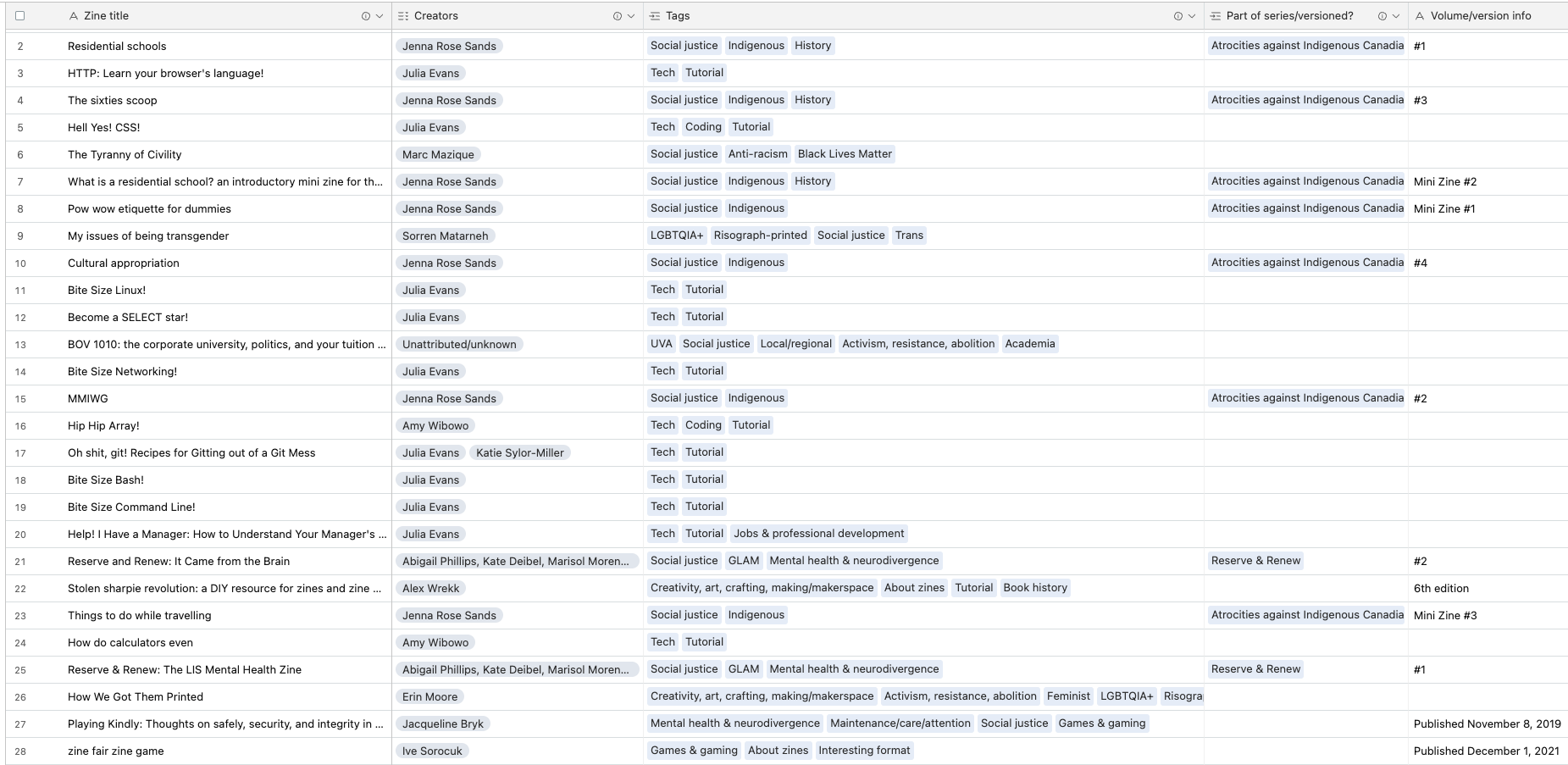
…and then easily pull data and view by other metadata fields, such as a zine’s status on my physical “zine wall” display…
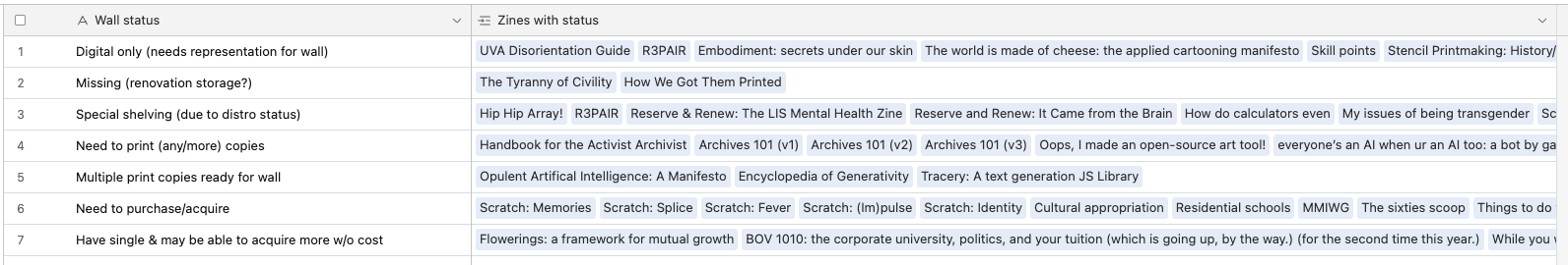
…or which zines cover which of the tagged topics of interest to me:

Currently, only a subset of my reads collection (a little over 100 zines) and its metadata (18 of 30 fields) are exposed as a public catalogue. I’ve focused on creating and filling out metadata fields that I know will power things I want to do, such as seeing how diverse the authors are, respecting authors’ explicit directions regarding IP (e.g. remix, sharing person-to-person vs. broadly, replicating from one print copy), and recording whatever I can toward making an ethical choice about preservation, sharing, and remix when that information is not explicitly stated. I made a bar chart showing me which thematic tags are most used, so I can identify topics where I need to collect more, or have enough reads to create some themed making project. If I don’t have a specific use in mind yet for some aspect of my zines, I keep things wieldy by not creating a field for it—for example, I could record zine binding style, but don’t know how I’d use that info yet so have not created a field for that metadata.
I know it’s weird to go from “include all the formats!” to “but just zines for now!” I have hundreds more collected non-zine reads to add to the database, in addition to hundreds of additional zines to add, but I’ve found that 100 items is enough to start doing interesting things with data filtering and sorting by metadata. The zines had the most metadata already recorded when I decided to combine all my formats into one collection. Starting out with just one (not print book or journal!) format helped me focus on filling out all the metadata I’d want for each of those reads. Seeing at a glance if something was missing data, instead of needing to look back at the title each time to tell whether the metadata field applied to the read or not, has helped me get a full pilot database up to start experimenting with. For example, an interactive digital tarot deck won’t use the zine fields for reprinting policy, zine layout type, or number of copies currently printed fields; and might have fields for non-zine features like how much bandwidth the website takes to load, or coding languages used to make the site.
So how does this dataset power makerspace projects? In the remainder of this piece, I describe three of the in-progress reads and making projects that my dataset has enabled [5].
Themed reading card decks
Why: Demonstrate the possibilities of the thematic metadata in my reads catalogue; potentially pull different formats of reads into the same list; create a fun, portable way to take syllabi or other themed reads lists away from our physical space, or hand them out at events.
Design: I designed and printed a deck of “playing cards”—just like standard poker cards, except the only text and graphics was what I designed [6]. These cards collect recommended zine readings about DH making and other topics of interest to me, one read per card. I was inspired by SLab colleagues’ past projects that use “card decks” to link you to various media: Ammon Shepherd blogged the RFID storyteller machine he built that lets kids select from a deck of stories, and Arin Bennett made a short video of the RFID jukebox he created, which opens Spotify links from cards.
Each card displays a work’s title, creators/authors, and a QR code on one side. Scanning the QR code with a smartphone brings you to a webpage where you can read the zine for free. The “recipe” at the end of this article (and in the associated zine!) contains further details on designing and creating a similar deck of your own, so check there for further details about the design of this prototype (and how to create your own).
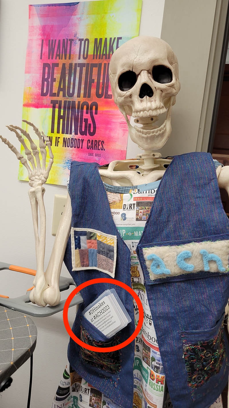
Building status: Fully prototyped. I created a small themed card deck as my contribution to ACH 2023 conference’s #DHMakes [7] team submission, and sent it to be added to that session’s larger DH making project. In line with my goals for inclusive reads amplification, this initial card deck contained reads I’d thematically tagged in my zines catalogue as related to LGBTQIA+ experience and rights, anti-racism, labor, and feminism.

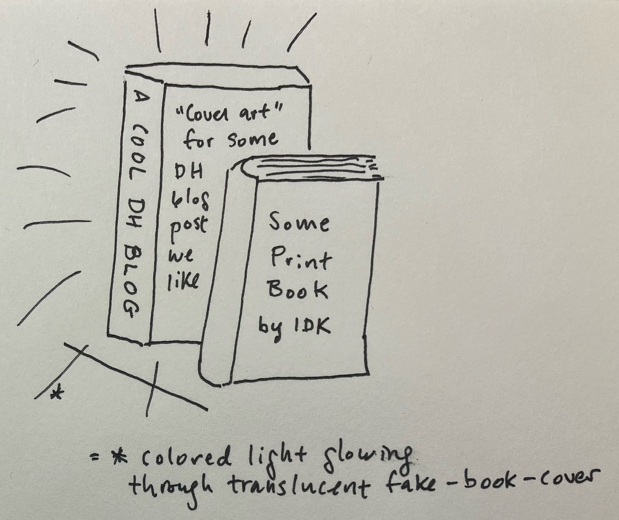
Ghost Books (modeled on Aidan Kang’s Luminous Books)
Why: Shelvable, book-shaped glowing invitations to amplify non-book reads right amid print books on a shelf.
Design: I like neon signs, but given the difficulties of creating true neon signs (glass! gas!), I’ve been experimenting with EL wire and LEDs to approximate the neon look more safely and inexpensively. Researching projects combining light and books, I found a number of neat projects that converted existing books (e.g. Steve Hoefer’s “Not Your Ordinary Book Light”). Aidan Kang’s Luminous Books [8] best met my goal of drawing book-like attention to non-book reads and fit my developing skills using LEDs and laser cutters.

My Ghost Books project is an attempt to make a crude approximation based directly off several photos of Kang’s elegant work. Could I figure out how to make something less beautiful, but with the same core components of LEDs, transparent book-shaped box, and translucent “book” cover? The “ghost” in the project name comes from this last component: can I come up with a visually appealing “cover” template for reads that don’t have covers of their own?
Building status: Early prototyping. I’ve sketched the project, and acquired materials to create two test Ghost Books.
Case. I used an online tool [9] to design laser cutting files to create the flat shapes to assemble into two rectangular prism book cases, and left a cutout for accessing the LEDs inside after the case is glued shut. I’m initially trying this with both glass and thick acrylic to see how each material works once it’s sitting on a shelf. I sized these two cases to match my hardback copies of Safiya Noble’s Algorithms of Oppression and Nick Montfort et al.’s 10 PRINT, as both had covers that might look good with light shining through. I started this project during the pandemic when I didn’t have access to a laser cutter, so I paid an online company (Ponoko) to laser cut and ship me the pieces needed. If these prototypes go well, I’ll experiment with making the case more book-shaped (e.g. Kang’s have rounded spines) and design a sliding piece or hinge into the case, so it’s easy to replace LEDs and covers.
I read Make.Share.Learn‘s acrylic display case tutorial to get a rough sense of how to design and assemble a case. I intended to use a transparent glue to put the pieces together into the cases, but I wasn’t sure whether flat or crenellated edges would keep the pieces together best, so I designed one of each to test. The pieces arrived cut to easily pop out of a larger rectangle, so I have extra material I’m now using to test gluing and clamping, before trying this on the actual case pieces.
Lights. I used a strip of blue LED bulbs and a piece of silicone half-tubing, which diffuses the LEDs when placed over them so the light looks more like continuous neon than separate dots. I’ll place this inside the case inside the cover once it’s ready, and get a sense of what cover materials allow the right amount of light to shine through. I also ordered a NeoPixel addressable LED strip, with the idea that I could make the lights slowly change color or pulse (“addressable” means I can send commands to the LED bulbs to change their color etc.). For this work, I used AdaFruit’s NeoPixel guide to ID the power adapters, microcontrollers, and cables I needed to light these up, and have started following their guides on how to program the addressable LEDs.
Cover. For the initial prototype, I’m using the actual covers of the two books named above, so I can focus first on the electronics and assembly work for which it’s less obvious what I need to do. If those work, I need to design fake “book covers” for any non-book reads I’d like to display. I’ll need to look if a given read has any associated art online, find stock illustrations to reuse, or try getting OpenAI’s image tool to create usable art. I’ll need to design the title and author text, and add a QR code so that viewers can easily go from looking at the Ghost Book to looking at the actual read it represents.
Mini Book List Printer (modeled on SailorHg’s “While(Fruit)”)

Why: We’ll create a digital interface to browse our mixed-format reading collection, and can make that catalogue usable from our public space via a computer workstation; adding a printer lets users take a list of reads they discover away with them. But a plain PC and printer doesn’t scream “discover cool reads here, including stuff not visible on the book shelf”—and does invite people to try to do unrelated things like checking email. I wanted a case that invites curiosity, and gives users a fun enough experience they might mention it to other people.
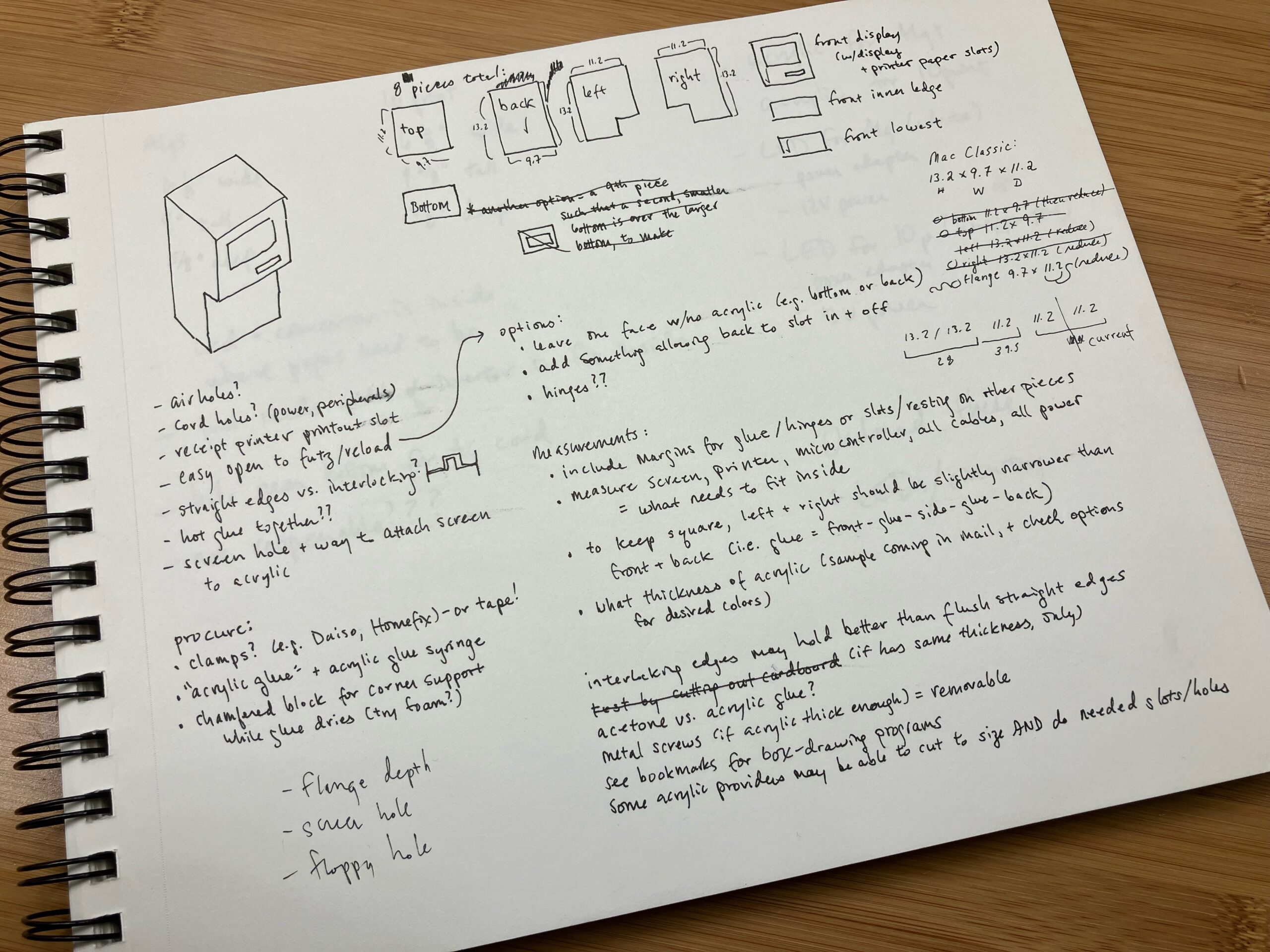
Design: I’m building a transparent green neon acrylic case, roughly shaped like a retro Apple computer (Mac Classic II), to draw visitors to a desk where they can interact with our catalogue. Apple has a history of transparent cases for prototyping [10], and more recently artists have made their own transparent cases for actual Apple hardware [11]. I am heavily inspired by and modeling my case’s look directly on SailorHg’s “While(Fruit)” exhibit, which simplifies the Mac Classic silhouette and combines neon transparent acrylic with cool retro programming art [12].
Inside, a small display screen will act as the case’s “monitor”; a Raspberry Pi allows users to access the reads database; and a mini thermal receipt printer will print out small (receipt-width) paper reading lists through the “floppy disk slot”. Users would be able to take a quiz that filters catalogue metadata (especially the thematic tagging) to produce a short recommended reading list; they would also be able to browse the entire database and mark any titles of interest for inclusion in a reading list.
Building status: Early prototyping.
Case. I’ve prototyped the retro Apple case to full scale using cardboard. I acquired acrylic samples to test color and thickness, as well as samples of straight and crenelated acrylic edges to test which provides the sturdiest and prettiest outcome, when glued together to form the computer case. Once our new laser cutter is available later this spring, I can purchase and cut acrylic to size and assemble the final retro Apple case.
Microcomputer, interface, printer. For the digital components, I’m halfway through setup of the Raspberry Pi and receipt printer, using Phillip Burgess’s “Internet of Things Printer for Raspberry Pi” tutorial. I’ve created an initial catalogue of 100+ zines and metadata that I can use to code both the quiz and catalogue browsing views. I need to create a connected catalogue of non-zine reads using an overlapping metadata schema, so that more than zines are included. I have an existing list of 300+ non-zine reads I want included in the collection. I’m hoping to work with my lab colleague Jeremy Boggs to connect to his DH Working Library reference collection and catalogue project as well.
What’s next?
I’m continuing the planned work on these reads projects and others, and will share their final forms at my research blog LiteratureGeek.com as they are completed. I welcome suggestions of related work to read and cite, relevant things you’ve made, etc. at visconti@virginia.edu. Check out the recipe tied to this article, if you’d like to make a themed reading card deck of your own!
Recipe: Themed Reading Card Decks
Below is a tutorial for creating a “themed reading card deck” similar to what I described earlier in the article. I thank Ammon Shepherd and Arin Bennett for sharing their own card-deck-shaped media projects with me, inspiring this work.
Ingredients
The list below produces 1 card deck; multiply #3-5 by how many decks you wish to create.
- A list of “reads” including titles and links to online locations where someone can access the “read” (or info on otherwise acquiring or understanding it, e.g. a review, a title in a zine union catalogue); if you’re starting from scratch, see the “data prep” section below before making the list so you save time by formatting as the project requires
- Optional: Additional “reads” data you might want to fit onto a card, and/or use to filter down to a set of reads sharing a specific theme or other feature (e.g. authors, themes, methods, formats)
- Access to a printer
- Black and white is fine, if color is unavailable.
- You’ll need to be allowed to switch in label paper and not have someone accidentally print on/use up your special paper while it’s in the printer tray, so if you’re on a public printer you’ll want to find quiet hours.
- 15+ standard-size playing cards
- “15+” is meant to be enough to feel like a “hand” or “deck”; less is fine, but some of the pleasure of the card form comes from things you can do with a normal playing card deck like tapping, sorting, dealing “hands”, fitting into a plastic deck case and/or shirt pocket…
- You can either
- Use existing playing cards you happen to own (note they will no longer be usable as playing cards after), or
- Purchase any blank playing cards (e.g. $9.99 for 180 2.5×3.5”cards on Amazon)
- Optional: If you want to be extra-fancy and have access to a printer that is able to handle the small size and rounded corners of blank playing cards, you may want to look into whether glossy vs. matte blank playing cards work best with your printer’s ink (e.g. vs. smearing). My instructions assume you’re using Avery printing labels; if you find blank cards that work with your printer, you can print to the cards directly and not purchase/use the labels.
- A playing-card case, either
- A clear plastic deck case (e.g. $15.99 for 15 clear plastic cases on Amazon), or
- An existing playing-card deck box, or
- Silicone earplugs are sometimes sold in a clear plastic case that can fit a deck
- Blank, printable labels to affix your content to the cards (e.g. $16.91 for 160 Avery printable name tags on Amazon)
- You need 2n+3 labels, where “n” is the number of cards you want in in your deck (covers card backs and fronts, a case label, and 1 Joker/info card with details about the whole deck)
- I used Avery printable name tags (product #8395), which allowed me to use Avery’s label design tool; while not required, this recipe gives some extra tips that are only useful if you’re also using Avery labels
Steps, Part 1: Data Prep
Getting your data into a format that allows easy printing to the playing cards.
- My reads catalogue lives in AirTable, but AirTable’s printing extension is not great. I exported info from to a CSV, then uploaded it to a Google Sheet as that’s my most comfortable spreadsheet manipulation place.
- You will need at least one column containing the URLs you want QR codes to bring you to.
- To generate the QR codes from your column of URLs:
- Refer to each cell in the URL column like “A2” in this example, to call the Google API and create the QR code: =IMAGE(“https://chart.googleapis.com/chart?chs=200×200&cht=qr&chl=”&ENCODEURL(A2))
- You may need to accept a prompt to allow Google to get data from external parties.
- If you’ve got the sheet set to display formulae, toggle that off to see the QR codes
- Copy-“paste as value” the generated QR codes to stop them from being tied to underlying formula/references.
- Download the file as a CSV
- I wasn’t able to get the QR codes into the Avery program (didn’t see a way to download/import a Gsheet/CSV that preserves the QR images), so I just took a screenshot of each QR code and dropped it onto the labels, when at the editing individual labels stage.
- Refer to each cell in the URL column like “A2” in this example, to call the Google API and create the QR code: =IMAGE(“https://chart.googleapis.com/chart?chs=200×200&cht=qr&chl=”&ENCODEURL(A2))
Steps Part 2: Design
You can use any graphics or document mail merge tool that lets you layout/print in a way that gets the ink on your card labels right; many label brands offer either tools, or at least document setup guidelines to help you print within each label’s boundaries.
I used Avery brand labels, so I used their free online tool to lay out my cards; that tool manages keeping your design within printing error margins, and allows you to easily repeat the design elements you want to appear the same on all cards.
- Tips:
- Being certain about the tool printing correctly re:label edges/margins for error was helpful; you input the Item # of the Avery product, and choose or create templates to lay out using those dimensions.
- I had trouble getting the text size settings I wanted—some of my reads titles are short, some are very long; ditto creators names list. So for this first car deck, I limited the text to title and creators. In the future, I can either individually resize titles that get cut off, or move to a different tool that allows sizing to automatically fit input text length.
- I picked a template that would work with a non-color printer, merged in my CSV, placed the title and creators data, and finished making edits to the default template.
- Switching to editing the label individually, I pasted in the QR code screenshot for each.
- I printed 4 different layouts, to cover:
- Card reads info labels (the titles, creators, QR codes)
- A label for the outside of the deck case
- A label for one Joker/“info” card to include in the deck, with some text about what the deck is
- Labeling the backs of all the cards (same design for each, in case you want to play a card game… somehow…)
Steps Part 3: Printing
These instructions may need tweaks to work with other printer models. For a Brother HL-L2350DW and its defaults:
- Put Avery sheets in so that the “front” (the part you’ll look at when peeling the labels off) faces down (not upward toward you)
- Make sure double-sided printing is off
- Make sure scale is set to 100% (not auto-rotating/best fit)
- Use the settings for media/quality heavyweight paper and best quality
- Test print on non-label paper first—I have to fight my brain on this every time, but an extra minute of your time is worth not ruining some of your limited set of label papers
- Print to the label paper
- Affix labels to cards and deck case. Your themed reading card deck is complete!
Endnotes
[1] Thanks to Élika Ortega for planting the framing of “what DH could be” in my head early in my involvement with the eternal “define DH” conversation, and to all her scholarship modeling how to take active part in moving us toward a better and more just DH.
[2] “SLab” is short for Scholars’ Lab; “reads” is my term for readings not limited to print books; and running the two together creates the word “breads”, which is pleasing to someone whose research writing includes the title “A digital humanist can have a little bread, as a treat“.
[3] The Cite Black Women Collective‘s Praxis page is a good place to start, if the non-accuracy of who we do and don’t cite isn’t a topic you’ve spent time considering before.
[4] In addition to the making possibilities this piece explores, creating a database from things I like to read, from zero entries up, only including the metadata I care about has been fantastic for learning new and brushing up old old database-related skills.
[5] There are more! I’ve started assembling a split-flap text display exhibit, but the other ideas are only in their earliest “wouldn’t it be cool if” stages.
[6] Some of this section and the associated “recipe” text are drawn from my earlier writing for the Scholars’ Lab blog and #DHMakes ACH 2023 conference session work. Thanks to the ACH 2023 #DHmakes crew of Quinn Dombrowski, Claudia Berger, Jojo Karlin, Alix Keener, Anne Ladyem McDivitt, and Jacque Wernimont for inspiring me to move forward on this project!
[7] #DHmakes is an active hashtag on Bluesky and Mastodon for folks who are DH-curious or -adjacent to share craft and making things they’re working on regardless of the thing’s relevance to DH or their work. We’d love to see your work—please consider posting using that hashtag!
[8] For more information and photos, see also https://www.artsy.net/artist/airan-kang, https://www.theparisreview.org/blog/2015/05/06/the-luminous-poem/, and this uncredited image that appears to show a bit of one od the books’ hardware https://inhabitat.com/wp-content/blogs.dir/1/files/2016/05/Light-Reading-Airan-Kangs-luminous-LED-books-are-truly-a-bright-idea-controls-889×592.jpg
[9] I unfortunately did not record which tool I used; it may have been Makercase.
[10] See https://images.fastcompany.net/image/upload/w_596,c_limit,q_auto:best,f_auto/fc/1672977-inline-rvw62n6njpgpart.jpg for an uncredited photo of such a transparent prototype from a 2013 Fast Company piece by Margaret Rhodes on “Christie’s Auctions Off Apple’s Rare, Iconic Designs”.
[11] See https://pbs.twimg.com/media/FVvwhEqWQAAiUnl?format=jpg&name=small for an uncredited photo of a custom translucent green classic Mac case included in Twitter user @dystopria’s tweet at https://twitter.com/dystopria/status/1539488354277986304
[12] The show’s webpages have since broken, but in February 2024 you could still view photos via several social media and store links, including https://www.instagram.com/p/CVyFWNYPFf1/?hl=en&img_index=1, https://twitter.com/CAPSULE_CORNER/status/1460416702655569921, and https://andand.gallery/product/blueberry/.
Weaving as Coding: Complexity and Nostalgia
For readers unfamiliar with the process of weaving, terms that first appear below in bold typeface are explained in the Weaving primer/glossary section between the Footnotes and Recipe.
I first faced a loom in summer 2017 at the Haystack Mountain School of Craft, during their Open Studio Residency, just before leaving. I went to Haystack only planning to work in ceramics, but then you can’t really start any new clay during the last few days of a residency. Wondering what else I could do to make the most of those final hours, I heard one of my fellow residents, Elaine K. Ng, say that she was planning to hop over to the weaving studio to learn how to set up a loom. I was having stimulating conversations with fiber artists at our communal meals, so I decided to tag along.
For someone with a physics background a shaft loom is an engaging thing. Kim Mirus—an incredible textile artist who we were so fortunate to have as our studio tech at Haystack that year—patiently stepped me through the process of reeling and threading a warp and laying in my first few picks. The mechanical logic of shaft weaving felt limpid yet heterodox, mired as I was in a 1980s mindset towards computers and programming. It was an enticing surprise.
Over the following two years I brought first a table loom and then a floor loom into my home office/studio, progressing idiosyncratically from weaving four-shaft classics to eight-shaft curiosities.1 I wove a set of curtains. As fun as all this was, I fell into a sort of ennui towards the tight pattern scales in conventional drafts with manually-manageable shedding sequences.2 I wanted somehow to gesture more expansively over long stretches of cloth. Experiments with pattern-weft improvisation in overshot drafts failed to satisfy.3 One day I gave in to the idea that I ought to be able to leverage some linear algebra know-how to find a way forward. After a week of effort I gave up, but as I shelved my meandering pages of math I made a mental note that it could be fun to design a class that introduced basic concepts of information theory—as we know it in modern electrical and computer engineering—via shaft weaving. My work in textiles turned towards shibori-dyeing4 cloth that I wove with natural-fiber warp and weft, shifting the contribution of the weaving draft to fine texture underlying larger-scale and more free-flowing gradations of dye.
Fast-forward another year or so and we’re in the first summer of COVID quarantine. As a university educator I’m grappling with the likelihood of a full year of remote teaching, asking myself what I can contribute towards making it less of a lost year for students who choose to stay enrolled in spite of the difficult circumstances. I come back to the idea of a hands-on weaving class with STEM learning goals and realize that I can use funds from a computer science grant to purchase some equipment. I craft a syllabus that elaborates a few key themes from information theory, box up some warping boards and eight-shaft table looms, and ship them to five students with whom I’ll only interact via Zoom. That initial remote version of the class took place in autumn 2020; I subsequently taught an updated in-person version of it in winter 2023.
A primary theme of the class is algorithmic complexity. If we ask the general question, “How can we quantify the complexity of a pattern,” one compelling idea from information theory is to refer to the length of the shortest computer program that faithfully produces it—more “complex” patterns require longer computer programs to generate them. In conventional engineering classes we normally develop this idea by talking about the abstract theoretical model of a Turing Machine. In my weaving class we take a more experiential approach — after students have spent eight or nine weeks immersed in threading and weaving twills, overshots, and loom-guided laces on their table looms,5 I show them the four pixelated images of weaveable patterns in Figure 1. I then ask them to rank-order the four patterns in terms of which look the hardest to weave, i.e., would involve more tedious threading and shedding sequences.
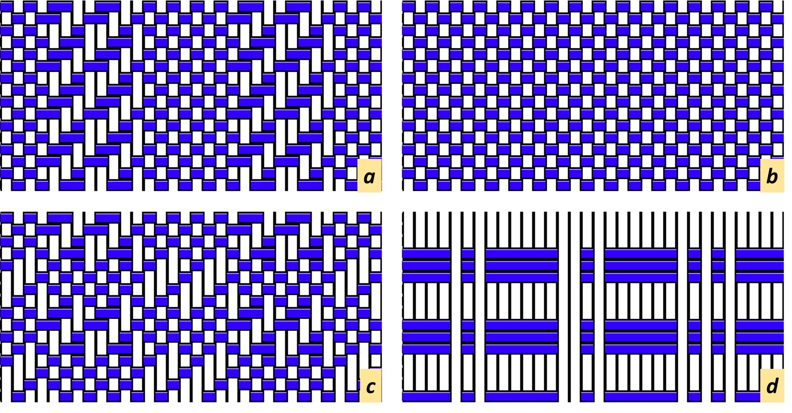
In classroom conversations, drawing from their hands-on weaving practice, students reach consensus that patterns c and a would be the most complex to execute, while d would be the least. We then look at the sizes of the .GIF image files for these four patterns on my computer and find that the sizes of the files decrease in corresponding order: 14432 and 14002 bytes for files c and a, respectively; 13647 for file b; and 9326 bytes for file d. The punchline is that patterns that are more complex to weave on a shaft loom require more space to store on a computer, because the corresponding image files fundamentally contain more information. This exemplifies a fundamental connection between the complexity of generating a pattern and the compressibility of a file that represents the pattern as binary data. Something oblique perhaps about the value of labor.
Data compression is, itself, a second principal theme of the class. I center this topic as we first learn how to read block drafts, which we do in the context of loom-guided laces in the book by Strickler.6 For the aims of this article, rather than fleshing out the pedagogical details let me instead jump back to my erstwhile quest for threadings that support “graphically macro” forms of improvisational weaving. While working through the Strickler chapters on Bronson lace, it finally sank in for me that block drafts of this type allow you to divide your warp ends into groups that can be independently switched between tabby and lace-spots “on the fly.”7 One night doing class prep I put this together with memories of an old red-LED travel alarm clock and cobbled together a seven-segment LED weaving draft in FiberWorks. A version of this draft (requiring seven shafts; eight treadles on a floor loom) is provided in the Recipe below; Figure 2 shows a photo (displayed in two orientations rotated by 180°) of my first sample woven on my table loom. I had the draft (the “information”) already back in 2020, and started trying to weave a sample in late 2022 but wasn’t able to make it look right because I made an unwise choice of yarn to use as weft.8 Getting to the product in Figure 2 required an alternative idea about the weft yarn that didn’t occur to me until a year later, but I’m sure a more experienced weaver would have known better from the start.
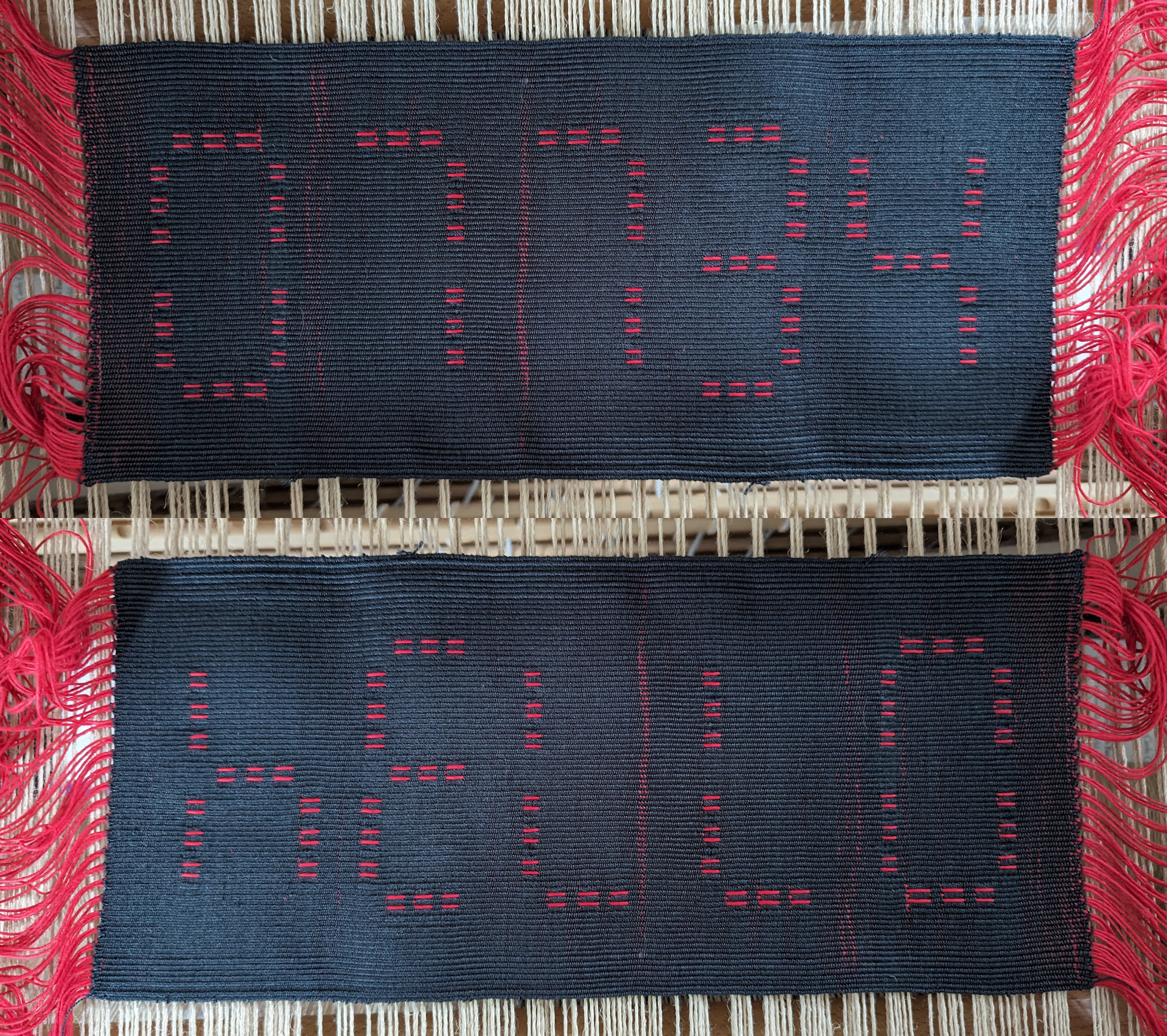
Those of us old enough to remember sitting in a schoolroom with an LED/LCD hand-held calculator are probably familiar with calculator words; in this sample I attempted to produce one via shaft-loom weaving. With the high contrast of a red warp and black weft—emulating an old-fashioned seven-segment LED display—the weave really needs to be wholly weft-faced to look right. Even with a suitable choice of weft yarn it took me a little while to get the hang of doing this so you can see the packing improve from the left side of the upper image (early picks) to the right side (final picks). This photo shows the sample just off the loom, without any type of wet finishing.
A third theme I highlight in my class is the idea of nested layers of coding, which I try to extend from the engineering context towards media studies following the work of Kristen Haring. In the first few weeks of the syllabus I have the students read several papers on layers of topological and material coding in Andean khipus; now that I have the Figure 2 sample to work with, I’ll plan in future iterations of the class to ask my students to unpack its layers as well. At the very base there is the binary over-under of all woven structures; using a draft such as mine, the warp ends are divided into five switchable sets (plus some fixed always-tabby spacers)9 that implement an overlain binary code of tabby versus lace-spot weave structures; by choosing appropriate shedding sequences one can then use this structure-switching to create patterns that mimic the ten decimal digits of seven-segment displays; by choosing appropriate digit sequences one can weave patterns that also read as English words when the cloth is rotated; by choosing suggestive warp and weft colors, and weaving in a very weft-faced way, one can produce cloth that recalls the vintage paradigm of calculator words with its accompanying nostalgic sentiments for viewers of a certain age. As early parts of the class syllabus introduces students to Jacquard, Babbage, and Lovelace, I hope they’ll immediately appreciate how this kind of textile artifact embodies further historical entanglements of weaving and computing.
I wonder how the “lo-fi” aesthetic of calculator words—tied as it is to a clever, almost subversive repurposing of a display strategy constrained by techno-industrial wherewithal of its time—may relate to Svetlana Boym’s notion of reflective nostalgia, especially when materialized via thoughtfully designed patterns hand-woven on an ancient type of loom, swimming against the tide of generative AI and digital fabrication. I’m no luddite, but seeing the “hello” sample come together on my little table loom kindled a precious feeling of limpid, heterodox satisfaction. As emerging technologies remove so many long-standing difficulties from the creative process, perhaps we could focus a bit less on what we think we are gaining and a bit more on what we may be losing. Will we forget how it feels to overcome a processual impasse that has vexed us for years? As makers, will we lose the urge to strive?
I circle back to the notion of algorithmic complexity. “Ask a generative AI for an image of fireflies in a temple garden, in the style of ukiyo-e; upload the file to a digital jacquard weaving service.” One can execute this program in mere minutes—how marvelous is the resulting yardage? This helps me remember how thrilled my students are when they harvest their first eight-inch mats of plain weave from their looms.
This work has been supported by the National Science Foundation (award CCF-1918549).
Footnotes
1. Many familiar fabric structures, with distinct structural variants and endless possible color combinations, can be woven on a loom with four shafts. This leads some weavers to think of more intricate fabric structures, which might require up to sixteen or even thirty-two shafts to weave, as fanciful. Others lean into the diametric appeal of pushing the boundaries of complex many-shaft weaving, with eight-shaft structures representing a sort of gateway… ↩
2. The cycle and rhythm of hand-weaving is simple at its core, however, the most straightforward threadings and the simplest shedding sequences (for which it is not too difficult to keep track of which step of the sequence you are at while weaving) tend to produce structural patterns that are like tilings of the cloth with small tiles — think of a tiling a wall with small tiles, of which you only have a few types to work with. Depending on your aesthetic tastes, you may develop a yearning as a weaver to do something more like gesturally painting that wall (your fabric structure) with bold and irregular strokes. ↩
3. A basic principle of overshot drafts is to separate the functions of making your cloth structurally stable (not too loose, such that it would easily snag or grossly deform) and creating visible patterns through the process of shaft weaving. Often this is done by alternating two different weft yarns/colors (for example by alternating between two different shuttles in subsequent iterations of the basic weaving cycle), with one weft yarn used to establish a background plain weave, and the other to superimpose a looser unconstrained pattern. This strategy can lend itself to a sort of improvisational weaving, in which the background plain weave remains unaltered but the weaver improvises the shedding sequence for the pattern weft only — an approach that in practice feels a bit like scribbling (as an indirect consequence of the types of threadings used in basic overshot drafts). ↩
4.Shibori here refers to traditional Japanese methods of “tie-dying”. ↩
5. Twills, overshots, and loom-guided laces are distinct categories of traditional weaving drafts. In my class, students first thread their looms for weaving twills and weave twills for a while, then re-thread their looms for weaving overshot drafts and weave those for a while, then finally re-thread their looms for weaving loom-guided laces and weave those for a while, including for their final projects. Each re-threading of the loom takes a novice several hours of meticulous work and presents many opportunities for making mistakes that need to be identified and corrected. The progression from twills to overshots to laces represents increasing complexity in the threading and weaving processes. ↩
6. Drafts in the category of loom-guided laces are often represented in both pedagogical books and online weaving resources using a block notation. I like to include these because reading and understanding a block draft requires procedural thinking skills related to those required for writing computer programming code, and exercise concepts that also underlie computational data compression. I find that students who may consider themselves averse to math or programming classes can be sufficiently motivated to learn to read block drafts if they are sufficiently motivated by the appeal of weaving lace structures on their table looms. ↩
7. This is to say, that the type of threading utilized in Bronson Lace drafts can be adapted to support a weaving procedure in which the weaver can improvisationally decide, while they are weaving, to switch between tabby (another term for plain weave) or lace structures for rectangular patches within the fabric. In practice this feels like laying down rows of cards on a table (as an analogy to weaving) with free choice of which contrasting face of each card should be up — this is meant to contrast with the sense of scribbling described in footnote 3. ↩
8. I initially tried using a thick fuzzy (and somewhat stiff) yarn as the weft, which did not lend itself to achieving a truly weft-faced cloth structure. As noted in the Recipe below, I switched to a much more supple weft yarn with much better results. ↩
9. See footnote 7; the “five switchable sets” and “tabby spacers” represent five groups of flippable cards (where every card within a given group must show the same face) plus several cards that always have to show their tabby (as opposed to lace) face in the rows I describe in my card-laying analogy for weaving. In the seven-segment LED fabric structure, the switchable sets represent segments of the LED that could be chosen by the weaver either to appear “on” (red/warp color) or “off” (black/weft color) as the cloth is being woven. ↩
Weaving primer/glossary
For readers unfamiliar with weaving, please find below a brief narrative description of the weaving process as it relates to my article, followed by some definitions of specific terms. You may find it most helpful to consider the narrative alongside a video showing the weaving process on a table loom (for example this YouTube video). The Wikipedia entry on weaving also has a few diagrams that help to establish the basic distinction between warp and weft.
In traditional weaving on a shaft loom, a set of yarn segments – the warp ends – are stretched within a plane parallel to the ground, oriented so that they all run to/from the weaver, with roughly equal spacing between them. Each warp end is threaded through one shaft of the loom, with the loom having at least two (and typically four to sixteen) independent shafts. To weave cloth, the weaver repeats a cycle of first raising a subset of the shafts to pull the corresponding warp ends up above the initial plane, passes (typically using a shuttle of some kind) weft yarn across the set of warp ends through the vertical opening between the raised subset and the rest, packs (typically using a reed or sword beater) the newly-lain weft yarn against the accumulated weft segments from previous iterations of this sequence, and finally lowers the raised subset of shafts (or changes the raised subset of shafts to jump directly into the next iteration of the cycle). Different weave structures are achieved according to how the warp ends are threaded through the several shafts (with any such scheme referred to as “a threading”), and the weaver’s choice of which shafts to raise during each iteration of the weaving cycle (with the sequence of such choices referred to as the shedding sequence). The combination of a threading scheme and a shedding sequence, which together produce a specific cloth structure, is referred to as a weaving draft. Weavers have developed various notations for recording and communicating weaving drafts, including some (e.g., block drafts) that incorporate data compression schemes.
Warp – yarn segments running along the length of a cloth, which are arranged by the weaver in the process of setting up their loom, before weaving. Each yarn segment of the warp is called an end.
Shaft – mechanical elements utilized in certain types of looms, including table looms and floor looms, which are used to selectively raise/lower subsets of all the warp ends.
Draft – see narrative.
Weft – yarn segments running across the cloth, which are arranged by the weaver during the process of weaving. Each weft crossing of the cloth is called a pick.
Treadle – a foot pedal incorporated in floor looms (a floor loom will typically have two to twelve treadles) that is mechanically connected to a subset of the shafts, such that weaver can raise this subset of shafts altogether by stepping on the corresponding treadle.
Weft-faced – refers to a manner of weaving in which the weft yarn largely hides the warp yarn on the “top” face (whichever face is meant to be viewed) of the cloth.
Packing – refers to how densely or loosely the sequence of weft picks are beaten against one another.
Pick – see Weft.
Wet finishing – refers to a common practice of soaking and lightly agitating cloth in water after it has been cut off the loom, in order to allow the warp and weft yarns to shift and settle to relax displacements associated with uneven tensions/friction built up in the process of weaving.
Shedding sequence – see narrative.
Recipe
What You’ll Need: a table loom with at least seven shafts (heddle counts are 42 heddles on shaft 1, 24 on 2, 2 on 3, 6 on 4, 2 on 5, 6 on 6, and 2 on 7) or a floor loom with at least seven shafts and at least eight treadles; a reed suitable for sleying 84 ends at 12 EPI; red warp yarn (this draft calls for 84 ends and I reeled 3 yards per end for my compact table loom, hence roughly 252 yards) suitable for weaving at high warp tension (I used 8/4 carpet warp); a shuttle (for this type of narrow cloth I found it most convenient to use a simple stick shuttle); black weft yarn preferably supple to help achieve weft-faced weave (I used 10/2 mercerized cotton, and for weft-faced weaving you may want to plan for 14” of weft yarn per pick and the maximum picks-per-inch that your weft yarn will pack to — I ended up with roughly 40 weft picks-per-inch and a total weave length of 14” for the draft below, hence roughly 218 yards).
As noted in the article text, we only require five sets of warp ends to be switchable between tabby and lace-spots in order to be able to weave patterns that emulate the digits of a seven-segment LED display. In Figure 3 these warp regions are labeled 3, 4, 5, 6, and 7 using boldface red numerals along the left edge of the simulated cloth—warp ends in this image run left-to-right, and progressing from left to right in the simulated cloth represents sequential weft picks. Weaving warp region 3 as lace or tabby turns the top horizontal bar on or off; region 4 controls both the upper-left and upper-right vertical bars; region 5 controls the middle horizontal bar; region 6 controls the lower-left and lower-right vertical bars; and region 7 controls the bottom horizontal bar.
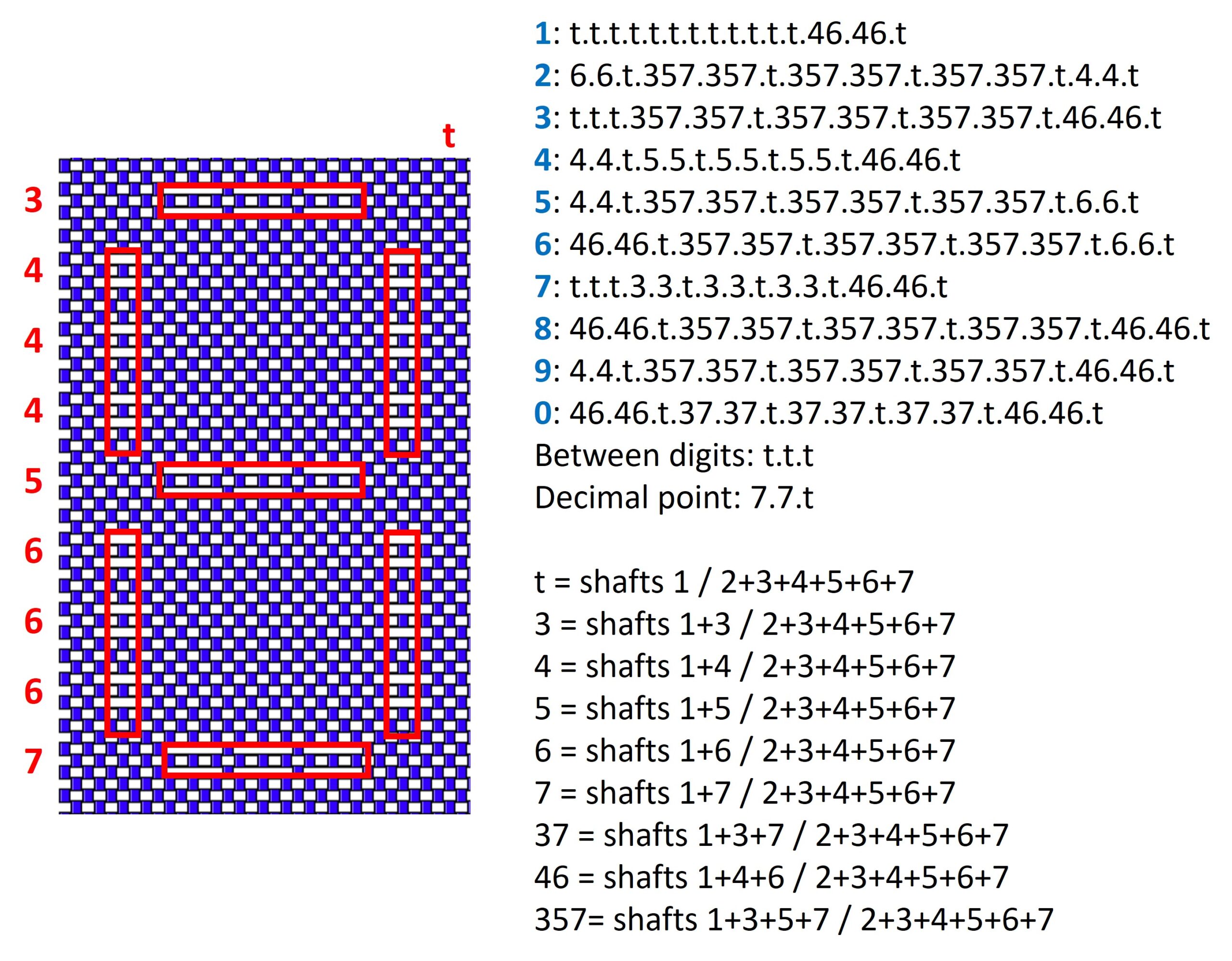
The text lines in the upper-right part of Figure 3 provide a key for how to weave decimal digits. There is one text line per digit (displayed as a boldface blue numeral); each text line has the format of a sequence of pick-pairs (labeled t, 3, 4, 5, 6, 7, 37, 46, and 357) separated by periods. The pick-pairs are spelled out in the lower-right part of Figure 3. For example, the pick-pair “46” is a pick with shafts 1, 4, and 6 raised, followed by a pick with shafts 2, 3, 4, 5, 6, and 7 raised. In order to weave a “spacer” region between digits a sequence of “t” (tabby) pick-pairs is used. As the fabric needs to be quite weft-faced to look like red LED segments displayed against a black background, you will almost certainly need to adjust the number of repeats within the LED/lace segments and spacer/tabby segments as you weave. Think of the key in Figure 3 as a starting guide.
The sample shown in Figure 2 can be reproduced using the threading and shedding sequence shown in this PDF (generated from a FiberWorks draft with the cloth type specified as weft-faced; the simulated cloth appearance as balanced weave is shown in this PDF). Again, you will likely need to adjust the number of repeats in segments/spacers according to warp tension and weft packing—once you see how the pattern works you can just do this by eye. For the sample shown in Figure 2, the warp is 8/4 cotton carpet warp at 12 EPI in a 12-dent reed and the weft is 10/2 mercerized cotton.
Knot Hard: Accessible Textile Data Visualization with a Circular Knitting Machine
“That is such a cool idea, but I’m not crafty at all.”
I hear this a lot when I mention that I run a Textile Makerspace, and teach Data Visualization with Textiles. It’s easy to see where people are coming from: temperature blankets, covid scarves, quilted topographic maps, embroidered Greek epic poetry — the data visualizations with textiles that have filtered into the attention of the general public all involve a significant amount of time and skill and thoughtful creativity. But the lure of being able to wear your data, or just turn it into a thing you can hold in your hands, draws in not only those who have cultivated a serious maker-hobby. This is where a circular knitting machine shines.
I learned to knit for the first time in high school, where I passed time in English and History classes making a small shoulder bag and a scarf: my only two creations before setting the craft aside. Even once I learned to sew and started making my own clothes, I remained certain that knitting wasn’t for me — and doubly so once I got a serger (a specialized sewing machine) to sew sweaters out of knitted fabric. I was too impatient for knitting, I told myself, overlooking the well of patience I’d managed to dig for myself between having three kids and learning to code. When a library colleague, Amanda Whitmire, started posting her adventures with a circular knitting machine, it felt like a way to open up new paths for data visualization without committing to learn a craft that seemed overwhelming in its time- and skill-demands. All you have to do is crank a handle, and yarn turns into a scarf.
The four vignettes in this piece trace my attempts to incorporate the circular knitting machine into my developing practice of textile data visualization, illustrating some of the ups and downs of learning to translate data into machine knitting. I’ll conclude with a few thoughts about why you might want to consider adding a circular knitting machine to your makerspace, or as a machine that you can share with others for team-building activities, or mental health breaks.
Why you might want a circular knitting machine
Circular knitting machines — particularly small ones like the 22-needle AddiExpress machine — are small, more affordable than most textile equipment (around $120), highly portable (thanks to the legs unscrewing), and a very accessible way to nudge people into textile making, even people who self-identify as “not crafty at all”. They’re fairly sturdy, but if someone uses a yarn too thick for the machine and pushes hard enough to break a needle, replacing a needle takes less than 10 minutes and is not a big deal, even if you’re not super comfortable disassembling machinery. If you can crank a handle, you can make a scarf. If you can count things and make a spreadsheet and do some very basic math in that spreadsheet, you can make a data scarf that can be both beautiful and filled with meaning — if you choose to explain it. By only having a small number of needles in a single gauge and fixed spacing between them, the circular knitting machine constrains the decision space of textile data visualization, in a way that is helpful for those new to this approach. Still, there are many facets you can play with: color, material (fiber content of the yarn), texture, length (of the piece overall and individual pieces of yarn), and patterns — none of which require textile craft skills beyond tying knots and cranking the handle. For those with other craft skills and interests– including embroidery, crochet, sewing, and hand-knitting– these can be fruitfully combined with knitted scarves or panels to add nuance and complexity to the textile data visualization.
Standing meetings
An internal grant funded a small and large Addi circular knitting machine for the Makerspace in January 2023, and I went looking for data to knit with this new tool. The most obvious use of it is to make scarves, which fit well with the season. I quickly settled on my own calendar: what were my standing meetings for the previous year? How often were they held vs. canceled? Like so many DH projects, it started with a spreadsheet: one row for each week, one column for each weekly standing meeting (my academic department, my immediate organization in the library, the Humanities and Area Studies librarian meeting I attend, and the Research Data Services group that had recently formed). One symbol if the meeting were held, another if it were canceled, and additional symbols if I was on vacation or a work-related trip during that meeting’s time slot.
I figured out that the yarn needed to knit one row on the smaller machine stretched roughly from my shoulder to fingertips, but it was far from precise. A great deal depended on how uniformly I tied the knot connecting the bits of yarn, and consistency is still not my strength. As one early experiment after another failed with dropped stitches leaving gaping holes, I concluded that tying the yarn together as I was knitting was making the task harder than it had to be. Stopping and starting the machine to tie knots was leading to dropped stitches much more often than if all the data were prepped in advance into a neat ball where I could crank the handle continuously and evenly. Thus the data ball was born, a physicalization of the kind of cleaning and reformatting work we so often do with data, transforming it from a spreadsheet into something knittable. The parallels with other DH projects were striking: the biggest time sink came from gathering the data, and preparing it in the right way. This work feels minimally-skilled, but in practice it involves moments of decision-making that can shape the outcome in ways that can be hard to anticipate in advance. Should consecutive black segments be cut and tied together, since they represent discrete cancellations? Or for the sake of expediency should multiple cancellations just be a single, long piece? And how to guesstimate the length, to account for the knots that would not need to be tied?

After all the preparation, knitting a scarf– much like creating charts or graphs– took almost no time at all.

This first project continues to be one of my favorite examples of textile data visualization. By chance, around 200 rows turned out to be a pretty reasonable scarf length, though on future ones I’ve leaned more towards 250. The colors I picked and the frequency of canceled meetings made for a visually attractive striped scarf, even without an explanation of the data. It also serves as a good example of the subversive language of textiles, making a wearable that lays bare — if you know how to read it — the mismatch between a meeting’s stated importance and the number of times it was actually held.
Love Data Week
Like many libraries, Stanford Libraries organized a series of events for Love Data Week in mid-February 2023. The sequel to the standing meetings scarf was born from a fit of pique: I was irked at this event telling me how I should feel about data. “How,” I wondered, “do people actually feel about data? What if we went descriptive instead of prescriptive?” The morning of the Love Data Fair, I made several copies of a survey with a single question, asking people to share their feelings about data. I posted one to the library Slack, another to Mastodon (where I had been spending time online since Elon Musk’s Twitter takeover), and I asked a colleague to post the third to Twitter.
I made a mistake with the survey I soon came to regret, allowing an “Other” option with a write-in, in addition to the options “I love data”, “Mixed feelings”, “I hate data”, “No feelings”. Qualitative data is more challenging to translate into yarn, especially when you’re only thinking in terms of yarn colors and a uniform mechanical stitch.
I spent the Love Data Fair preparing the data ball. This one was simpler than the standing meeting data scarf, since that scarf represented multiple facets: meetings (yarn colors) and time (scarf length), while this one would only represent survey responses. For each data source, I simply aggregated and counted the survey responses, which led to long sections of each color. As people came by the Textiles + Data booth at the Love Data Fair, I asked them about their feelings about data, adding their results to a smaller data ball that would eventually be joined to the main one.

In the last half-hour of the fair, I clamped the circular knitting machine to a table and invited people to help with the knitting. This invitation was met with the same mix of puzzlement, curiosity, and wariness one often finds in the digital humanities classroom: Do I trust myself to not break this machine? What if I make a mistake? Is this actually a good idea? All my tech- and data-oriented colleagues faced with this bizarre new machine are very used to those reactions from students in workshops, but it’s another thing entirely to experience those anxieties yourself with a technology unfamiliar to you. To my surprise, textiles had become a tool for cultivating empathy.


Data-Sitters Club
Since 2019, The Data-Sitters Club has been collaborating on a friendly, colloquial guide to computational text analysis, using Ann M. Martin’s The Baby-Sitters Club series. We had never all met in person until March 2023, when Roopika Risam threw a Data-Sitters Club retreat over a couple snowy days at Dartmouth. Snacks and crafts were essential supplies for such an event.

Over the course of a couple days, and further inspired by a visit to Jacque Wernimont’s Digital Justice Lab (well-stocked with a digital knitting machine, looms, fibers of all sorts, and some marvelous creations in various stages of development), the Data-Sitters gathered their data, assembled data balls, and almost everyone went home with a scarf. It helped that we all knew each other and had plenty to talk about while constructing the data balls, but a similar setup could also work well for an open workshop: find and prep an interesting data set, offer some basic tools for analyzing it in different ways (e.g. Voyant if you’re working with a text data set), and let people come up with different questions about the data alone or in groups. Those groups could then work together to get the numbers they need, and each person could assemble and knit their own data ball.

Lee Skallerup Bessette worked with the Baby-Sitters Club Fandom Wiki to find out how many of the Baby-Sitters Club books were translated into each language identified there, and make one row per book per translated language. Anouk Lang and I worked with our own data about the Ann M. Martin Papers at Smith College, charting which book had which kind of supporting materials (e.g. synopses, outlines, other notes) in the archives. Maria Cecire and I calculated the average sentence length for each book, and she used that data. Katia Bowers focused on the publication history of the Baby-Sitters Club books, month by month, from 1986-2006.

Knitting the scarves took time, and spilled over into the sleepover portion of the retreat: not all the yarns were equally cooperative with the machines, and we had to go slowly and carefully to avoid dropping stitches. Dropped stitches can be recovered while the knitting is still on the machine using a crochet hook to connect it through however many rounds have passed since the stitch was missed; sometimes, though, it’s easier to just secure the stitch after the fact by passing a small length of yarn through the floating loop and tying it on the inside of the scarf, and I patched up a few mistakes on the scarves that way.


As the owner of the knitting machine, I saved my data knitting for the flight home. Here I can say that attaching the circular knitting machine to the tray table and using it on a plane is technically possible but not recommended. The jostling of the plane made it easier to drop stitches, and the long screws of the clamps poked uncomfortably– even as someone much smaller than an airplane seat. There were enough dropped stitches at the end that I unwound the scarf and swore I’d re-knit it, but the data ball remains in my office.


Hong Kong
In May 2023, I visited Hong Kong University as part of the New Horizons for Digital Humanities event organized by Javier Cha. While my official contribution to the event was a talk on digital cultural heritage preservation and a workshop with Melanie Walsh on multilingual NLP using fanfic data, I also wanted to bring in the textiles that were becoming an increasingly meaningful part of my work. I held a lunch workshop on data visualization with textiles, talking through a couple of example projects and the tools I’d used to make them. As a follow-up, I enlisted all the workshop participants — in-person and virtual — in a brief survey about how long they had traveled to attend: ranging from 0 minutes (virtual participants) to over 30 hours (Gimena del Rio Riande, whose route from Buenos Aires took her via Addis Ababa).

I’d traveled with just my backpack and one carry-on, but packed it full of yarn, roving (wool for spinning into yarn), along with my travel e-spinner for creating the yarn, and a handful of beads. I consulted with Gimena on mapping the survey results to colors; this time I wasn’t trying to make a scarf, but just a flat-panel visualization. The circular knitting machine has a flat-panel switch that treats the black needles as stoppers — so you go back and forth between, rather than in full circles. It takes a little practice to get the hang of it: you have to turn the handle a little further than you think you should, as if to start a stitch on one of the black needles, but then that stitch is caught on the first white needle when you change directions.

The panel was only the first part of this visualization: I wanted to capture both time and space in people’s travel. I asked the student assistants at the conference to print me out an image with a Dymaxion projection of the world map (my favorite projection), and a map of Hong Kong, which I set about attempting to embroider in yarn on the knit panel. It was a frustrating and illuminating experience: the knitting machine does not produce very dense fabric, which limits the amount of detail you can include. If part of the goal of the Dymaxion projection is to disorient viewers used to a centered view of North America and Europe on their maps, an embroidered map on a knit panel is all the more disorienting through its inevitable distortion of land shapes.


The Hong Kong embroidery had similar challenges, trying to include enough detail to be recognizable with prompting, but also ensure enough room to capture people’s travel paths. On top of it all, I struggle with geography even under ideal circumstances, so trying to translate from locations on Google Maps, to corresponding locations on my paper map cut-outs, to where that would be on the knit panel, was no small challenge.


I worked with my fellow panelists to trace our flights — not trying to mimic actual flight paths, but just getting a piece of string from a departure airport to its destination. Red beads marked the airports we’d left from and orange ones marked the airports we only transferred through.

For the local attendees, yarn color indicated travel mode. I used a darker blue for MTR (subway) transit, yellow was for bus, and pink was for car. Walking paths were a spun single (rather than plied) yarn strand because they were so short. One participant wanted to represent rather than simplify his complex data, where he uses one means of transit to drop off his daughter, and another to go from her school to the workshop. For that, we tied two colors of yarn together, and put the knot in the center of the path.

The final piece, given to the organizers as a thank-you gift, was a joyfully chaotic thing, made collaboratively and with love for the circumstances that brought us together for that week.

Conclusion
When I got the circular knitting machine, only a bit over a year ago as I write this, I was fully convinced that this would be how I would interact with knitting and the yarn-based arts in general. A year later, I’ve picked up crochet and become very fond of hand-knitting, and the flexibility it offers in contrast to the machine. Even though I don’t use mine regularly anymore, I wouldn’t have ended up here if I hadn’t started with the circular knitting machine, and I’m quick to bring it out for workshops and events, in case it sparks that same journey for someone else … or just lets them create a really cozy scarf in less than a half hour.
Off the Wheel and Off the Rails: When Making and Teaching Go Wrong
An aspect of making and crafting I considered when invited to contribute to this special issue on physical data visualization is the possibility of confronting failure, especially the failure in the make, and the outcome possibly going very wrong. To be able to learn and grow as a crafter and data viz creator is to make many failed attempts before achieving some mastery. While the literature on “academic failure” focuses on the concept of student failure in learning1, little discusses the aspect of failure regarding program planning and implementing innovative teaching methods2. We read articles and postings of crafted data visualizations, and admire the beautifully knitted temperature scarf, or the carefully embroidered bar plots. What we rarely see are all the dropped stitches, the warped fabric, or the Play-Doh getting stuck in the carpet.
What I hope to be able to cover in my contribution is highlighting what happens when things don’t go according to plan, and how we can learn from that. Focusing on the outcomes from a workshop I led on crafting data visualization, I use my own experiences learning to make pottery, especially learning to measure my expectations about what I can create, to reflect on the process and the ways things can go wrong in teaching.
If there is anything guaranteed in ceramics, it is that you’ll leave behind a trail of failed makes before you make anything you’re happy with. Everything else is unpredictable, from the first attempt at centering your ball of clay on the wheel, to the final firing after glazing.
I picked up pottery in 2022 after my spouse and I completed a cross-country move for new jobs in a city I’ve never been to, in an attempt to be social and meet people outside of work, and to try the rare form of crafting that appealed to both of us (while I have a constant need to make things with my hands and developed a collection of cross-stitching, knitting, legos, and painting supplies, my spouse was never one to do arts & crafts until he joined me in binging “The Great Pottery Throwdown”3).
You’re told early on that being able to shape clay and make things on the wheel is magical, a result of the “body knowledge”, the muscle memory developed to instantly make cups, bowls, and pots with your hands4. As an amateur potter, you hope to go from haphazard clay mass to identifiable shapes in a few short lessons and tries on the wheel. Since my first time in the studio, I can only call myself mildly proficient in working with clay. Every part of making a piece is a waiting game in hoping that nothing breaks, and a small mistake early on can bring down all your efforts.
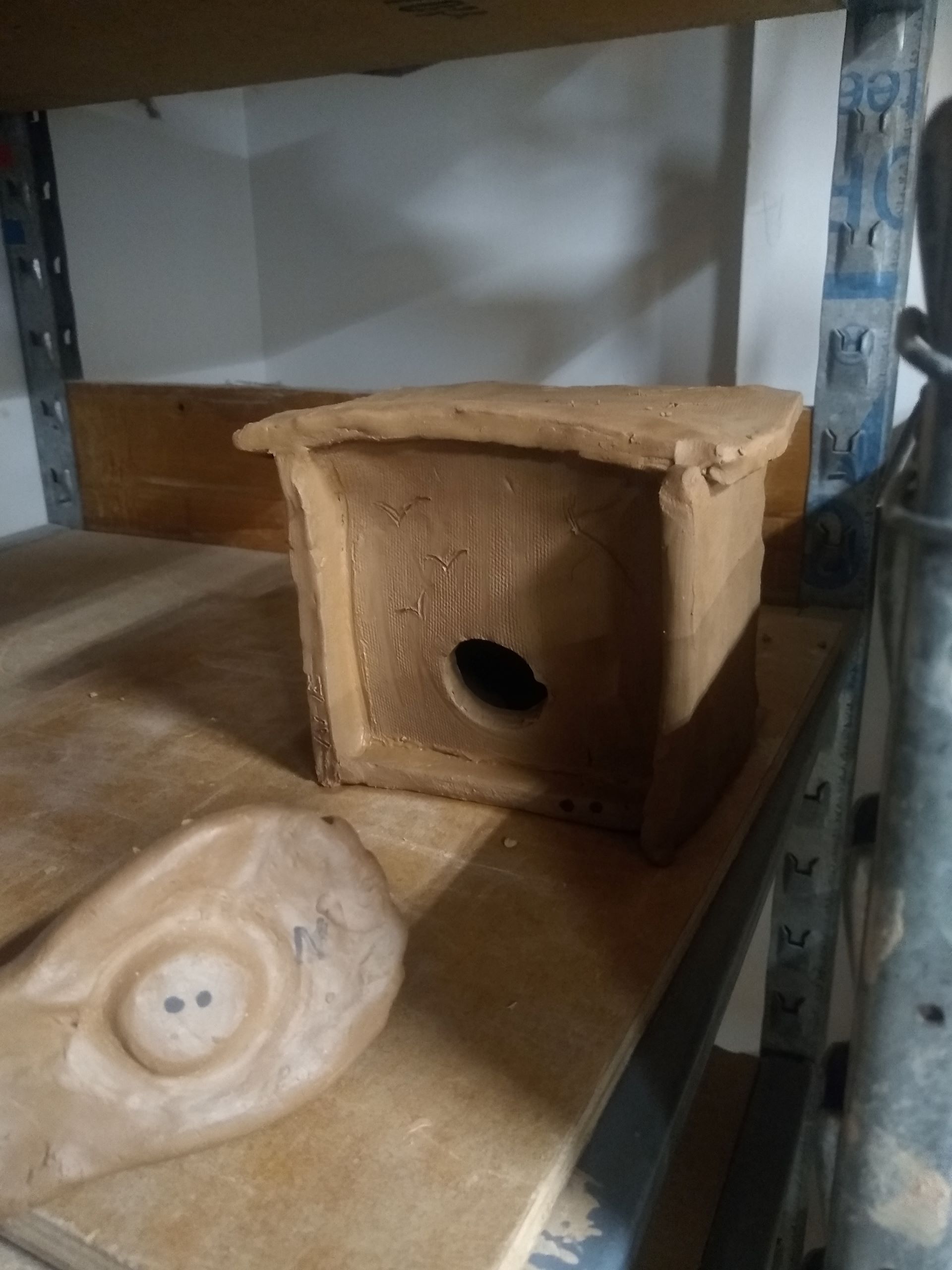
Before you can learn how to make on the wheel, you have to learn how to wedge and center your clay. Wedging uses your hands to mix the clay and ensures no air bubbles, much like kneading bread. Once wedged, you plop your ball of clay on the wheel head, smack it a couple of times to ensure it doesn’t fly off, and begin centering. The clay will want to fly out with the speed of the wheel, so centering keeps the clay in the center (you think this is obvious, but doing this is much harder than you think). Centering also makes sure that your walls are of equal thickness when you pull up. You need to use physical strength to center, and the more clay, the more force you need to apply. Without centering correctly, your pieces come out uneven, the clay will fly everywhere, and you might pull a muscle5.
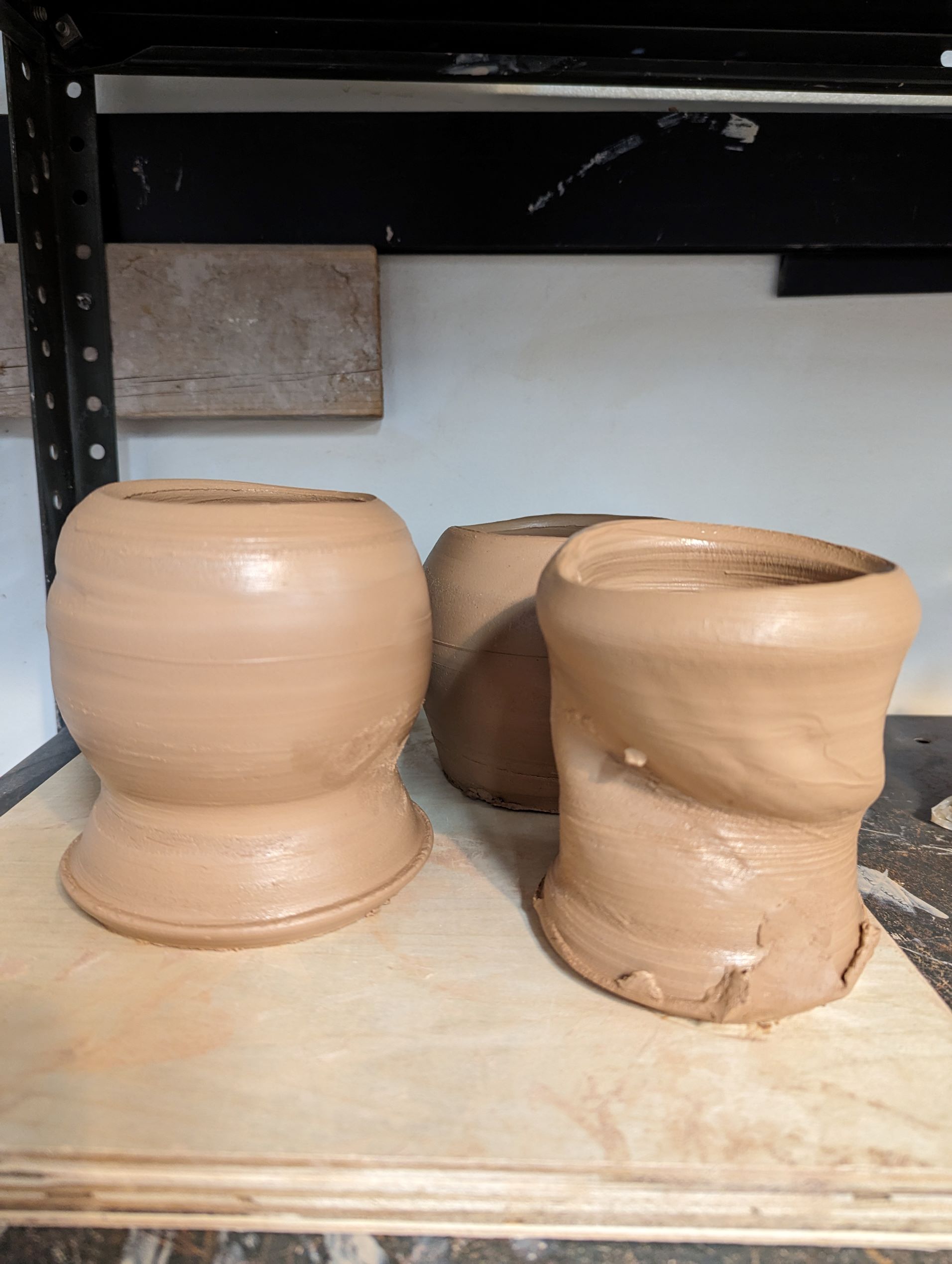
Despite more than a year of learning in the studio, I still have a hard time centering. And yet, because I am stubborn, and because I’m in classes with others and begin to compare my skills to theirs, I power on in trying to make anything. My walls become uneven, I can’t pull tall walls, and my makes just collapse and break, but I thought that because I “understood” the concept of centering, it was enough. Sometimes this will work in my favor, but most times my pieces definitely do not look professional.
While I would be tempted to destroy the pieces that come out badly (and I do this to pieces that are beyond saving), I keep the ones with obvious errors. I find my makes precious since they have to go through a journey in the kiln, where they may break or explode. But I also tell myself each of the ways the pieces are deficient, and what I should have done instead. I tell myself that this will help me learn and grow in pottery. It’s a lesson I try to apply in my library work, especially when things aren’t going the way I hope.
In Spring 2023, I hosted a workshop on crafting data visualization for our digital scholarship group on campus. Physical makes of data visualization had been making the rounds on social media, and I had been inspired by Claudia Berger’s talk on Embodied Data6 to try something new. I also wanted to bring some levity and a possible new way to destress for our DS community, especially near the end of the school year. This wasn’t my first workshop; I had been leading library instruction sessions and workshops since 2020 and may have felt a little too secure in my abilities to pull off my plans. However, my plans for this workshop were a bit too ambitious for my skill level. The plan was for a hybrid, 2-hour long workshop, with the first hour focused on the history and cases of artistic crafted data visualizations, and the second hour used to learn basic crafting skills and how to make data viz. There were plans for a separate virtual crafting session for the attendees who couldn’t make it in person. The event was advertised for a few weeks, reaching beyond the digital scholarship community. I made sure to have yarn, needles, crochet hooks, Play-Doh, and any other materials I could think of to supply the crafting hour. I thought I was ready.
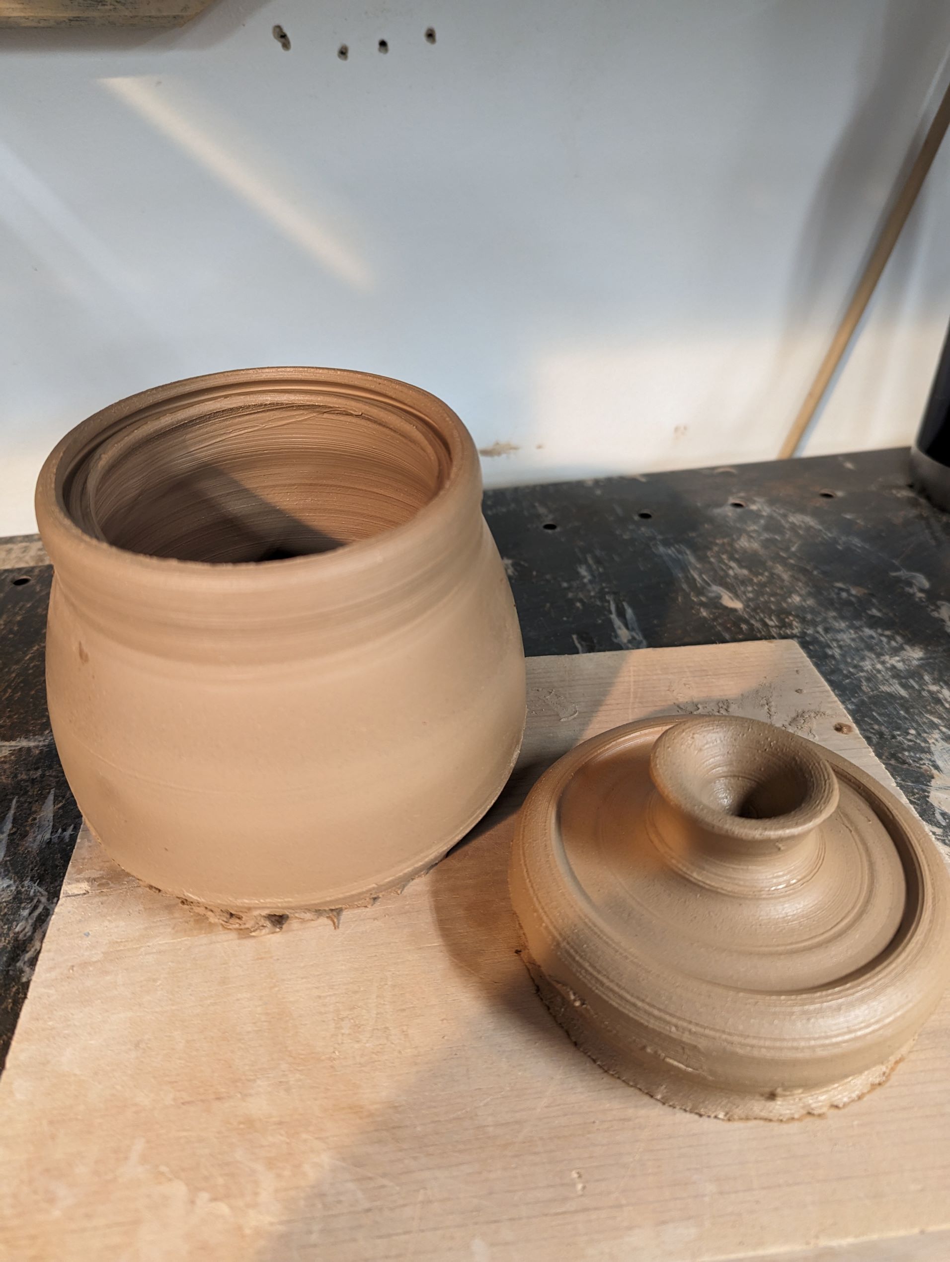
On the day of the presentation, about 20 people joined in on Zoom, which was great! But, only 4 attendees, including our tech help who had to be there and a student who thought this was a traditional digital data visualization workshop, appeared for the in-person. Throughout the presentation, tech problems plagued the first hour, my mic kept on cutting out, and our Zoom attendees lost most of the first part of the presentation. The second hour wasn’t any better. I couldn’t get any of the participants to engage with the materials I brought. The overall feeling I had at the end of the workshop was of utter failure7.
This publication is about crafted data, but what can you craft when the data is close to zero? The answer would be nothing. If I wanted to make a stretch of an argument, I could make the argument that the crafted piece represents how the data makes me feel. Instead, I would rather focus on process, and how there’s commonality in the trial and error in working on things you spent so much time, resources, and energy on8.
When I think about the workshop, I think about how I let it go so wrong. But I also think about how when you’re making something, whether tangible or not, you can’t always expect perfection. You learn from the mistakes. You figure out whether the wheel was going too fast, whether the tension on your pulls was off, or whether your clay was too weak. And then you try again. Maybe I should have tried a different channel for advertising the workshop. Maybe I should have been clearer on what I wanted participants to do.
But you also don’t beat yourself up too much for how things turn out. You should be happy you made a thing! It’s not perfect, but you made it, and it’s yours. My workshop wasn’t perfect, but people showed up, and they heard me talk about something I think is pretty neat. We fail, and we learn, and we keep trying.
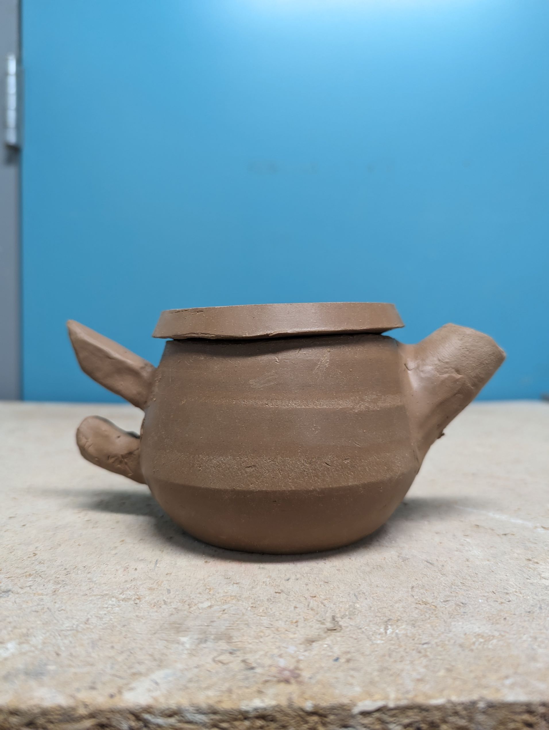
I’d like to thank Claudia Berger for both inspiring this attempt to teach physical data viz, as well as inviting me to contribute to this special issue. I’d also like to thank Pamella Lach who, along with Claudia, edited this piece and gave such thoughtful, supportive, and constructive feedback. This piece is better thanks to them.
References
Berger, Claudia. 2022. “‘Embodied Data Visualizations’ at DH Unbound 2022 https://claudiaeberger.com/embodied-data/embodied-data-visualizations-at-dh-unbound-2022/.
Carter, Ben, Linda Jane Arbuckle. 2016. Mastering the Potter’s Wheel: Technique, Tips, and Tricks for Potters. Minneapolis, MN: Voyageur Press.
Donte the Potter [pseud.]. “Centering for beginner [sic](common mistakes made),” posted April 4, 2019, YouTube video, 17:27, https://youtu.be/RXuUL_JzFs4?si=4sc554400tDh8HnW
Eckstein, Lydia E., Amelia B. Finaret, and Lisa B. Whitenack. 2023. “Teaching the Inevitable: Embracing a Pedagogy of Failure.” Teaching and Learning Inquiry 11 (May). https://doi.org/10.20343/teachlearninqu.11.16.
Gadsby, Florian. “How to Center Clay – A Beginner’s Guide,” posted March 27, 2022, YouTube video, 16:44, https://youtu.be/-YCGK33c0xs?si=uksIprn2wRtyqzKL
Holmes, Linda. “The Soothing ‘Great Pottery Throw Down’ Makes Great Isolation TV,” NPR, September 17, 2020, https://www.npr.org/2020/09/17/913564272/the-soothing-great-pottery-throw-down-makes-great-isolation-tv
Neff, Kristin D, Ya-Ping Hsieh, and Kullaya Dejitterat. 2005. “Self-Compassion, Achievement Goals, and Coping with Academic Failure.” Self & Identity 4 (3): 263–87. https://doi.org/10.1080/13576500444000317.
Norton, Christina, Anne Armstrong, Dee Anna Phares, Kristin Allen, Amy Hall, and Tish Hayes. 2023. “‘Survive and Sustain’: Adaptive and Innovative Library Instruction in the Time of COVID-19.” Internet Reference Services Quarterly 27 (2): 55–82. https://doi.org/10.1080/10875301.2022.2163021.
Proctor, Christopher L., Courtney M. Block, and Melanie E. Hughes. 2021. “Disaster Librarianship: Reflections on Teaching and Learning from the Heart of the Campus.” Journal of Teaching and Learning with Technology 10 (1). https://scholarworks.iu.edu/journals/index.php/jotlt/article/view/31289.
Vladis, Nathalie, Aspen Hopkins, and Arvind Satyanarayan. 2020. “Data Crafting: Exploring Data through Craft and Play.” In IEEE VIS Workshop on Data Vis Activities to Facilitate Learning, Reflecting, Discussing, and Designing. http://vis.csail.mit.edu/pubs/data-crafting/.
1. See Neff, Kristin D, Ya-Ping Hsieh, and Kullaya Dejitterat. 2005. “Self-Compassion, Achievement Goals, and Coping with Academic Failure.” Self & Identity 4 (3): 263–87. https://doi.org/10.1080/13576500444000317., Eckstein, Lydia E., Amelia B. Finaret, and Lisa B. Whitenack. 2023. “Teaching the Inevitable: Embracing a Pedagogy of Failure.” Teaching and Learning Inquiry 11 (May). https://doi.org/10.20343/teachlearninqu.11.16.
↩2. The exception being literature related to COVID-19. Example: Norton, Christina, Anne Armstrong, Dee Anna Phares, Kristin Allen, Amy Hall, and Tish Hayes. 2023. “‘Survive and Sustain’: Adaptive and Innovative Library Instruction in the Time of COVID-19.” Internet Reference Services Quarterly 27 (2): 55–82. https://doi.org/10.1080/10875301.2022.2163021., Proctor, Christopher L., Courtney M. Block, and Melanie E. Hughes. 2021. “Disaster Librarianship: Reflections on Teaching and Learning from the Heart of the Campus.” Journal of Teaching and Learning with Technology 10 (1). https://scholarworks.iu.edu/journals/index.php/jotlt/article/view/31289.
↩
3. “The Great Pottery Throwdown” is a British reality competition show that began in 2015 and has continued (with gaps around 2018-2020). Amatuer potters complete challenges every week that highlight various ceramic skills, with the goal of winning the title of “potter of the week” every episode and winning the overall series at the end. NPR’s pop culture critic Linda Holmes explains the appeal of the show in, “The Soothing ‘Great Pottery Throw Down’ Makes Great Isolation TV,” NPR, September 17, 2020, https://www.npr.org/2020/09/17/913564272/the-soothing-great-pottery-throw-down-makes-great-isolation-tv
↩
4. Ben Carter, Linda Jane Arbuckle, Mastering the Potter’s Wheel: Technique, Tips, and Tricks for Potters. ↩
5. If you’d like to see these steps in action, YouTube is very helpful. Earth Nation Ceramics (https://www.youtube.com/@EarthNationCeramics) and Florian Gadsby (https://www.youtube.com/@floriangadsby) are two channels I think are good at explaining the processes. Specifically, Gadsby’s “How to Center Clay – A Beginner’s Guide” (uploaded March 27, 2022 https://youtu.be/-YCGK33c0xs?si=f2xE13FmuGgyICh-) and ENC’s “Centering for beginner [sic](common mistakes made)” (uploaded April 4, 2019 https://youtu.be/RXuUL_JzFs4?si=4sc554400tDh8HnW).
↩
6. “‘Embodied Data Visualizations’ at DH Unbound 2022 – Claudia Berger.” 2022. May 31, 2022. https://claudiaeberger.com/embodied-data/embodied-data-visualizations-at-dh-unbound-2022/. ↩
7. If you’d like to learn about a workshop that was successful, see Vladis, Nathalie, Aspen Hopkins, and Arvind Satyanarayan. 2020. “Data Crafting: Exploring Data through Craft and Play.” In IEEE VIS Workshop on Data Vis Activities to Facilitate Learning, Reflecting, Discussing, and Designing. http://vis.csail.mit.edu/pubs/data-crafting/.
↩
8. There’s another discussion worth having here about the similarities of the steep learning curves of certain crafts and tools used to make data viz, especially noting how intimidating they both can be. ↩
Developing a Creative Practice with Ceramic Data Physicalizations
Introduction
Over the past year I have been researching and crafting a data physicalization piece titled Me & You, 2024 (porcelain and thread, Figure 1). The resulting piece maps the physical locations of three significant people in my life in relation to where I lived at the time. Thread was weaved in between the shapes starting at the time we met to signify our relationship through time and space. This essay documents the creative process to create this work and a repository for personal reflections. In addition, this essay aims to offer transparency in my process, providing a potential guide for others seeking to embark on their own data physicalization projects and inspire the growth of their own creative practices.
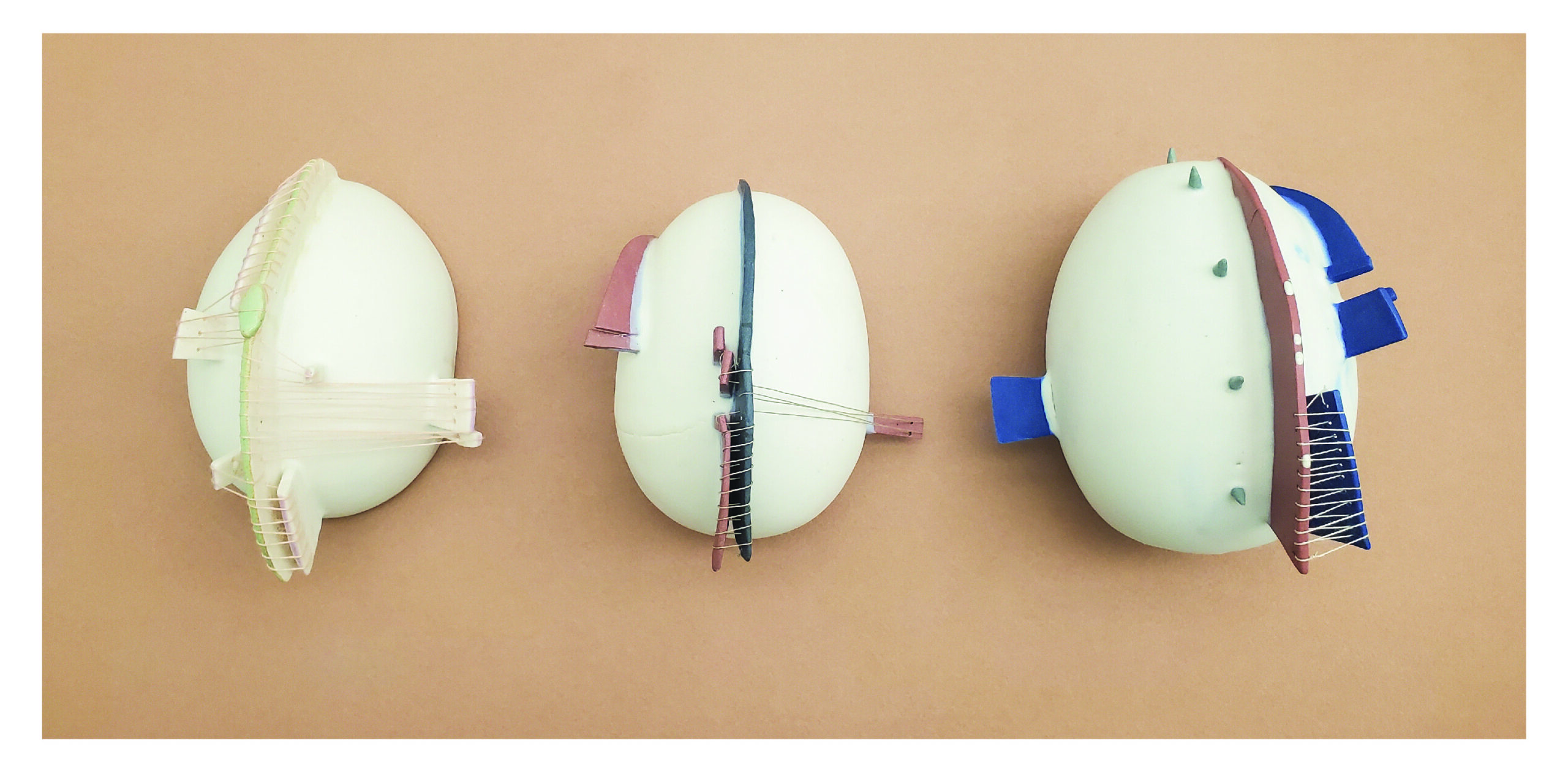
Throughout the creation of Me & You, I developed a practice grounded in experimentation and research, drawing from my background as both a scientist and an artist. This essay delves into the distinctions between crafting a data physicalization piece and producing 2D data visualizations on a computer. It explores the commonalities and differences in how I create art and data science work.
The essay unfolds in two main parts. The initial section establishes the personal and cultural foundations that shape my approach to creating a data physicalization piece. The subsequent part delves into the construction of the artwork, with a specific focus on the chosen medium — porcelain clay. The essay concludes with a reflective segment, wherein I contemplate the lessons and insights from this project, shaping my future endeavors in data and art.
Through conceiving Me & You and writing this essay, I navigated the intricacies of encoding the world as observed and explored through the physicalization of data and how this practice may extend the communication process beyond the confines of 2D representations and sculptures alone. Ultimately, this process underscores the significance of intentionally situating one’s perspective within a project, emphasizing transparency in the process, and recognizing its influence on how the audience interprets the final work.
Part One: Cultural and Personal Foundation
Encoding and Abstracting Meaning in Data Visualization and Data Physicalization
Comparing the practice of creating science and art is a complex philosophical exploration and is beyond the scope of this writing. That said, I borrowed from both my science and art practices when creating Me & You. Personally, I am less interested in how science and art are defined and compared and more interested in the process underlying them – specifically, abstracting the world to make sense of patterns.
Artists collect ideas about the (or their) world and develop a language to convey them from repeated themes and aesthetics defined by their artistic voice. For example, painters, over the years, form their artistic style and voice by defining a visual language, rearranging color and form to communicate a personal truth for themselves. Artists are always filtering the world through themselves to get to the end results. The process is similar to that of a data scientist but with the possible difference in how “truth” is defined and conveyed. Scientists strive for a truth that exists regardless of human interpretation, a pattern outside of the influence of human understanding. This includes a common falsity that if data is handled correctly, the scientist’s influence is not part of the process, that somehow they are expressing a truth beyond themselves and even beyond personal or cultural bias. Most scientific analysis aims to erase the human(s) influence who measured, quantified, and performed the work.
We must always remind ourselves that numbers are still abstractions of reality. The moment we measure is the moment we imprint ourselves and our perspective into the truth we are measuring. In data visualization, we further abstract numbers into a visual language using form and color. These are unavoidable human-mediated separations from reality. I’m very interested in exploring how our abstractions and the hundreds of decisions involved in data processing, some consciously and some unconsciously, are based on our inherent personal and cultural backgrounds. Data work is always an extension of ourselves.
This opposes what is practiced in the art world, where there is almost an expectation of artists to center themselves in their work. The act of writing an artist statement and describing their intentions when creating a piece through presentation and critique is common. Artists often highlight their personal choices when describing their process for creating a piece. Their story is celebrated in the creation of the work. This was one of the aims when I began the process of creating a data physicalization piece – to center myself in the process, my past, views, perceptions, and aesthetics. It was something I rarely do when working on any other data project, but why?
Data physicalization offers possibilities for interpretation beyond art and data viz alone because it exists in this middle realm between the two and can absorb the strengths of communication from both. In the end, data viz and artwork are further absorbed and interpreted by the personal and cultural backgrounds of our audience, and we begin a dialog of what the piece is saying. Form and color, the language of visual art, is rife with personal and cultural associations, modulating throughout a person’s lifetime and culturally throughout human history. The final piece has the creator’s metaphorical fingerprints all over the piece and grows infinitely more imbued with human influence through the audience’s personal and cultural background. Creating a data visualization and/or an art piece and putting it out into the world is a messy and beautiful cacophony of humans trying to make sense of and communicate patterns.
Part 2: Building Me & You
In this section, I explain how and why I made certain decisions when building Me & You in hopes that others can gain some insight into how they might approach creating a data physicalization piece using clay.
Step Zero: Working with Porcelain
What fascinates me most about data and art is the concept of pattern finding and communication, especially in the context of human evolution. Humans and clay have had an intimate relationship dating back 21,000 to 13,800 years [1]. Our first wheel was used not for transportation but as a pottery wheel [2]. Clay is an ideal material to meditate on the large time scale of human thought and innovation. Clay is millions of years old, containing the minerals, sediment and rocks from rivers, glaciers, and ocean floors that were once mountain tops, as well as long decomposed plants and animals. The clay is imbued with deep time and an earthy liveness, soon to be reincarnated by my hands and intentions. The main reason I chose clay, and porcelain in particular, is because with porcelain, it is easy to see the artist’s presence within the piece. You can easily see fingerprints, mistakes, or subtle nudges. As opposed to stoneware clay which is more coarse in texture and harder to see fine details. I like observing when work is handmade, and the transparency in process, further exemplify centering the artist within the work.
Step One: Establishing Standards of Experimentation
In computational data science work, you can reiterate and rapidly manipulate variables to iterate fast through the same processes and subtly isolate variables to test their influence on the final product. However, when creating a physical data object, there are limits to redoing something. Test tiles are commonly used in pottery work, they are small (so as not to take up precious space in the kiln) clay tiles a way to prototype different aspects of the work. Test tiles are used to experiment, a way to isolate variables and rapidly test them. Experimentation can occur along many axes. For example, physical form is necessary to test physical limits (i.e., cracking, structural balance) or aesthetic choices (i.e., color, design, form). But, when communicating quantitative characteristics, it is vital that these choices are tested for interpretability. I used test tiles as a method to prototype and standardize encoding data points, allowing for reiteration of the final tiles based on creative preferences. I chose a simple circle as my form, which I made with cookie cutters of different sizes (Figures 2 and 3). When I found forms that resonated with me, I would prototype them on larger objects (Figure 4).
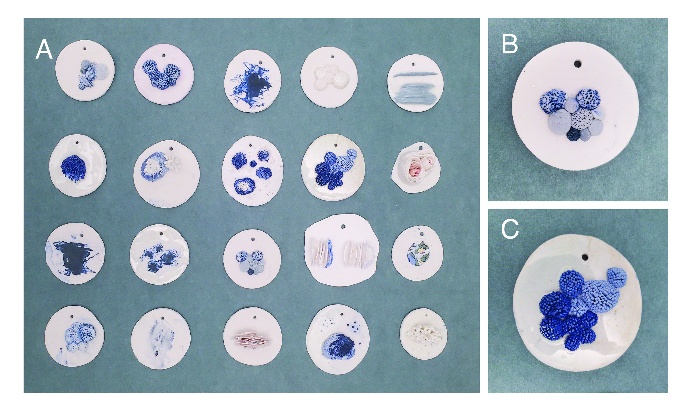
Step Two: Observing and Encoding
What I found instrumental in encoding quantity (numbers) into clay was a scale for measuring weight. If I were interested in a certain form, I weighed out different clay weights and built each form with the different weights. This was also important for standardizing the color of the clay in early experiments (Figure 3), weighing the amount of pigment to adjust hue and shade. I ended up doing many color experiments, but in the end, for creating Me & You, color does not encode anything quantitative. Any color present in the final product was based on personal aesthetics, another nod to centering myself. I also wanted to limit what I encoded and allow exploration beyond vision for the encoding process. In theory, intentional quantitative abstractions in Me & You can all be communicated through touch.
Again, the guiding principle was centering myself in the work, something I rarely do in scientific data visualization. The design and aesthetic choices that did not encode “data” were choices that I found aesthetically beautiful – for example, the colors used, the shape of the clay form, and the smooth texture. The main fin-like shape that encodes my physical relation throughout my life is unapologetically in the center, transversing the spine of the sphere form (my world). Even though I physically moved in geographic locations many times in my life, the “You” position changed, reflecting more of my truth than reality. I celebrated my bias within every decision. Even in the title “Me & You,” Me is before You, even though it is less grammatically accepted.
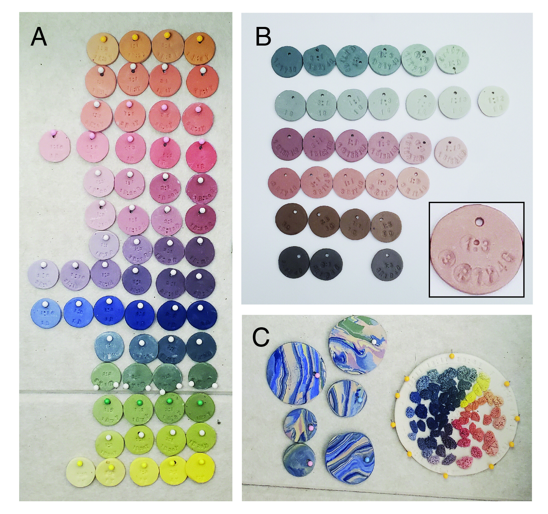
Step Three: Choosing Visual Language and Data Theme and Prototyping
The dataset was determined in congruence to experimentation with material. This process was very different from how I create a sculpture and how I perform scientific data work. I knew I wanted the work to tell a story of personal relationships, so I began playing with my cell phone data and the data of friends, etc. It was a back-and-forth dialog on how each data story would fit with the test tiles I was defining in Steps 1 and 2. Then a series of prototyping on larger shapes (Figure 4). After reading about data physicalization, I was surprised to learn that this may be a common approach. In a systematic examination of the creation process for various data physicalization projects, it was frequently observed that, during the initial stages of dataset selection, designers often found themselves simultaneously engaged in the later phases of creating the work [3].
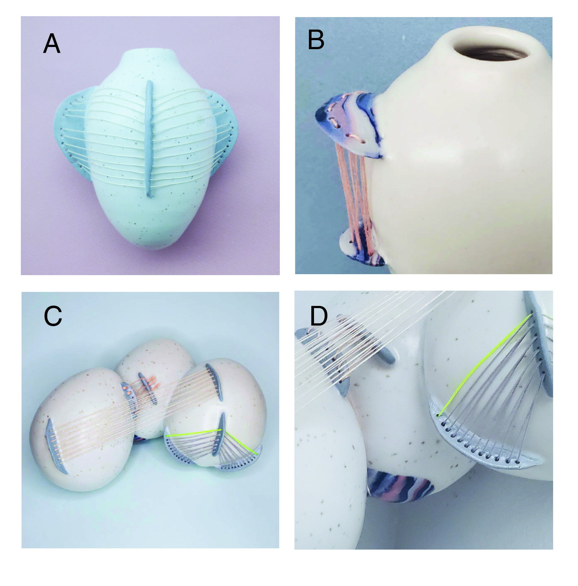
The encoding I landed on was spatial relationships in my life throughout time. The “Me” center fin-shape begins at the top of the piece and is furthest back in time. The shape grows in height as age/time progresses. The “You” (all other shapes) represent a significant person’s geographic relationship to me through time, left of center is west of me, while right is east of me (see example key in Figure 5A and 5B). Even if I am the person moving geographically, their shapes move, the piece reflects my perception. Even after centering myself in the work, I felt the “us” component was needed, so I chose to encode our relationship as thread weaved between our shapes throughout time. The thread starts from the year we met and spans time and space as we live our lives till now.
Step Four: Execution
The execution was the fastest part, which is something I didn’t anticipate. At some point, when the visual language was achieved, and I landed with a dataset that would fit, the data collection was straightforward. I reached out to three significant people in my life: my husband, my sister, and one of my best friends. I talked through where they lived throughout their lifetime and calculated how many miles away I was from them for each year. The furthest distance was mapped onto the furthest space I could place a point on the clay form, and all numbers were normalized from there. The execution felt more like building a functional piece of work since my intentions in my quantitative approach were explicitly defined, I had a step by step guide and the structure was already tested, I just had to do the measurements and cut the pieces. The thread was sewn after firing, encoding our connection throughout our lives – my younger sister’s connections began when I was born, while with my husband, the thread joining our pieces did not begin until halfway through my life. Note: A clearly visible landmark is the two years my husband and I were separated while he lived in France, this can be seen on the right hand side or our piece (Figure 1 middle, Figure 5E).
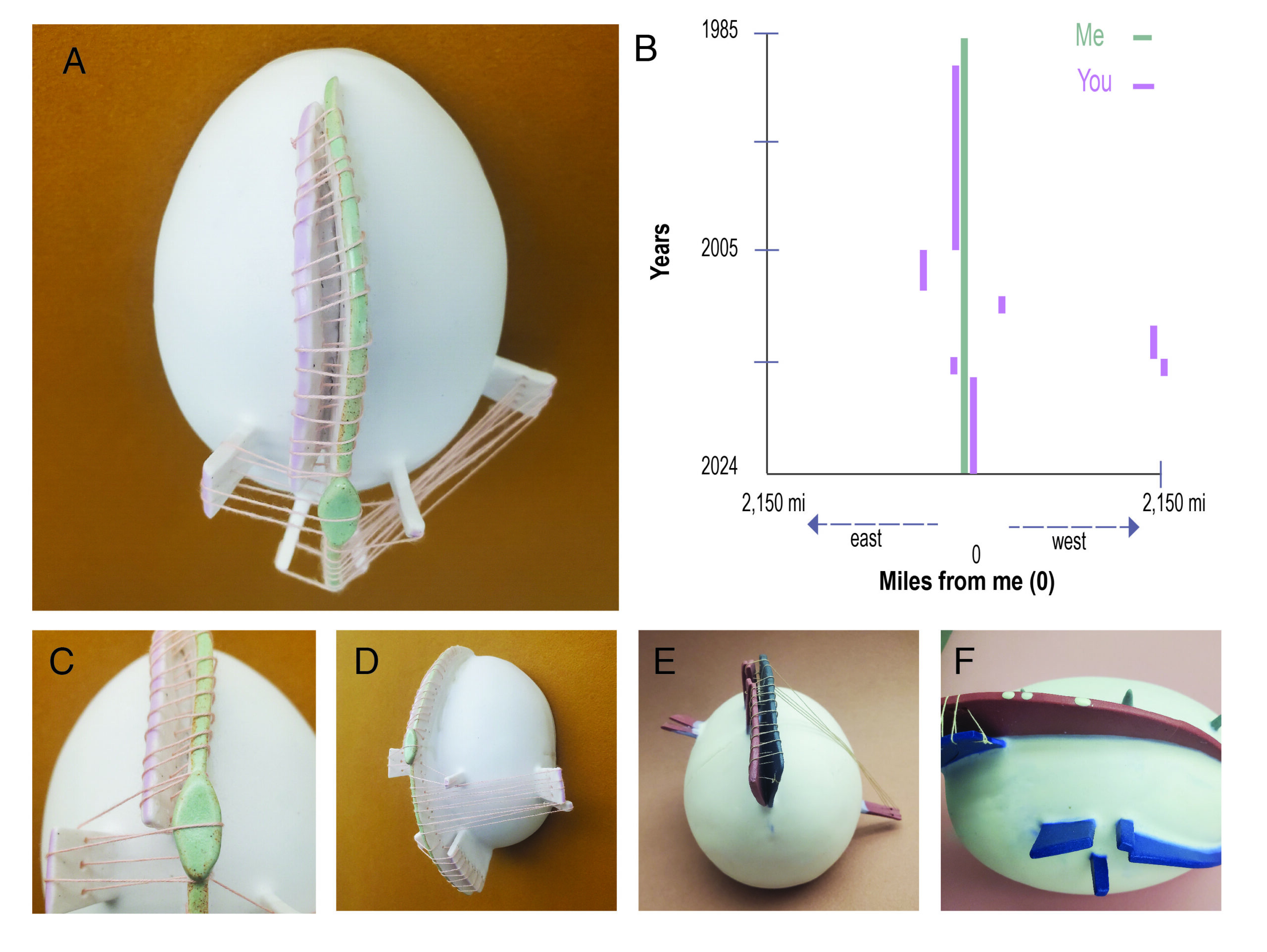
Part 3: Reflection
When designing a data physicalization piece, the overarching goal is communicating with others. In Hornecker et al., 2023 [3], the authors attempt to map what vocabularies exist for data physicalization, further categorized into three categories based on intention: 1. implicit, 2. explicit, and 3. unintentional. This is an incredibly valuable way of thinking about not only data physicalization pieces but, in my opinion, art in general. More importantly, this framework provides a common language for practitioners to communicate their design decisions. A data physicalization piece offers the creator the ability to communicate intention in a more straightforward way than a sculpture alone. To describe the data “key” for a data visualization piece is expected and the intention deliberately described. While there is a strength in not describing intention, allowing “critical inquiry into materiality, context, and the process of making,”[4].I found that describing the encoding made the viewer spend more time trying to understand what the piece was saying.
After creating Me & You, I haven’t stopped thinking of people in my life within the visual language I developed, abstracting the many divergent patterns of relationships I’ve had in my life. How do I quantify connection? Did I lose connection with some people I don’t interact with anymore – how would I encode those relationships? I have shown this work to different types of audiences and was surprised at how engaged the response was in both art and data critiques. There is something in seeing data presented in this way, forcing the audience to lean in and pay attention. Often, viewers transposed their lives and decisions into the visual language and began dreaming up their own symbols. Interesting questions were discussed: How do you represent death or pregnancy? What if you never reveal what the symbols mean? With the “key” hidden, how does this change the meaning to both the artist and the viewer? Engaging in physicalization compels us to reassess conventional concepts surrounding data[4].
The unpredictability of working with clay and the firing process forced some unintentional but now valued aspects of the work. For example, there was a crack in the spine of one of the fins shapes for the piece with my sister. I obscured the crack by placing a diamond shape over it (Figure 5C). Only after making this decision did I observe that the crack formed at the exact year that my sister and I separated from where we lived for the first time in our lives. And now, the crack and mending adopted meaning and became a symbol – a movement from unintentional to intentional. This is a natural dialog that happens when creating art and extends to the audience. The unintentional has its own life in the interpretation of a piece of art, while in scientific data work, this modulation is often thought of as a flaw – scientists do not want unintended meaning when communicating results. The unintentional chaos in the behavior of clay also began to reflect how I think of bias in all data work, that bias is unavoidable. There is always an unintentional bias when measuring reality. It is a reminder that crisp, clean lines seen in most data visualizations are never the representation of reality. Somehow, random modulation in form is closer to the truth.
I’m continually trying to articulate to myself why I’m attracted to data work because the word “data” has many negative cultural associations. Data lacks emotion and is boring, sterile, nerdy, and/or unapproachable. Again, from my perspective, doing data and artwork is a continuation of human curiosity. Finding patterns, predicting the future, and acting on those patterns, I would argue, it is what makes us human. Whether our final product is art, science, craft, or survival, abstracting the world for pattern is to be human. And incorporating quantitative information is leveraging the (almost) universal cultural understanding of numbers as a language to communicate ideas and the patterns we find. Data physicalization is a way to convey information that is impossible to define using numbers or language alone – when we further abstract the number into a 3D physical representation with material, we are able to embed cultural and personal information from the material itself. When it comes to embracing the commonalities in intention between creating data and artwork and the opportunities that arise when combining them in data physicalization, what I find most exciting is not the result but the process of finding and communicating those patterns. It is how we connect and make sense of the world – this is why I love data work.
Special Thanks to the Data Science by Design Book Club, which, through thoughtful (and fun!) discussion, helped me tease apart how to think about the intersection of art, creativity, craft, data science, and ethics. And thank you to the artists of the Compound Art Gallery and Studio Art Critique group for your insightful comments during the creation of Me & You.
References
1. Boaretto, E. et al. Radiocarbon dating of charcoal and bone collagen associated with early pottery at Yuchanyan Cave, Hunan Province, China. Proc. Natl. Acad. Sci. U. S. A. 106, 9595–9600 (2009).
2. Baldi, J. & Roux, V. The innovation of the potter’s wheel: a comparative perspective between Mesopotamia and the southern Levant. Levantina 48, 236–253 (2016).
3. Hornecker, E., Hogan, T., Hinrichs, U. & Van Koningsbruggen, R. A Design Vocabulary for Data Physicalization. ACM Trans. Comput.-Hum. Interact. 31, 1–62 (2023).
4. Offenhuber, D. What We Talk About When We Talk About Data Physicality. IEEE Comput. Graph. Appl. 40, 25–37 (2020).