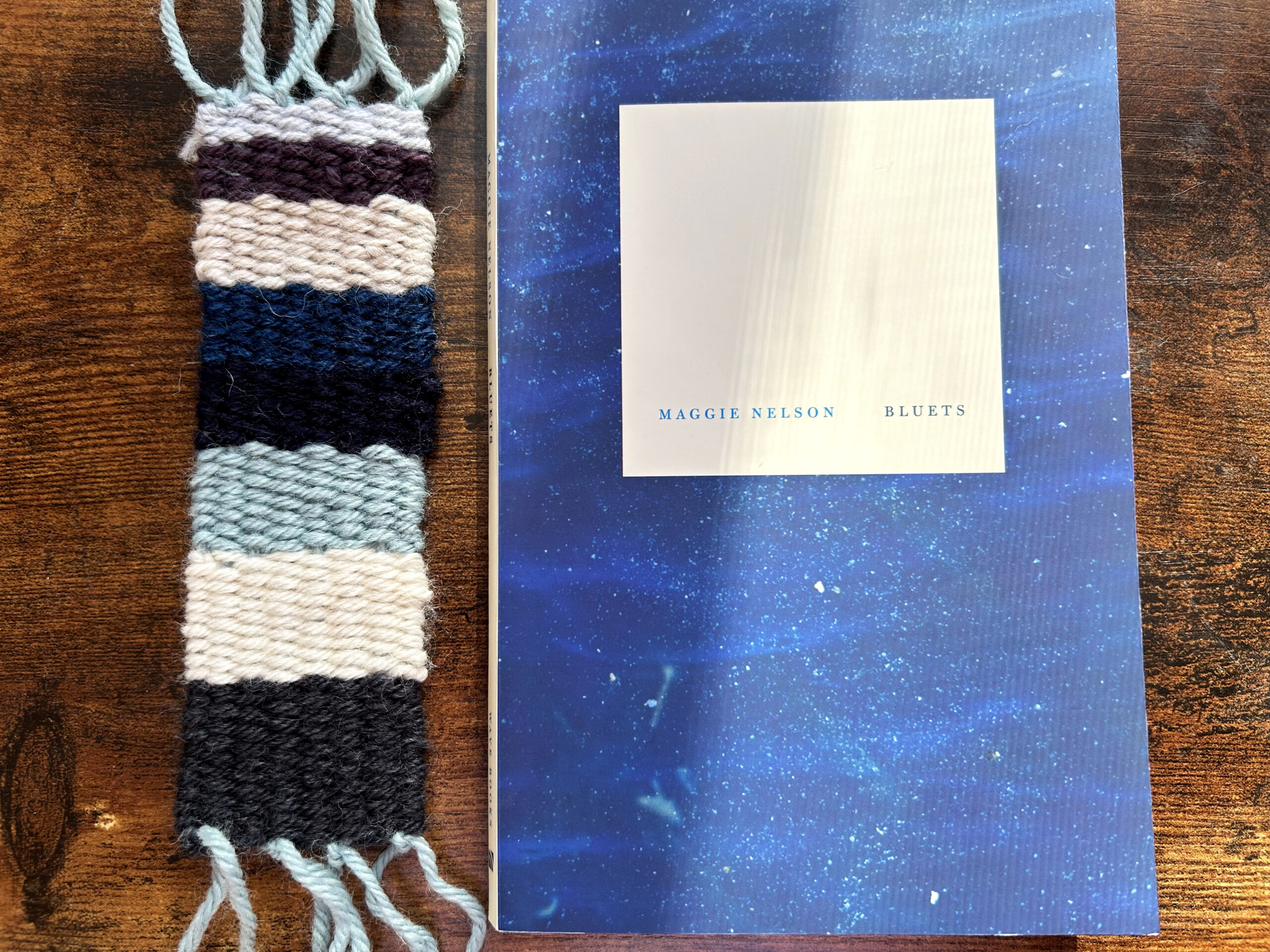
Maggie Nelson’s book, Bluets and the final data physicalization, a woven bookmark based on emotional data from the book.
Color has long had a deep connection to our emotions, which cuts through different cultures, time periods, and contexts, from textiles and architecture to design and art. Goethe was the first Western color theorist to suggest that colors have a direct effect on our physical and psychological wellbeing. Writing in his book, Theory of Colours, he argues, “yellow excites a warm and agreeable impression” and “blue tends to melancholy and sadness.” [1] These ideas still resonate, some 200 years later, as notions around the healing properties of green crystals or the power of purple to reduce anxiety persist. The connection between colors and emotions has been explored by many data artists and designers, and there are even algorithms that will automatically select “appropriate” colors for data visualizations, such as pink for data about love. [2] These kinds of algorithms are often based on Western stereotypes or cultural repetition of color in relation to a given topic. There is no inherent reason why pink should suggest love. It is only through the repeated use of pink in Valentine’s Day cards and romance novel covers that, especially in an American context, the color pink tends to be associated with love. In this project, I was interested in exploring this connection between color and emotion, especially as it is expressed through language. Although words and language are not the only, and not even necessarily the primary way, we might express emotions, it is the way emotion comes through in literature and writing. However, language in literature is never straightforward, and emotional moments are infused with varied meanings and contradictory implications. It was in this complicated mix of interpretation, language, and emotion, that I explored Maggie Nelson’s book Bluets, to pull forth an emotional analysis of the book and create a data physicalization in the form of a woven bookmark.
Data physicalizations can be defined as physical artifacts whose geometrical shape or material properties encode data. [3] Data physicalizations have the capacity to change our relationship to and understanding of data, and as others have argued, one of the key ideas around data physicalizations is that they can deepen our emotional connection to data. [4,5,6] If we can touch data, might it make the data feel more personal? If, for example, we can wrap ourselves in a scarf based on weather data, will it help us to think more deeply about the climate crisis? Data physicalizations can take many forms, and utilize different materials, such as wood, metal, textiles, plastics, liquid, and clay. Recent works in the emerging area of data cuisine have even explored food as a material for expressing emotional data. [7] In my project, I have used wool yarn, both as a practical material that works well for weaving as well as a material that is soft to the touch and not too thick to slip into a book.
Data physicalizations are often less explicit than 2-D representations, which are typically created on paper or a computer screen, but there is nothing inherent in data that suggests it needs to be situated in a particular medium. One of the effects of this is that 3-D work may be more open to interpretation. With a data bookmark, there is no way to know what the data means or what it represents, unless someone explains it. There may be ways to intuit what the data means, especially if we think of familiar, cultural representations of color (e.g. love and pink, or in this case, blue and melancholy). However, what I find interesting about data bookmarks is that it is a deeply personal data representation. It’s not meant for anyone else and doesn’t need to adhere to cultural or social expectations. It’s meant for the reader, me, to connect more deeply with the book I am reading, and perhaps to serve as a reminder of the book should I ever return to it later. If I created many data bookmarks, they could even serve as a kind of archive of my own personal library.
There are additional qualities—built into the medium—that come to life in data physicalizations beyond the data. For example, a metal sculpture may feel cold; an ice physicalization may melt and change over time; a piece made from tissue paper might feel light and fragile, blown away by the wind. These are all additional, experiential, characteristics that add to the interpretive and sensory experience of data physicalizations. At the same time, many data physicalizations borrow similar representational practices as computer-based designs, such as the use of color, shape, and size to correlate to particular data points. Quilts, knitting, and weaving can easily adapt shapes and styles, such as bar charts and line graphs, but increasingly, data artists are exploring ways to leverage the properties of the material to move beyond the kinds of representations we can already do on paper or screen.
Physicalizations that utilize thread, yarn, fabric, and other textiles often emphasize color as a primary element of representation because color is such an important element in textile design. For this project, I wanted to use an emotional analysis of books to create a data physicalization. A natural way to do this is through handmade bookmarks, an object that is inherently connected to books and lends itself to making. The bookmarks are woven on a small hand-loom and the process is simple and accessible, making it possible for anyone to do, even if they have never had any experience with weaving.
The book I chose to work with, Bluets, by Maggie Nelson, is a book that I have always found to be particularly emotionally resonant. The book is ostensibly about the color blue, although it goes far beyond the color itself to explore issues related to the author’s life, relationships, loss, grief, and love. The book is written in an especially poetic manner and consists of 240 short entries, some as short as a sentence and some as long as ten sentences. The book makes reference to philosophy, poetry, cultural studies, and art as Nelson explores the color blue from a theoretical and practical perspective and weaves in a thoughtful personal narrative.
To collect data, I intentionally went about this in two ways: digital and analog. I wanted to understand the different outputs if I let a machine search the document, as well as my own analysis by hand. There are a number of programs that will conduct a sentiment analysis on text, and they work by pulling words based on a certain set of constraints, for example, particular emotion words and related words. Because I was already familiar with this book, I had a sense of what kinds of emotions are contained within the book. However, this is an especially poetic book and one that uses language in unique and unexpected ways. The data from the digital analysis was limited by its ability to only analyze words in the book. This meant words and phrases that were not “technically” emotion words could be missed. Likewise, when an emotion word was used in the negative form (e.g. I was not happy) the software might capture this as happy, rather than unhappy. These issues have been explored in digital humanities before, [8] and I was interested in experiencing the difference firsthand in my own analysis.
Despite the fact that it took significantly longer, I was surprised to discover how much more accurate and nuanced the analog analysis proved to be. There are several reasons for this. First, I was able to highlight data beyond a single word use. I could highlight a phrase or even a sentence, even if that sentence didn’t technically have any emotional words in it. Even increasingly advanced forms of AI have difficulty understanding poetic and nuanced language, especially sentences that are laden with metaphor, simile, and allusion. [9] This is something humans are very good at. Secondly, I was better able to identify negative uses of emotions, as well as to detect when the author was being sarcastic, ironic, or intentionally using a word in an alternative way.
Consider, for example, this excerpt, early in the book:
- The half-circle of the blinding turquoise ocean is this love’s primal scene. That this blue exists makes my life a remarkable one, just to have seen it. To have seen such beautiful things. To find oneself placed in their midst. Choiceless. I returned yesterday and stood again upon the mountain.
There are few words in this paragraph that directly express an emotion, and yet it is obviously deeply emotional. The word “choiceless” is a particularly moving word, one that could suggest anything from helplessness to anger to failure to resignation. There are several words in this paragraph that suggest something beyond their direct meaning: remarkable and beautiful, as well as the entire last sentence “I returned yesterday and stood again upon the mountain” strikes me as referring to a sense of awe or gratitude. This was a consistent feeling throughout the book, even though the word awe is never actually used in the book, there are so many words that imply this emotion. In fact, awe itself is defined as a sense of both fear and wonder—a complicated and even contradictory emotion that is sometimes difficult to identify even when we are feeling it.
When I began my analysis of Bluets, I wrote down a dozen different emotion words that I expected to be expressed in the book. Had I not read the book before, I might have approached this in a different way, but what surprised me was how several emotions were so clearly at the heart of the book, but it was difficult to articulate exactly what those emotions were. The aforementioned “awe” became a catchall for anything that resembled wonder, surprise, or thankfulness, as well as concepts connected to god, heaven, spirituality, and religion. During my analysis, I wondered if this was reductive—to categorize all of these varied and unique emotions into one larger sense of “awe.” It is reductive, I will concede, but at the same time, I found it useful to put constraints on the number of different colored threads that I would use in the bookmark. Thus, all of the emotional categories contain multiple types. Isn’t this the very nature of emotion, though? If I say the word love, doesn’t everyone have a hundred ways of defining this? What about desire? Or grief? These simply aren’t words that have a singular definition, and so I took heart in the nature of the project, knowing that if someone else analyzed this book, they might very well come up with an entirely different set of emotions. What I categorize as suffering, someone else might call pain or struggle or heartbreak. What I think of as hope, someone else might think of as happiness, joy, connection, or meaning. The point of the analysis is not to offer a definitive explanation of the book, but rather to highlight my own understanding and emotional experience of it. In the end, I came up with 8 emotions that, in my experience, best-described Bluets:
| Emotion | # Instances |
| Suffering | 131 |
| Hope | 97 |
| Awe | 90 |
| Grief | 83 |
| Despair | 72 |
| Love | 72 |
| Desire | 52 |
| Loneliness | 33 |
These emotions were then translated into a woven bookmark based on color. In choosing colors for this project, I experimented with several different palettes and settled on one that utilized various shades of blue, grey, and white because the colors clearly tied in with the content (and title) of the book. Because this is a short book, I was able to do a direct representation of the number of times a given emotion was represented, although with a longer book, it could make more sense to do this based on a proportional percentage. Bluets is a book that I have loved for many years, and it was especially rewarding to create a data physicalization that helped me to think of the book in a more profound way, even after having already read it multiple times.
Goethe referred to blue as having “a peculiar and almost indescribable effect on the eye. As a hue it is powerful it is on the negative side, and in its highest purity is, as it were, a stimulating negation. Its appearance, then, is a kind of contradiction between excitement and repose.” [10] Bluets, and the range of emotions contained within it, exist in this liminal space between excitement and repose. I’ve already felt this many times as a reader, but as a designer and data artist, this project gave me a new understanding of the emotions in the book, and the bookmark stands as a physical reminder of the words Nelson has so carefully crafted and which have meant so much to me.
Pattern: How to Make an Emotional Bookmark
Step 1: To make an emotional bookmark, begin by choosing a book and conducting an analysis of all the emotional words and phrases in the book. For the analysis, I encourage you to do it by hand, as this builds an intimate connection with the language in the book. But, you may also use a digital tool, or simply search terms throughout a PDF. (Figs. 1, 2)
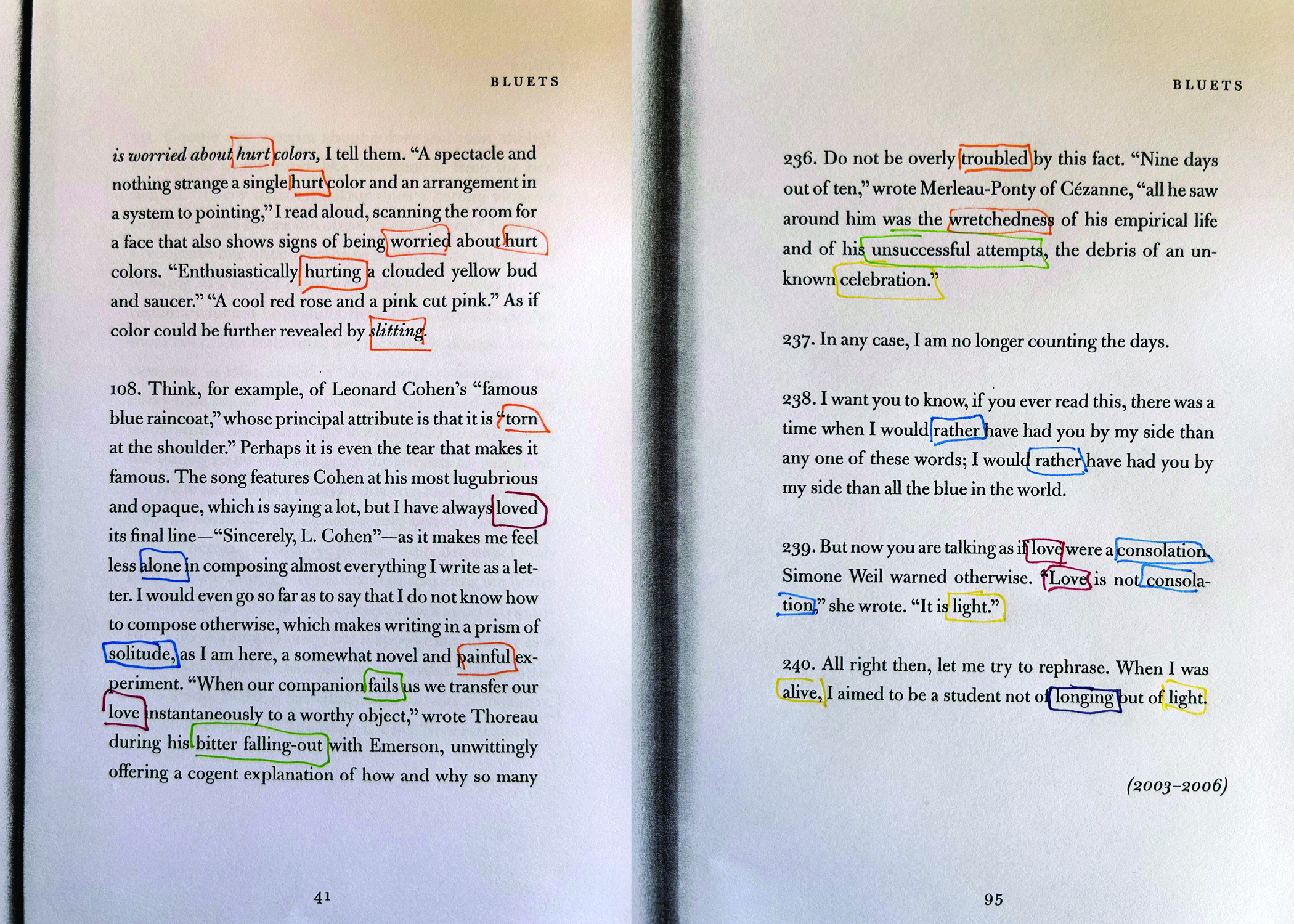
Fig. 1 & 2: Data Analysis: Collect emotional words and phrases from your book. You can do this with any digital tool, or by hand. I encourage you to try it with multiple methods.
Step 2: Once you have collected your data, you will need to organize it. This can be done by hand by simply adding up the number of emotional words and phrases you have collected, or you can employ a tool such as Excel or Tableau to organize your data. This can be especially helpful if you are working with a large book. Now is the time to connect your data to your yarn colors. (Figs. 3, 4)

Fig. 3: Organize your data, combining categories of emotion as-needed. Consider how many emotions you would like to represent in your design, keeping in mind that a bookmark is a limited size.
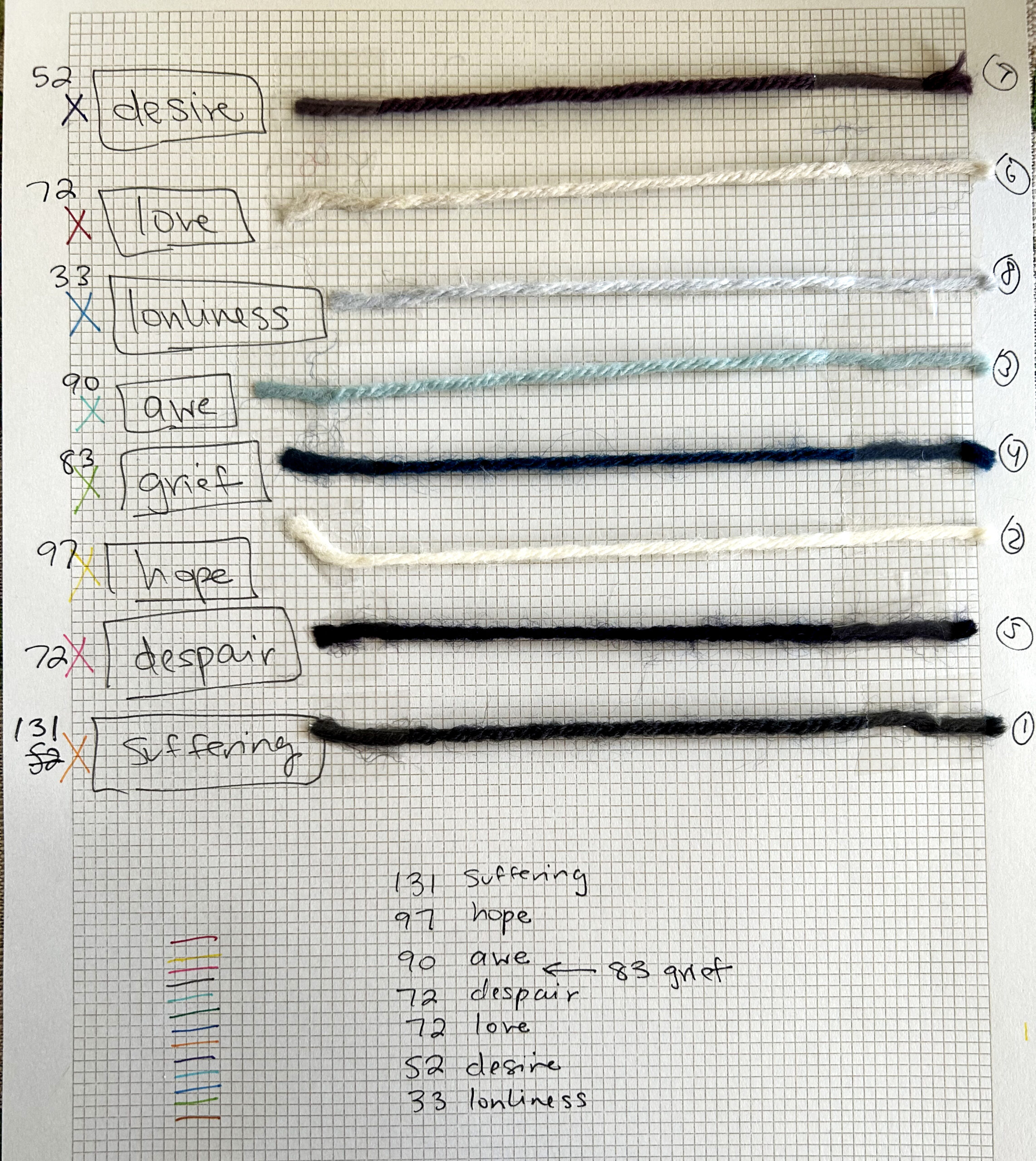
Fig. 4: Choose colors for each of your data points. Think about how the color you choose connects to that emotion. You don’t need to follow cultural conventions of what color is typically associated with which emotion. You can intentionally challenge these conventions, or just use your intuition!
Step 3: Set up your loom. I used a small hand loom for this project, and there are several bookmark looms that can be purchased online. Alternatively, you can build your own loom from a piece of cardboard. Once you have set up the yarn on your loom, or what is called the warp, you can begin to weave by pulling yarn back and forth through each line with what is called the weft. The weft will consist of all the various colors you have chosen for your project. As you are weaving, you may need to use a comb, which typically comes with weaving kits, to push the yarn down as you move through each line. In a pinch, you can use a fork for this! (Figs. 5 & 6)
Note: You can use other textiles for this, such as embroidery thread, fabric, or felt. You could even use paper to weave a bookmark. You might try experimenting with different mediums for different books!
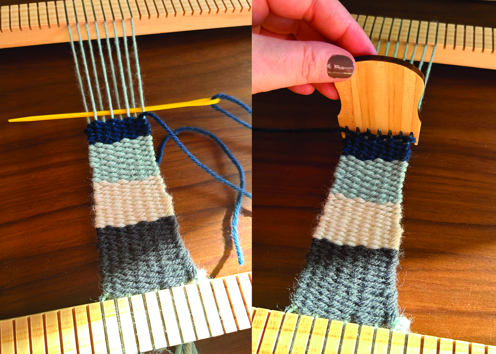
Fig. 5 & 6: Set up your loom, and weave the colored yarn according to the data set you collected. Each color should correspond to the number or percentage of emotion words you have collected. You can experiment with different patterns. This example is a simple line pattern, but you can be more adventurous if you would like to create shapes or organize the data in a more visually exciting way.
Step 4: After your bookmark is finished, tie off all the ends to secure the yarn, and enjoy your bookmark! (Fig. 7)
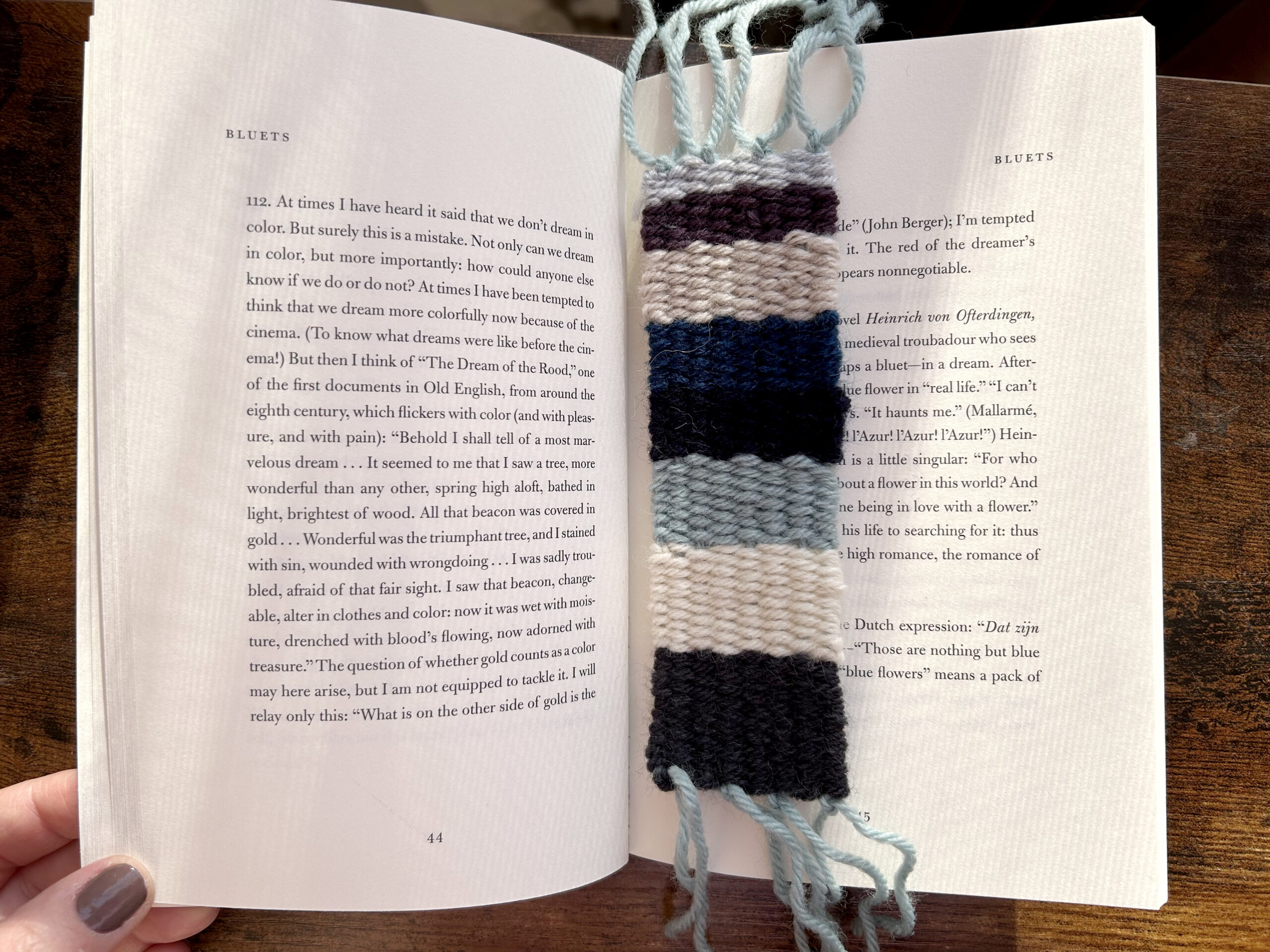
Fig. 7: The finished bookmark with Bluets, the book it represents.
—–
Notes:
[1] Von Goethe, Johann Wolfgang, and Charles Lock Eastlake. Goethe’s Theory of Colours. Routledge, 2019. (First published in 1810).
[2] Lin, Sharon, Julie Fortuna, Chinmay Kulkarni, Maureen Stone, and Jeffrey Heer. “Selecting Semantically‐Resonant Colors for Data Visualization.” In Computer Graphics Forum, vol. 32, no. 3pt4, pp. 401-410. Oxford, UK: Blackwell Publishing Ltd, 2013.
[3] Yvonne Jansen, Pierre Dragicevic, Petra Isenberg, Jason Alexander, Abhijit Karnik, Johan Kildal, Sriram Subrama- nian, and Kasper Hornbæk. 2015. “Opportunities and Challenges for Data Physicalization.” In Proceedings of the 33rd Annual ACM Conference on Human Factors in Computing Systems (CHI’15) . Association for Computing Machinery, New York, NY, 3227–3236. DOI: https://doi.org/10.1145/2702123.2702180
[4] Hornecker, Eva, Trevor Hogan, Uta Hinrichs, and Rosa Van Koningsbruggen. “A Design Vocabulary for Data Physicalization.” ACM Transactions on Computer-Human Interaction 31, no. 1 (2023): 1-62.
[5] Lupton, Deborah. 2017. Feeling Your Data: Touch and Making Sense of Personal Digital Data. New Media & Society 19, 10 (July 2017), 1599–1614. DOI: https://doi.org/10.1177/1461444817717515
[6] Yun Wang, Adrien Segal, Roberta Klatzky, Daniel F. Keefe, Petra Isenberg, Jorn Hurtienne, Eva Hornecker, Tim Dwyer, and Stephen Barrass. 2019. An Emotional Response to the Value of Visualization. IEEE Computer Graphics and Applications 39, 5 (Sept. 2019), 8–17. DOI: https://doi.org/10.1109/mcg.2019.2923483
[7] Li, Yufan, Yue Huang, Kang Zhang, and Varvara Guljajeva. “Bitter Data: Bitterness Taste in 100,000 Trouble Data.” In Proceedings of the 16th International Symposium on Visual Information Communication and Interaction, pp. 1-2. 2023.
[8] Kim, Evgeny, and Roman Klinger. “A Survey on Sentiment and Emotion Analysis for Computational Literary Studies.” arXiv preprint arXiv:1808.03137 (2018).
[9] Deng, Jiawen, and Fuji Ren. “A Survey of Textual Emotion Recognition and its Challenges.” IEEE Transactions on Affective Computing (2021).
[10] Von Goethe, Johann Wolfgang, and Charles Lock Eastlake. Goethe’s Theory of Colours. Routledge, 2019. (First published in 1810).
Nancy Smith
Nancy Smith is an Assistant Professor at the School of Information at Pratt Institute, where she teaches in the Information Experience Design Program. Her primary research is focused on understanding the relationship between digital technologies and the environment, which includes work in animal-computer interaction, speculative design, critical making, and multispecies justice. She teaches courses in visual communication design, digital storytelling, and data visualization. She is especially interested in experimental and creative forms of knowledge production and utilizes a variety of materials, including fabric, thread, yarn, and organic materials to create data physicalizations. More of her work can be found on her website: www.somequietfuture.com
- Web |
- More Posts