Introduction
Over the past year I have been researching and crafting a data physicalization piece titled Me & You, 2024 (porcelain and thread, Figure 1). The resulting piece maps the physical locations of three significant people in my life in relation to where I lived at the time. Thread was weaved in between the shapes starting at the time we met to signify our relationship through time and space. This essay documents the creative process to create this work and a repository for personal reflections. In addition, this essay aims to offer transparency in my process, providing a potential guide for others seeking to embark on their own data physicalization projects and inspire the growth of their own creative practices.
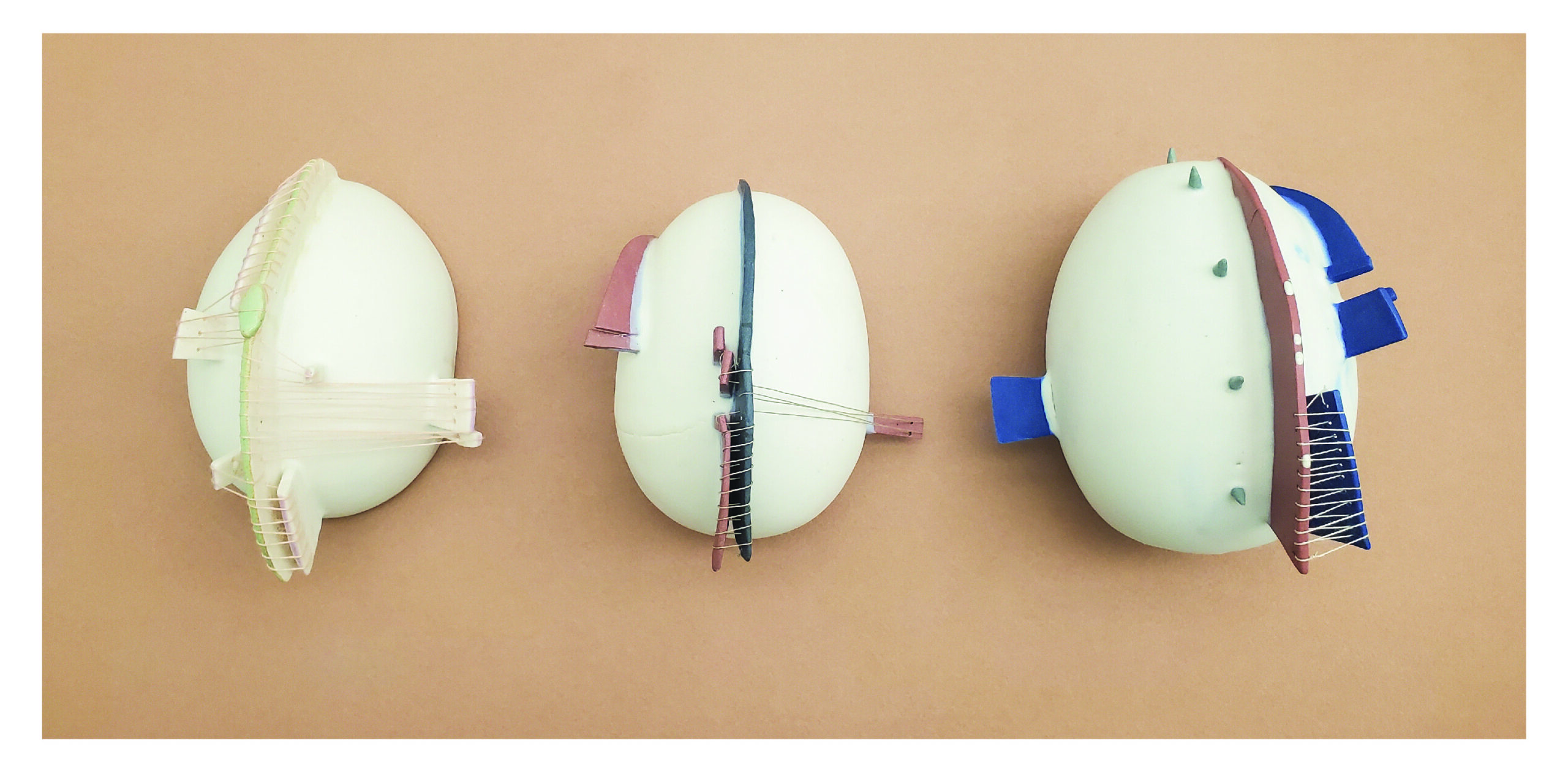
Figure 1: Me & You, porcelain and thread. This work is made up of three pieces, each one shows the spatial relationships between myself and three people in my (the artist’s) life, my sister, my husband, and a best friend (from left to right). The center fin-like shape is my life, the top is further back in time and the shape gets larger with age. The thread encodes our connection through time and begins when we met.
Throughout the creation of Me & You, I developed a practice grounded in experimentation and research, drawing from my background as both a scientist and an artist. This essay delves into the distinctions between crafting a data physicalization piece and producing 2D data visualizations on a computer. It explores the commonalities and differences in how I create art and data science work.
The essay unfolds in two main parts. The initial section establishes the personal and cultural foundations that shape my approach to creating a data physicalization piece. The subsequent part delves into the construction of the artwork, with a specific focus on the chosen medium — porcelain clay. The essay concludes with a reflective segment, wherein I contemplate the lessons and insights from this project, shaping my future endeavors in data and art.
Through conceiving Me & You and writing this essay, I navigated the intricacies of encoding the world as observed and explored through the physicalization of data and how this practice may extend the communication process beyond the confines of 2D representations and sculptures alone. Ultimately, this process underscores the significance of intentionally situating one’s perspective within a project, emphasizing transparency in the process, and recognizing its influence on how the audience interprets the final work.
Part One: Cultural and Personal Foundation
Encoding and Abstracting Meaning in Data Visualization and Data Physicalization
Comparing the practice of creating science and art is a complex philosophical exploration and is beyond the scope of this writing. That said, I borrowed from both my science and art practices when creating Me & You. Personally, I am less interested in how science and art are defined and compared and more interested in the process underlying them – specifically, abstracting the world to make sense of patterns.
Artists collect ideas about the (or their) world and develop a language to convey them from repeated themes and aesthetics defined by their artistic voice. For example, painters, over the years, form their artistic style and voice by defining a visual language, rearranging color and form to communicate a personal truth for themselves. Artists are always filtering the world through themselves to get to the end results. The process is similar to that of a data scientist but with the possible difference in how “truth” is defined and conveyed. Scientists strive for a truth that exists regardless of human interpretation, a pattern outside of the influence of human understanding. This includes a common falsity that if data is handled correctly, the scientist’s influence is not part of the process, that somehow they are expressing a truth beyond themselves and even beyond personal or cultural bias. Most scientific analysis aims to erase the human(s) influence who measured, quantified, and performed the work.
We must always remind ourselves that numbers are still abstractions of reality. The moment we measure is the moment we imprint ourselves and our perspective into the truth we are measuring. In data visualization, we further abstract numbers into a visual language using form and color. These are unavoidable human-mediated separations from reality. I’m very interested in exploring how our abstractions and the hundreds of decisions involved in data processing, some consciously and some unconsciously, are based on our inherent personal and cultural backgrounds. Data work is always an extension of ourselves.
This opposes what is practiced in the art world, where there is almost an expectation of artists to center themselves in their work. The act of writing an artist statement and describing their intentions when creating a piece through presentation and critique is common. Artists often highlight their personal choices when describing their process for creating a piece. Their story is celebrated in the creation of the work. This was one of the aims when I began the process of creating a data physicalization piece – to center myself in the process, my past, views, perceptions, and aesthetics. It was something I rarely do when working on any other data project, but why?
Data physicalization offers possibilities for interpretation beyond art and data viz alone because it exists in this middle realm between the two and can absorb the strengths of communication from both. In the end, data viz and artwork are further absorbed and interpreted by the personal and cultural backgrounds of our audience, and we begin a dialog of what the piece is saying. Form and color, the language of visual art, is rife with personal and cultural associations, modulating throughout a person’s lifetime and culturally throughout human history. The final piece has the creator’s metaphorical fingerprints all over the piece and grows infinitely more imbued with human influence through the audience’s personal and cultural background. Creating a data visualization and/or an art piece and putting it out into the world is a messy and beautiful cacophony of humans trying to make sense of and communicate patterns.
Part 2: Building Me & You
In this section, I explain how and why I made certain decisions when building Me & You in hopes that others can gain some insight into how they might approach creating a data physicalization piece using clay.
Step Zero: Working with Porcelain
What fascinates me most about data and art is the concept of pattern finding and communication, especially in the context of human evolution. Humans and clay have had an intimate relationship dating back 21,000 to 13,800 years [1]. Our first wheel was used not for transportation but as a pottery wheel [2]. Clay is an ideal material to meditate on the large time scale of human thought and innovation. Clay is millions of years old, containing the minerals, sediment and rocks from rivers, glaciers, and ocean floors that were once mountain tops, as well as long decomposed plants and animals. The clay is imbued with deep time and an earthy liveness, soon to be reincarnated by my hands and intentions. The main reason I chose clay, and porcelain in particular, is because with porcelain, it is easy to see the artist’s presence within the piece. You can easily see fingerprints, mistakes, or subtle nudges. As opposed to stoneware clay which is more coarse in texture and harder to see fine details. I like observing when work is handmade, and the transparency in process, further exemplify centering the artist within the work.
Step One: Establishing Standards of Experimentation
In computational data science work, you can reiterate and rapidly manipulate variables to iterate fast through the same processes and subtly isolate variables to test their influence on the final product. However, when creating a physical data object, there are limits to redoing something. Test tiles are commonly used in pottery work, they are small (so as not to take up precious space in the kiln) clay tiles a way to prototype different aspects of the work. Test tiles are used to experiment, a way to isolate variables and rapidly test them. Experimentation can occur along many axes. For example, physical form is necessary to test physical limits (i.e., cracking, structural balance) or aesthetic choices (i.e., color, design, form). But, when communicating quantitative characteristics, it is vital that these choices are tested for interpretability. I used test tiles as a method to prototype and standardize encoding data points, allowing for reiteration of the final tiles based on creative preferences. I chose a simple circle as my form, which I made with cookie cutters of different sizes (Figures 2 and 3). When I found forms that resonated with me, I would prototype them on larger objects (Figure 4).
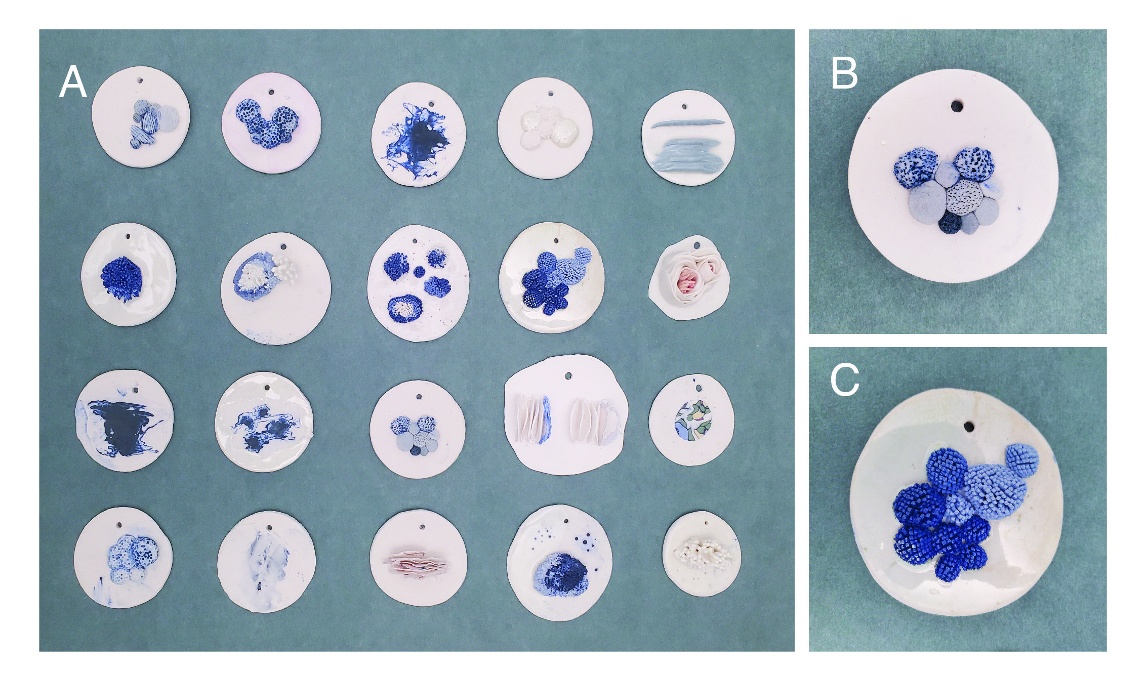
Figure 2: Texture Test tiles. A.) Examples of test tiles. B.) Close up of texture shape, testing size and staining C.) Close up of texture shape testing size and hue.
Step Two: Observing and Encoding
What I found instrumental in encoding quantity (numbers) into clay was a scale for measuring weight. If I were interested in a certain form, I weighed out different clay weights and built each form with the different weights. This was also important for standardizing the color of the clay in early experiments (Figure 3), weighing the amount of pigment to adjust hue and shade. I ended up doing many color experiments, but in the end, for creating Me & You, color does not encode anything quantitative. Any color present in the final product was based on personal aesthetics, another nod to centering myself. I also wanted to limit what I encoded and allow exploration beyond vision for the encoding process. In theory, intentional quantitative abstractions in Me & You can all be communicated through touch.
Again, the guiding principle was centering myself in the work, something I rarely do in scientific data visualization. The design and aesthetic choices that did not encode “data” were choices that I found aesthetically beautiful – for example, the colors used, the shape of the clay form, and the smooth texture. The main fin-like shape that encodes my physical relation throughout my life is unapologetically in the center, transversing the spine of the sphere form (my world). Even though I physically moved in geographic locations many times in my life, the “You” position changed, reflecting more of my truth than reality. I celebrated my bias within every decision. Even in the title “Me & You,” Me is before You, even though it is less grammatically accepted.
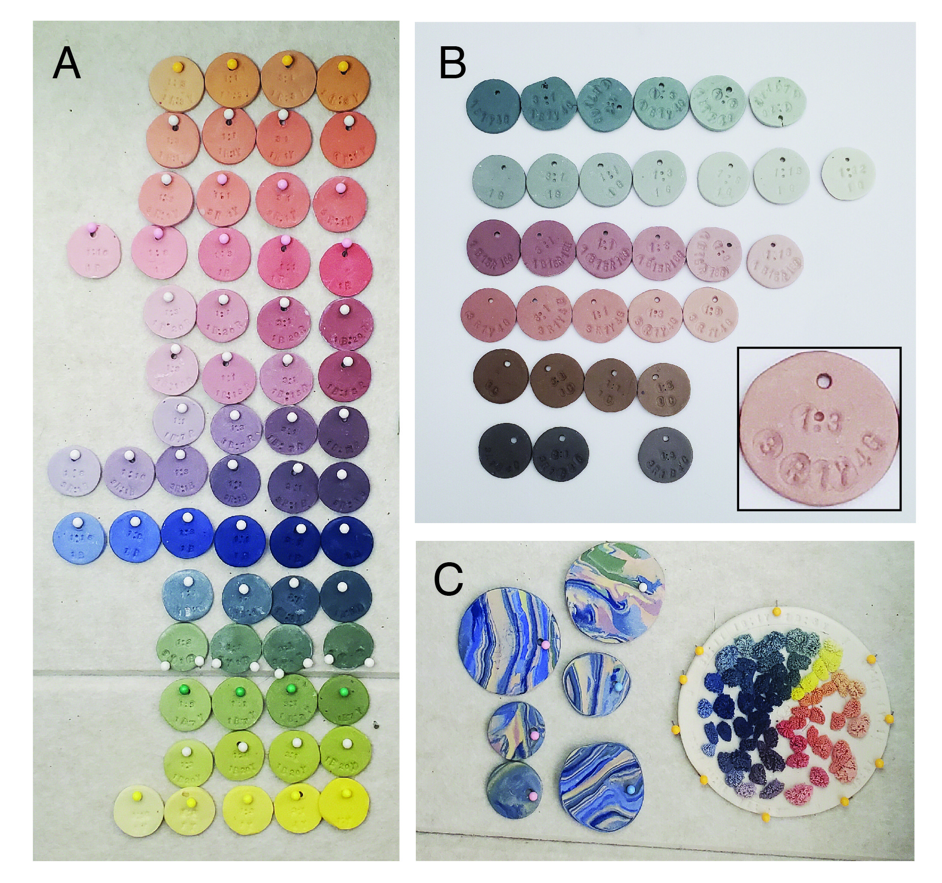
Figure 3: Color Test Tiles. A.) Using three pigments (Red, Blue, Yellow), a series of colors were created by weighing out each pigment and mixing them together. B.) Brown and gray pigments were added to a few of the hues to achieve a muted palette. Close up shows color recipe. Example shown: 1 part color 3 parts porcelain. 3R1Y4G = 3 parts Red, 1 part Yellow, and 4 parts Grey. C.) Left side is an experiment of nerikomi technique. Right side is a color wheel to test how colors look with a specific texture.
Step Three: Choosing Visual Language and Data Theme and Prototyping
The dataset was determined in congruence to experimentation with material. This process was very different from how I create a sculpture and how I perform scientific data work. I knew I wanted the work to tell a story of personal relationships, so I began playing with my cell phone data and the data of friends, etc. It was a back-and-forth dialog on how each data story would fit with the test tiles I was defining in Steps 1 and 2. Then a series of prototyping on larger shapes (Figure 4). After reading about data physicalization, I was surprised to learn that this may be a common approach. In a systematic examination of the creation process for various data physicalization projects, it was frequently observed that, during the initial stages of dataset selection, designers often found themselves simultaneously engaged in the later phases of creating the work [3].
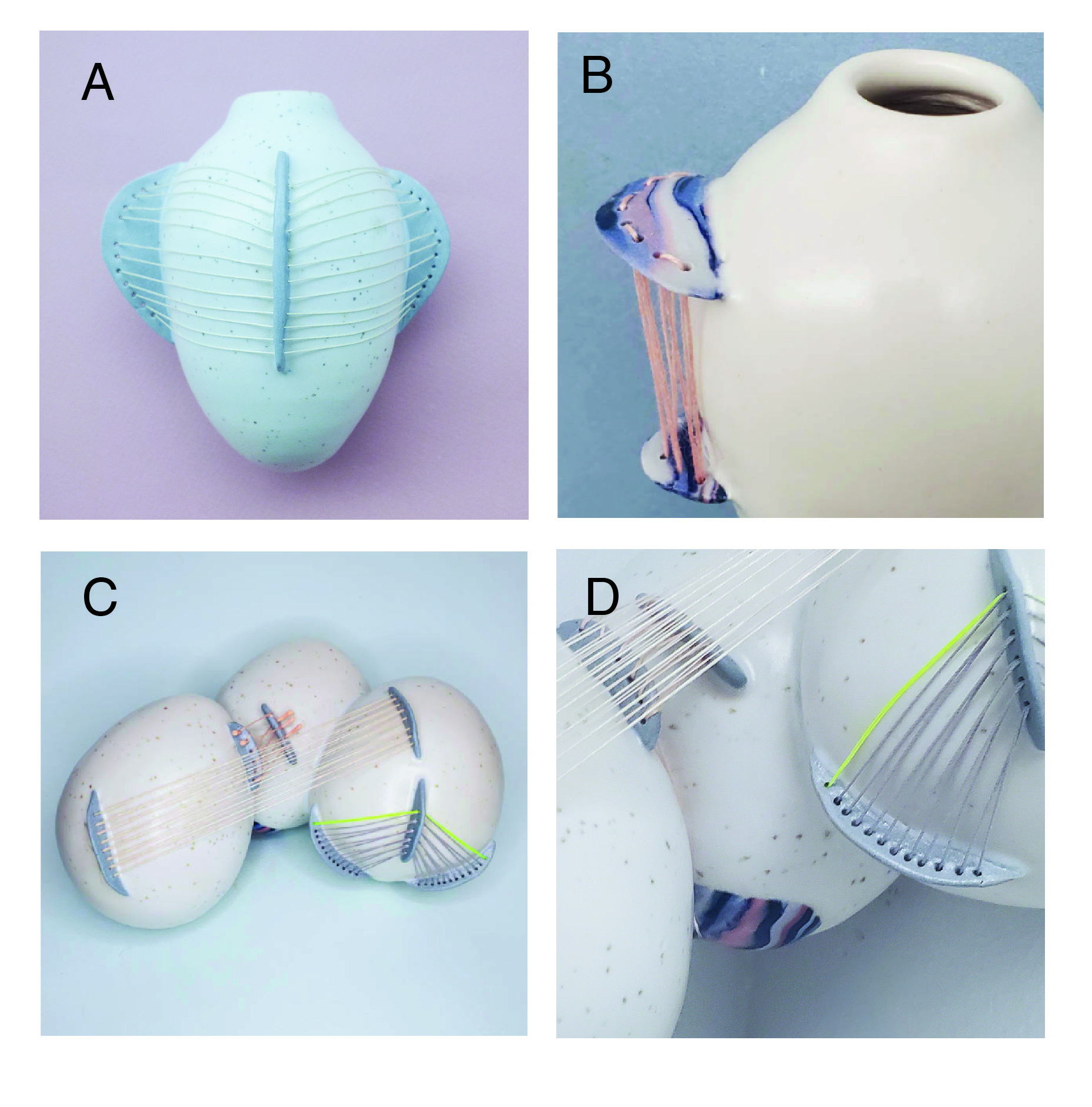
Figure 4: Prototypes of the use of thread and fin shapes. A.) Hanging wall vase with blue fins and white thread. B.) Hanging wall vase with nerikomi fins with pink thread. C.) Cluster of three orb shapes with short blue fins and multicolored thread. D.) Close up detail of C.
The encoding I landed on was spatial relationships in my life throughout time. The “Me” center fin-shape begins at the top of the piece and is furthest back in time. The shape grows in height as age/time progresses. The “You” (all other shapes) represent a significant person’s geographic relationship to me through time, left of center is west of me, while right is east of me (see example key in Figure 5A and 5B). Even if I am the person moving geographically, their shapes move, the piece reflects my perception. Even after centering myself in the work, I felt the “us” component was needed, so I chose to encode our relationship as thread weaved between our shapes throughout time. The thread starts from the year we met and spans time and space as we live our lives till now.
Step Four: Execution
The execution was the fastest part, which is something I didn’t anticipate. At some point, when the visual language was achieved, and I landed with a dataset that would fit, the data collection was straightforward. I reached out to three significant people in my life: my husband, my sister, and one of my best friends. I talked through where they lived throughout their lifetime and calculated how many miles away I was from them for each year. The furthest distance was mapped onto the furthest space I could place a point on the clay form, and all numbers were normalized from there. The execution felt more like building a functional piece of work since my intentions in my quantitative approach were explicitly defined, I had a step by step guide and the structure was already tested, I just had to do the measurements and cut the pieces. The thread was sewn after firing, encoding our connection throughout our lives – my younger sister’s connections began when I was born, while with my husband, the thread joining our pieces did not begin until halfway through my life. Note: A clearly visible landmark is the two years my husband and I were separated while he lived in France, this can be seen on the right hand side or our piece (Figure 1 middle, Figure 5E).
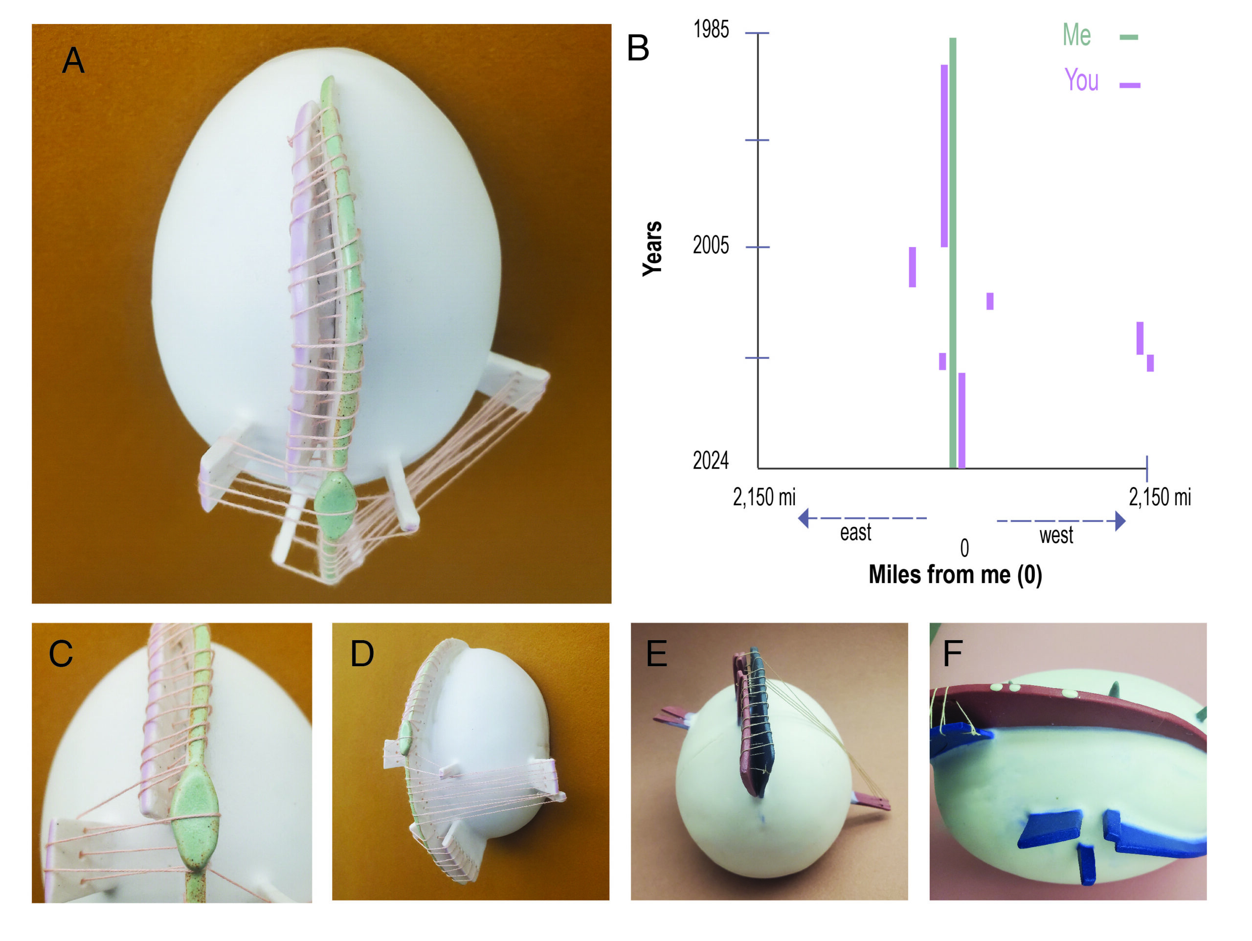
Figure 5: Details of Me & You. A.) Close up of the piece that was created to show the geographic distance between my sister and myself throughout our lifetimes. B.) Graph showing the data as a data visualization. C.) Close up of a symbol that hides a crack that formed, but also signifies when we first moved away from each other. D.) Side view of the piece. E. Bottom view of another of the pieces that displays the geographic distance between my husband and myself throughout our lifetimes F.) Close up view of the third of the pieces, representing the geographic location of one of my best friends throughout our lifetimes.
Part 3: Reflection
When designing a data physicalization piece, the overarching goal is communicating with others. In Hornecker et al., 2023 [3], the authors attempt to map what vocabularies exist for data physicalization, further categorized into three categories based on intention: 1. implicit, 2. explicit, and 3. unintentional. This is an incredibly valuable way of thinking about not only data physicalization pieces but, in my opinion, art in general. More importantly, this framework provides a common language for practitioners to communicate their design decisions. A data physicalization piece offers the creator the ability to communicate intention in a more straightforward way than a sculpture alone. To describe the data “key” for a data visualization piece is expected and the intention deliberately described. While there is a strength in not describing intention, allowing “critical inquiry into materiality, context, and the process of making,”[4].I found that describing the encoding made the viewer spend more time trying to understand what the piece was saying.
After creating Me & You, I haven’t stopped thinking of people in my life within the visual language I developed, abstracting the many divergent patterns of relationships I’ve had in my life. How do I quantify connection? Did I lose connection with some people I don’t interact with anymore – how would I encode those relationships? I have shown this work to different types of audiences and was surprised at how engaged the response was in both art and data critiques. There is something in seeing data presented in this way, forcing the audience to lean in and pay attention. Often, viewers transposed their lives and decisions into the visual language and began dreaming up their own symbols. Interesting questions were discussed: How do you represent death or pregnancy? What if you never reveal what the symbols mean? With the “key” hidden, how does this change the meaning to both the artist and the viewer? Engaging in physicalization compels us to reassess conventional concepts surrounding data[4].
The unpredictability of working with clay and the firing process forced some unintentional but now valued aspects of the work. For example, there was a crack in the spine of one of the fins shapes for the piece with my sister. I obscured the crack by placing a diamond shape over it (Figure 5C). Only after making this decision did I observe that the crack formed at the exact year that my sister and I separated from where we lived for the first time in our lives. And now, the crack and mending adopted meaning and became a symbol – a movement from unintentional to intentional. This is a natural dialog that happens when creating art and extends to the audience. The unintentional has its own life in the interpretation of a piece of art, while in scientific data work, this modulation is often thought of as a flaw – scientists do not want unintended meaning when communicating results. The unintentional chaos in the behavior of clay also began to reflect how I think of bias in all data work, that bias is unavoidable. There is always an unintentional bias when measuring reality. It is a reminder that crisp, clean lines seen in most data visualizations are never the representation of reality. Somehow, random modulation in form is closer to the truth.
I’m continually trying to articulate to myself why I’m attracted to data work because the word “data” has many negative cultural associations. Data lacks emotion and is boring, sterile, nerdy, and/or unapproachable. Again, from my perspective, doing data and artwork is a continuation of human curiosity. Finding patterns, predicting the future, and acting on those patterns, I would argue, it is what makes us human. Whether our final product is art, science, craft, or survival, abstracting the world for pattern is to be human. And incorporating quantitative information is leveraging the (almost) universal cultural understanding of numbers as a language to communicate ideas and the patterns we find. Data physicalization is a way to convey information that is impossible to define using numbers or language alone – when we further abstract the number into a 3D physical representation with material, we are able to embed cultural and personal information from the material itself. When it comes to embracing the commonalities in intention between creating data and artwork and the opportunities that arise when combining them in data physicalization, what I find most exciting is not the result but the process of finding and communicating those patterns. It is how we connect and make sense of the world – this is why I love data work.
Special Thanks to the Data Science by Design Book Club, which, through thoughtful (and fun!) discussion, helped me tease apart how to think about the intersection of art, creativity, craft, data science, and ethics. And thank you to the artists of the Compound Art Gallery and Studio Art Critique group for your insightful comments during the creation of Me & You.
References
1. Boaretto, E. et al. Radiocarbon dating of charcoal and bone collagen associated with early pottery at Yuchanyan Cave, Hunan Province, China. Proc. Natl. Acad. Sci. U. S. A. 106, 9595–9600 (2009).
2. Baldi, J. & Roux, V. The innovation of the potter’s wheel: a comparative perspective between Mesopotamia and the southern Levant. Levantina 48, 236–253 (2016).
3. Hornecker, E., Hogan, T., Hinrichs, U. & Van Koningsbruggen, R. A Design Vocabulary for Data Physicalization. ACM Trans. Comput.-Hum. Interact. 31, 1–62 (2023).
4. Offenhuber, D. What We Talk About When We Talk About Data Physicality. IEEE Comput. Graph. Appl. 40, 25–37 (2020).
Dr. Ciera Martinez has a Ph.D. in Evolutionary Biology from UC Davis and a Postdoc in Evolutionary Genomics supported by NSF Predoctoral and Postdoctoral fellowships. In 2018, she held a Mozilla Open Science Fellowship, where she researched biodiversity data management and standards in Natural History Museums. In 2020, she co-founded Data Science by Design (DSxD, datasciencebydesign.org), a collective of data scientists, artists, and designers who celebrate creativity in data work, and she serves as lead editor of the DSxD book series. Previously, she was the Research Lead for Biodiversity and Environmental Sciences at the Berkeley Institute for Data Science. Currently, Ciera is a Data Science Researcher and Senior Program Manager at The Eric and Wendy Schmidt Center for Data Science and Environment at UC Berkeley, where she focuses on biodiversity monitoring, environmental sustainability, and data ethics with an overall goal of using data and data tooling to better our environment. She lives and creates ceramic art (Instagram: @ciera.christin) in Oakland, California.